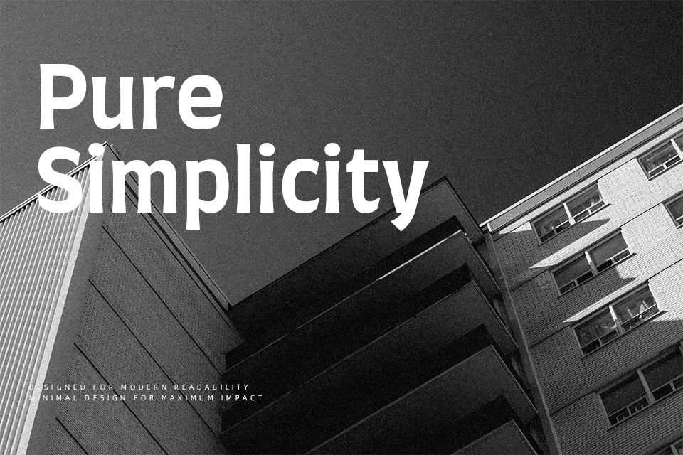
Farro Font
Free for Commercial UseAbout
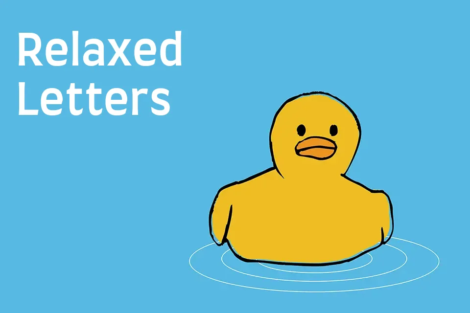
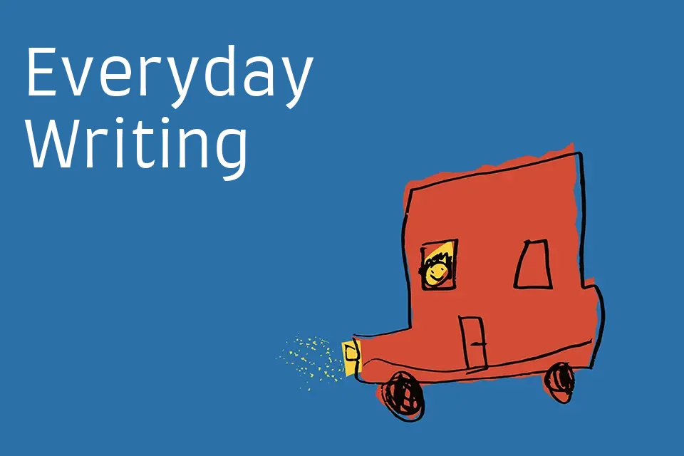
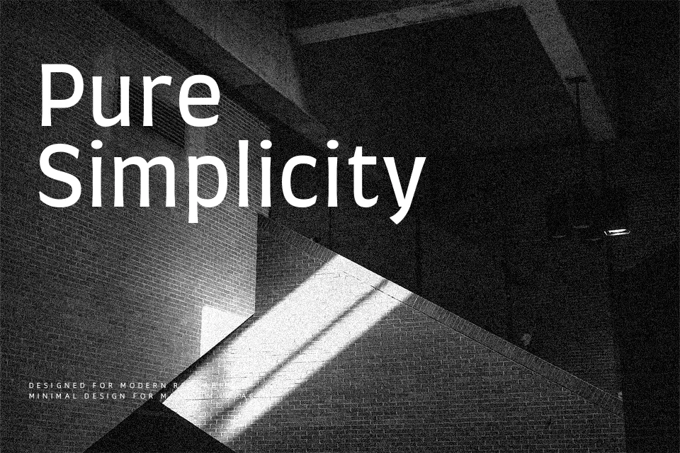
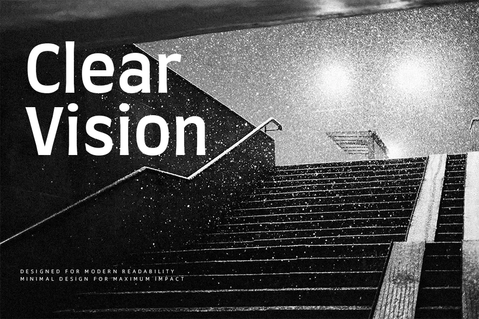
Farro is a four-weight display sans serif built on a humanist skeleton, with open counters, loose spacing, and subtly uneven strokes that give it a hand-tuned, artsy feel. The letters lean a bit tall and narrow, so text feels upright and energetic rather than neutral. Its whimsical details show up in characters like a, g, and y, which adds charm to headlines and short taglines without drifting into cartoon territory. I like it for creative brand wordmarks, poster titles, and UI banners where you want some personality but still need quick readability. It tends to feel too busy for dense paragraphs or conservative corporate reports, so I’d keep it for display roles instead of body copy.
Best For:
expressive headlines
creative brand wordmarks
poster titles and event graphics
short UI banners and hero text
Not Ideal For:
long paragraphs or body copy
formal corporate documents
highly traditional editorial layouts
Perfect for branding, headline, and logo, with a artistic and display style.
License
Gallery