Dokdo Font
Free for Commercial UseAbout
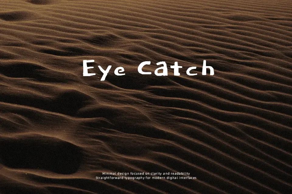
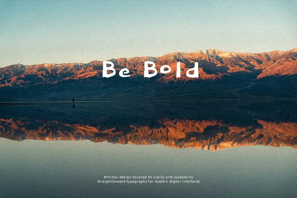
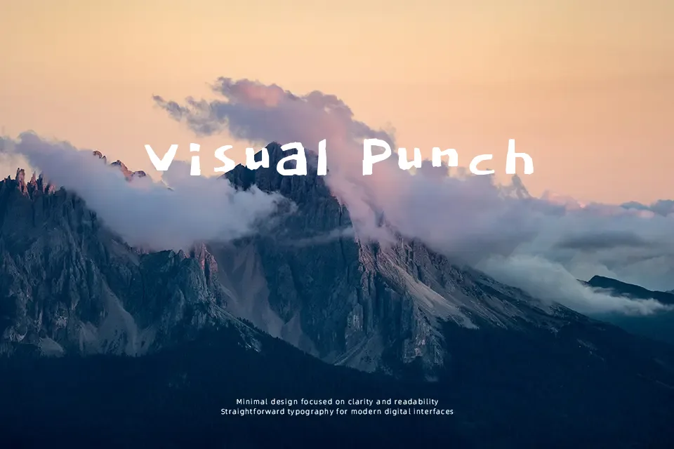
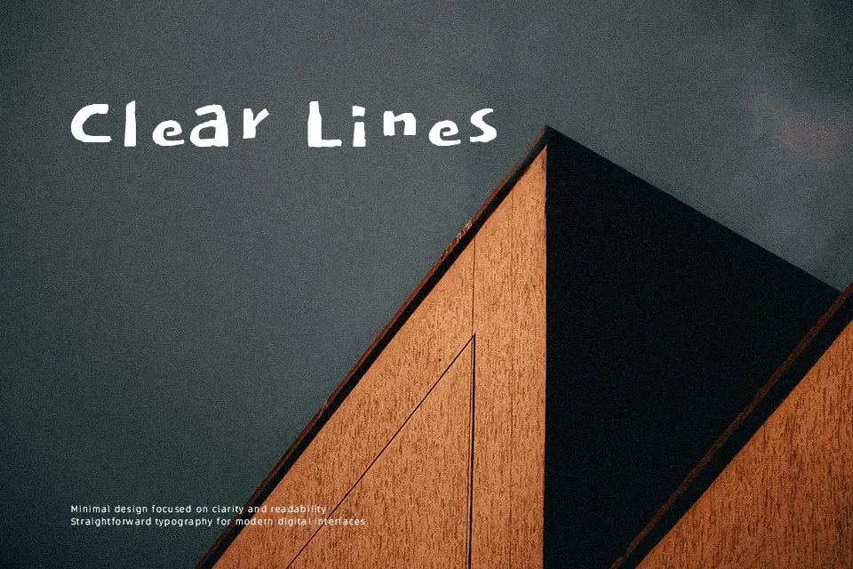
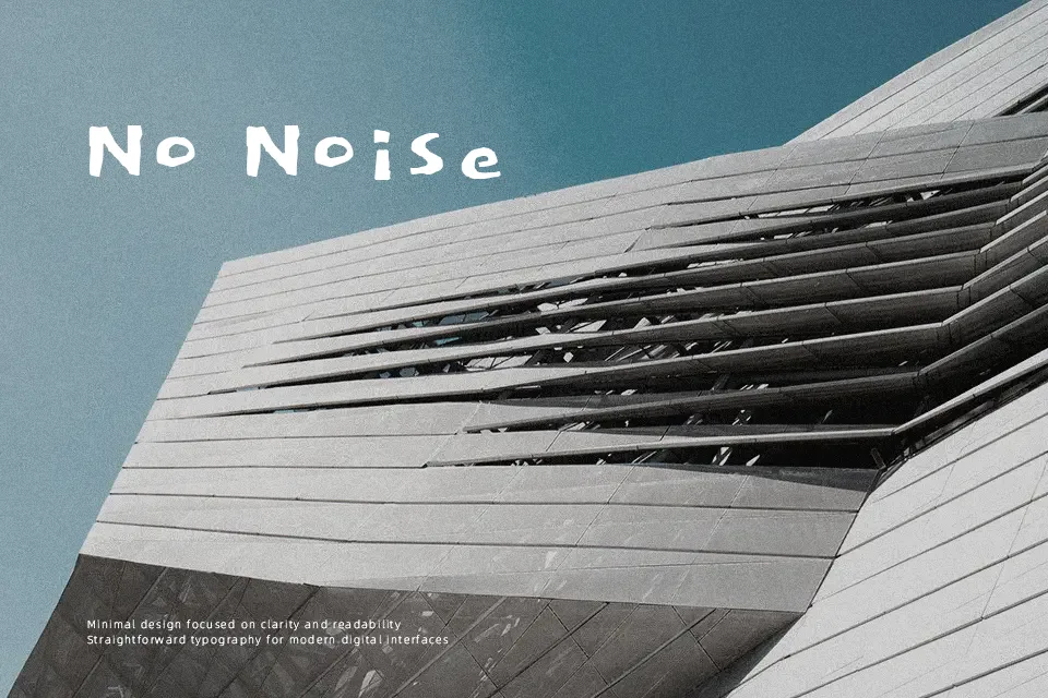
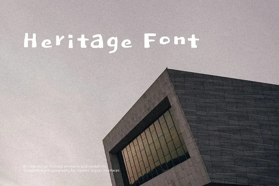
Dokdo has rough, brush-like strokes, uneven baselines, and deliberately awkward proportions that give each letter a sketchy, hand-doodled feel rather than a polished calligraphic look. The weight sits on the heavier side, with tight counters and inconsistent spacing that create a busy, energetic texture at larger sizes. Overall it reads as a casual, decorative display face with a strong handwritten voice rather than a neutral workhorse. It works nicely for street-style poster titles, youth-focused branding accents, or humorous YouTube thumbnail text where personality matters more than precision. For long copy, formal identities, or dense UI labels, the jittery rhythm can quickly become tiring or feel off-brand, so it is better kept for short, loud moments of emphasis.
Best For:
short headlines and tags
playful social media graphics
casual poster titles
youthful branding accents
Not Ideal For:
long paragraphs
formal corporate documents
dense UI or app interfaces
small caption text
Perfect for branding, gaming, and headline, with a artistic and display style.
License
Gallery