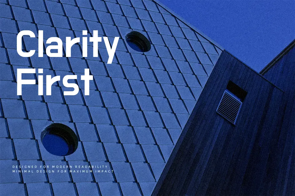
Do Hyeon Font
Free for Commercial UseAbout
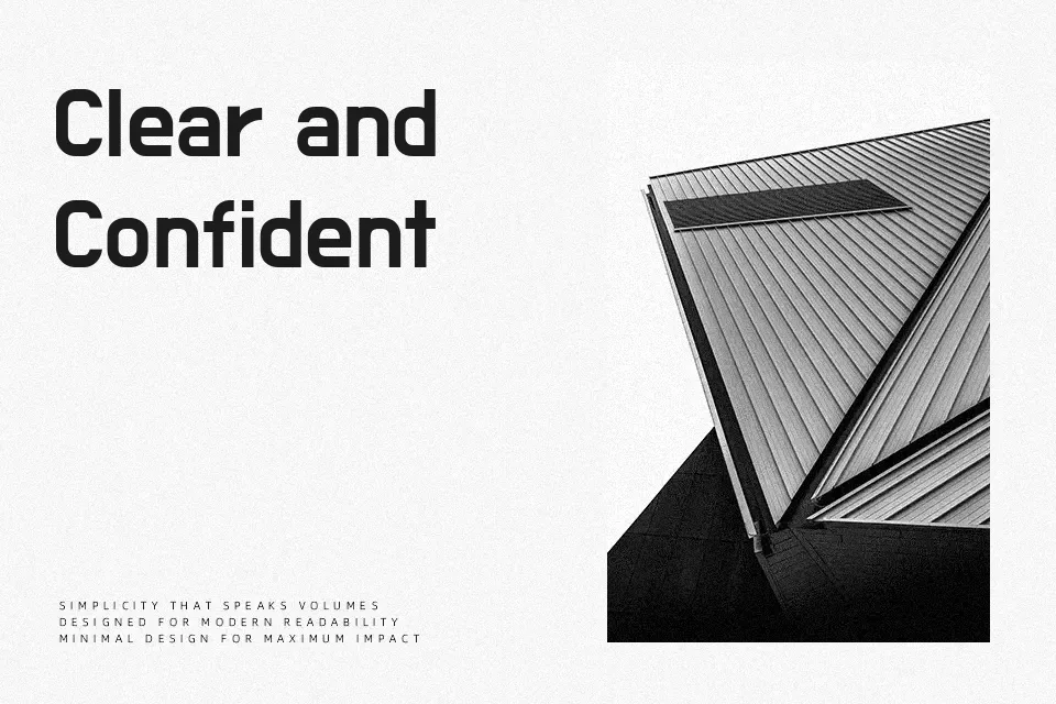
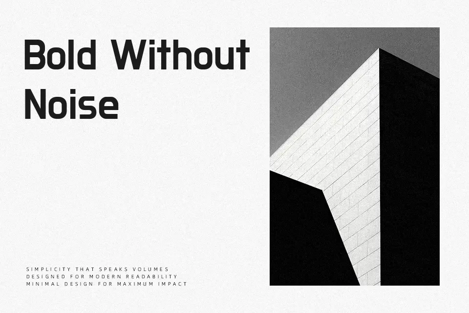
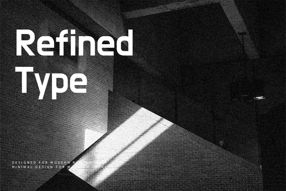
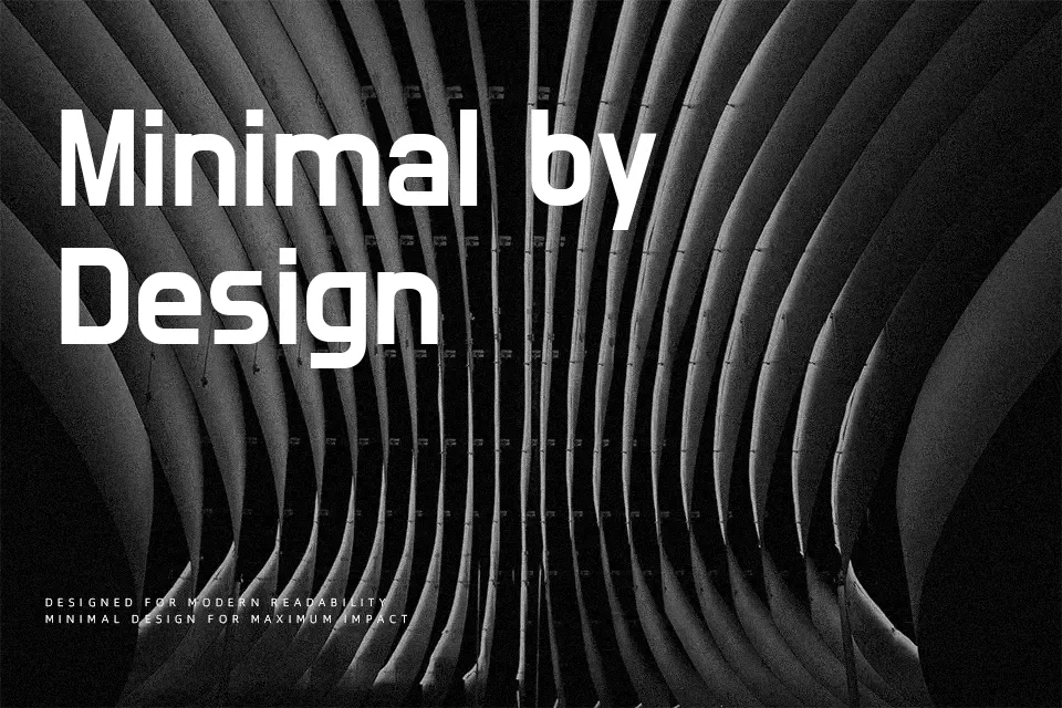
Do Hyeon combines heavy, even strokes with rounded terminals and a superellipse-inspired skeleton, giving letters a compact, almost blocky silhouette that still feels approachable. The Korean glyphs connect consonants and vowels into clear, continuous shapes, while the Latin set keeps a simple, geometric rhythm with relatively tight spacing. On screen, it delivers punchy, legible headlines for mobile apps, food delivery services, tech banners, and bold section titles, especially when you want a hint of retro signage in a modern layout. It tends to feel too rigid and heavy for body copy or formal branding, so it works best when you treat it as a strong accent rather than a workhorse text face.
Best For:
bold headlines
app and web UI labels
Korean–Latin display typography
signage and poster titles
Not Ideal For:
long paragraphs
formal editorial layouts
traditional corporate branding
small caption text
Perfect for advertising, gaming, and headline, with a bold and display style.
License
Gallery