Cormorant Upright Font
Free for Commercial UseAbout
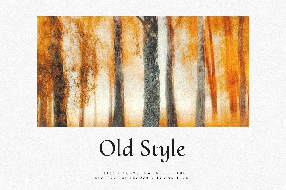
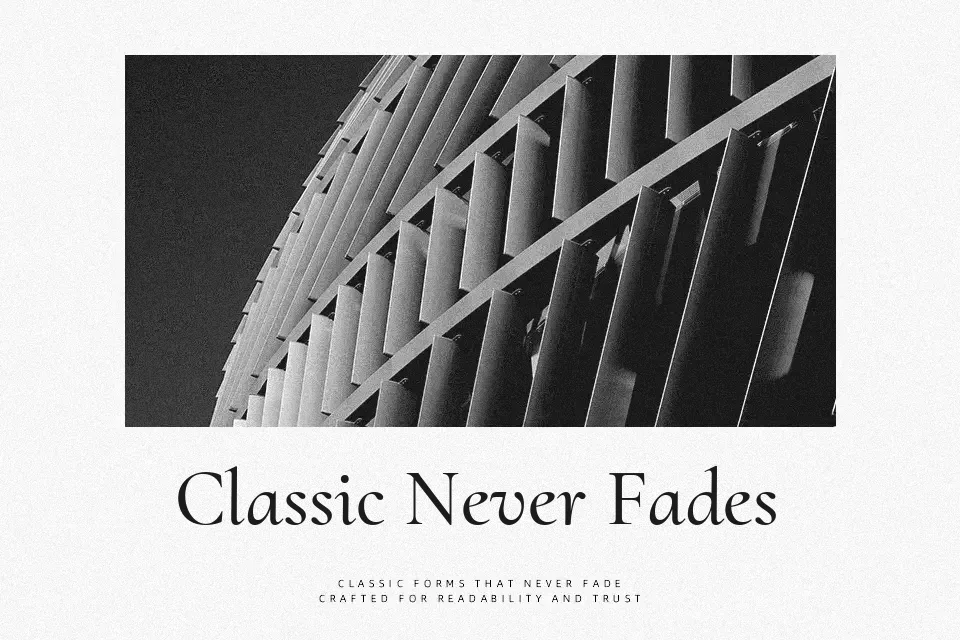
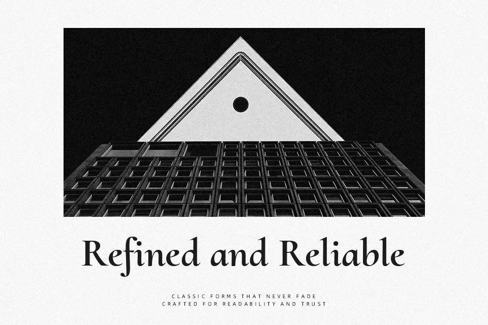
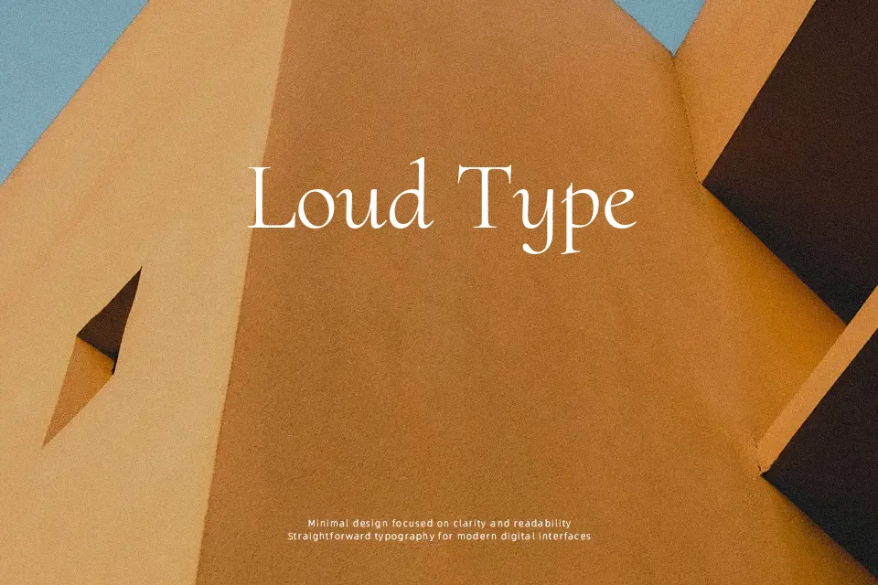
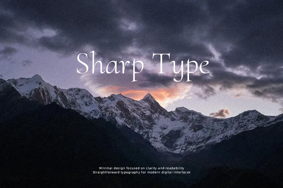
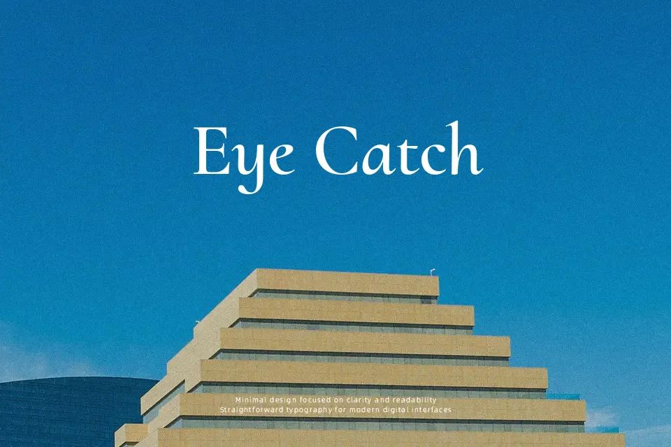
Cormorant Upright sits between classic book serif and expressive display, with slim, high-contrast strokes, sharp triangular serifs, and a slightly condensed stance that lets titles carry more text without feeling cramped. The caps feel ceremonial, while the lowercase has a literary flavor, so it fits packaging or editorial work that needs character without turning loud. It handles short paragraphs and pull quotes gracefully, but extended body copy can start to feel busy because of the detailing in each glyph. If you already like traditional Garamond-style forms but want something more theatrical and upright, this variant gives you that extra drama without losing typographic discipline.
Best For:
headline
book covers
premium packaging
boutique branding
Not Ideal For:
long-form body text
dense UI copy
highly technical documents
Perfect for branding, editorial, and headline, with a classic and display style.
License
Gallery