Cormorant SC Font
Free for Commercial UseAbout
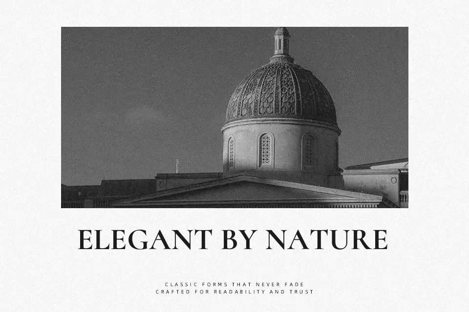
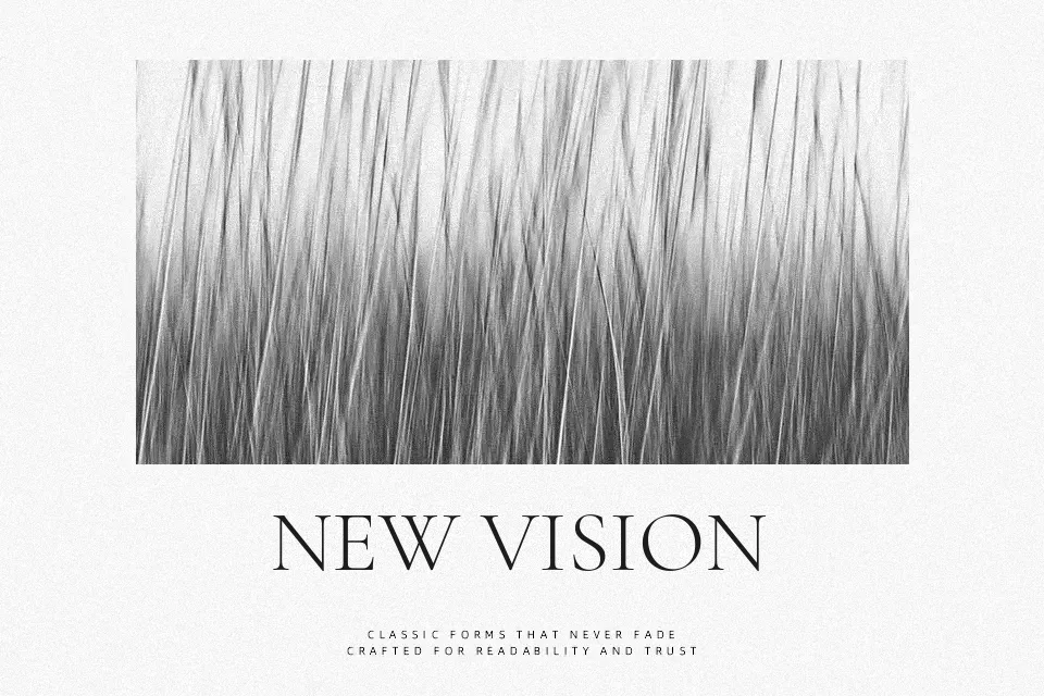
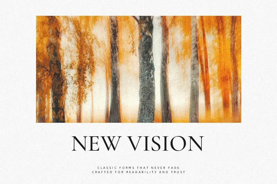
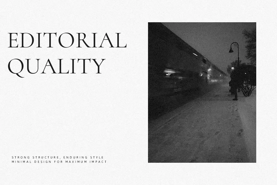
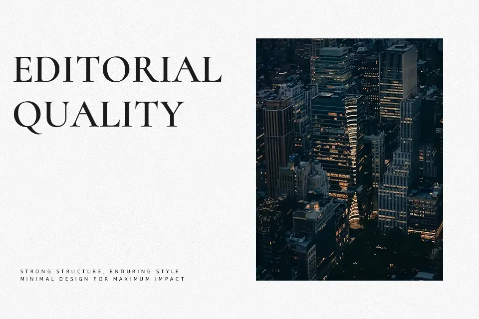
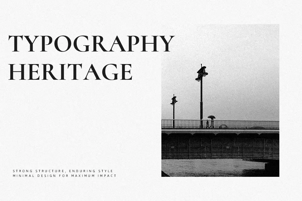
Cormorant SC takes the calligraphic elegance of old-style Garamond forms and recasts them as small caps with high contrast, crisp serifs, and fairly tight spacing, so headlines feel compact yet expressive. The letters have a slightly uneven, hand-cut rhythm that reads sophisticated on packaging, menus, and magazine covers, especially when you keep copy short and give it breathing room. It shines when you need a literary or heritage tone, but the detailing can look fussy in dense UI labels or tiny legal text. If you like classic book serifs but want something more dramatic than plain Garamond, this is a thoughtful step up.
Best For:
editorial headlines
wine and boutique packaging
heritage-inspired branding
book covers and title pages
Not Ideal For:
long body paragraphs
very small on-screen text
minimalist tech interfaces
Perfect for branding, editorial, and headline, with a artistic and display style.
License
Gallery