Copse Font
Free for Commercial UseAbout
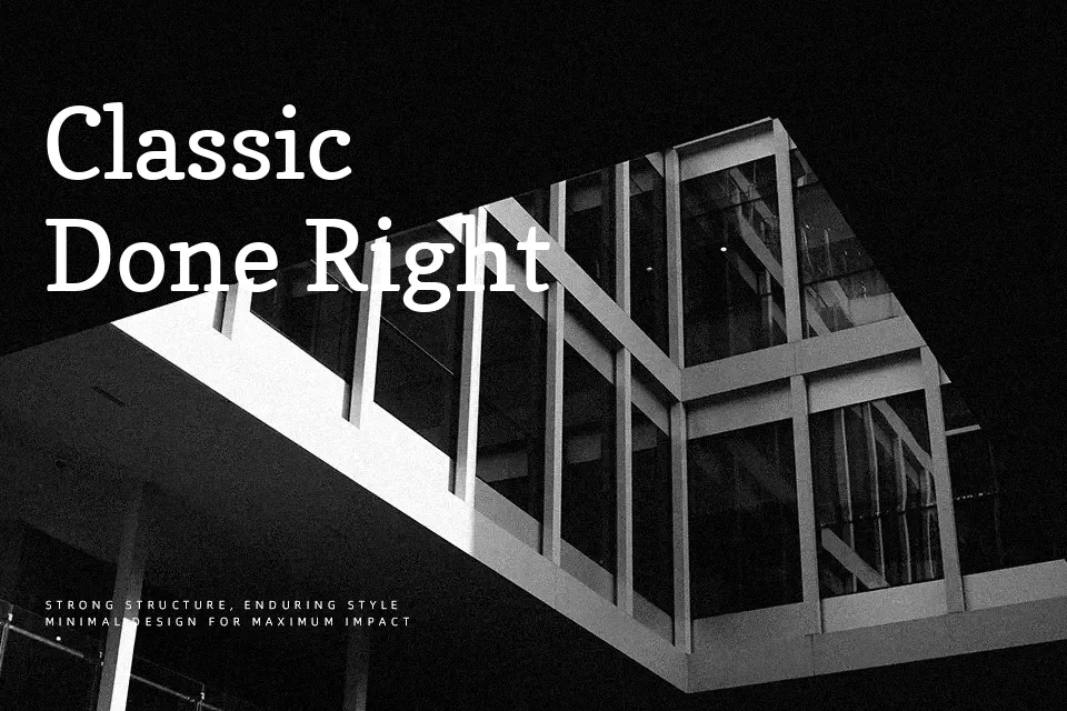
Copse is a humanist slab serif with relatively low contrast, chunky rectangular serifs, and slightly softened curves that keep it from feeling mechanical. The x-height is generous and the spacing is open enough for short to medium blocks of copy, while the strokes stay thick enough to hold up at smaller sizes on modern displays. Visually it leans friendly and grounded rather than flashy, so it fits nicely in editorial articles, product descriptions, and interface headings that need a bit of warmth. It can feel heavy and repetitive in dense long-form text or in branding that demands high glamour, where a crisper serif or a refined sans might serve better.
Best For:
editorial subheadings
interface and app headings
product description text
approachable brand collateral
Not Ideal For:
long book-length paragraphs
highly formal corporate reports
luxury fashion branding
very small legal disclaimers
Perfect for body text, branding, and editorial, with a classic and serif style.
License
Gallery