Concert One Font
Free for Commercial UseAbout
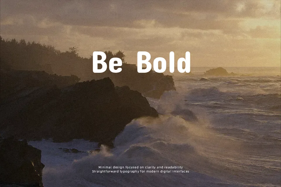
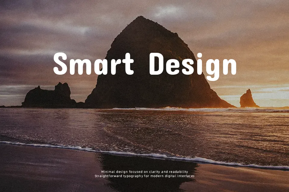
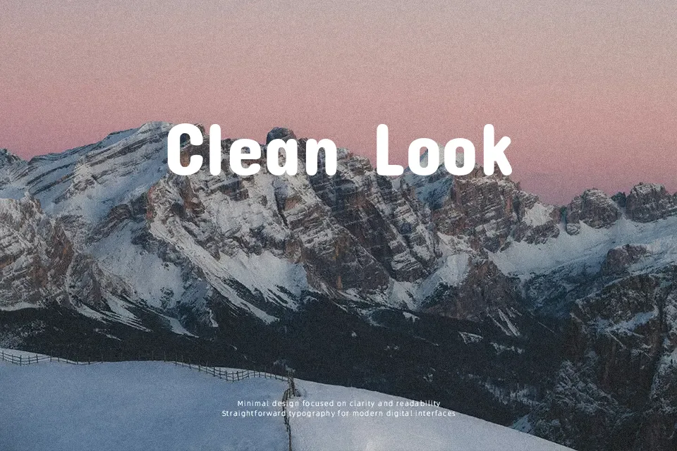
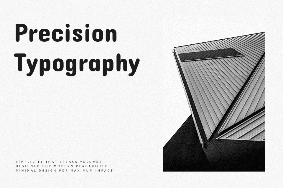
Concert One has a chunky, rounded grotesque structure with consistent stroke weight, wide proportions, and open counters that keep letters legible even at large sizes. The shapes feel sturdy but not stiff, thanks to softened corners and slightly compressed verticals that give words a compact, bouncy rhythm. It leans clearly into display use: short lines, bold titles, and graphic layouts where the font can carry visual weight on its own. In practice, it works nicely for poster headlines, streetwear-inspired logos, kids product packaging, and YouTube thumbnails that need a loud, approachable voice. For long paragraphs or formal editorial work, though, the heavy weight and rounded forms start to feel tiring and a bit too casual, so it’s better paired with a more neutral text companion.
Best For:
bold headlines
playful branding
poster titles
kids product packaging
Not Ideal For:
long paragraphs
formal documents
dense UI copy
minimalist editorial layouts
Perfect for branding, headline, and logo, with a bold and display style.
License
Gallery