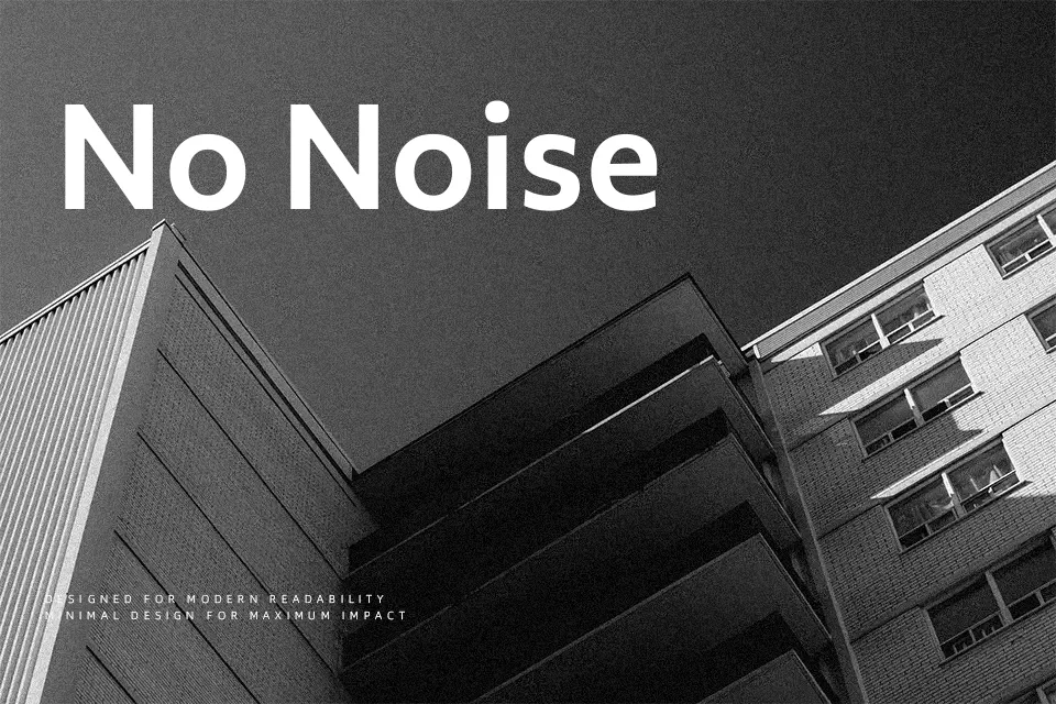
Commissioner Font
Free for Commercial UseAbout
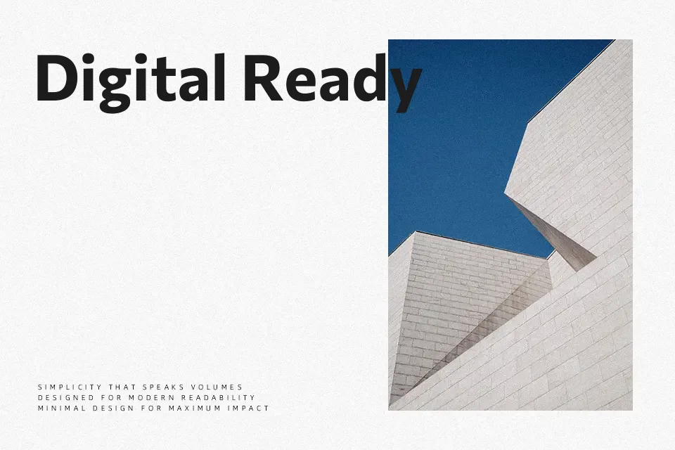
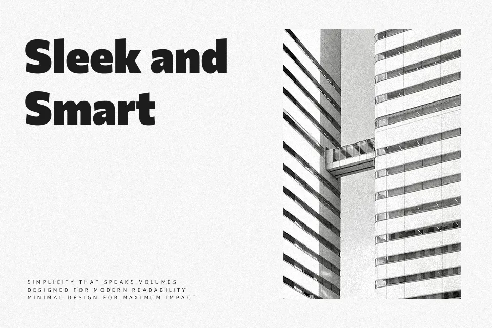
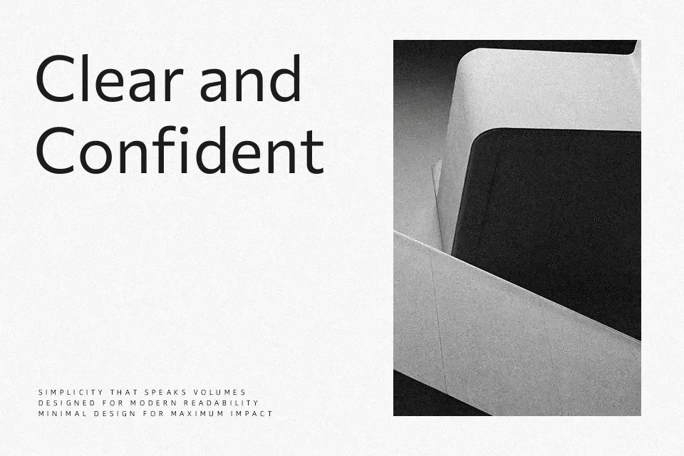
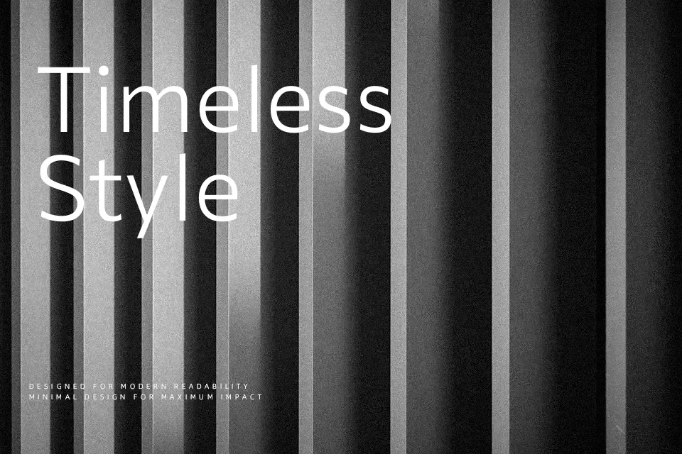
Commissioner is a humanist sans serif with straight stems, relaxed open counters, and modest contrast that gives it a calm, readable texture on screen and in print. The family spans from thin to black with italics and three optical “voices,” shifting from a more sober grotesque to flare and wedge-like terminals that read louder at display sizes. In practice it shines in interface text, long-form reading, and editorial systems where you need a warm, contemporary tone rather than a cold geometric look. For ultra-formal documents, or branding that leans heavily on sharp serifs or high drama, it can feel too understated and may not deliver the needed contrast in personality.
Best For:
user interfaces and app text
editorial layouts and blogs
digital product branding systems
multi-weight web typography
Not Ideal For:
highly ornate luxury branding
strictly traditional corporate reports
expressive display wordmarks needing strong serifs
Perfect for body text, branding, and headline, with a clean and geometric style.
License
Gallery