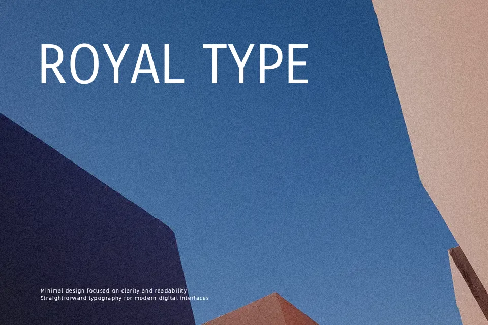
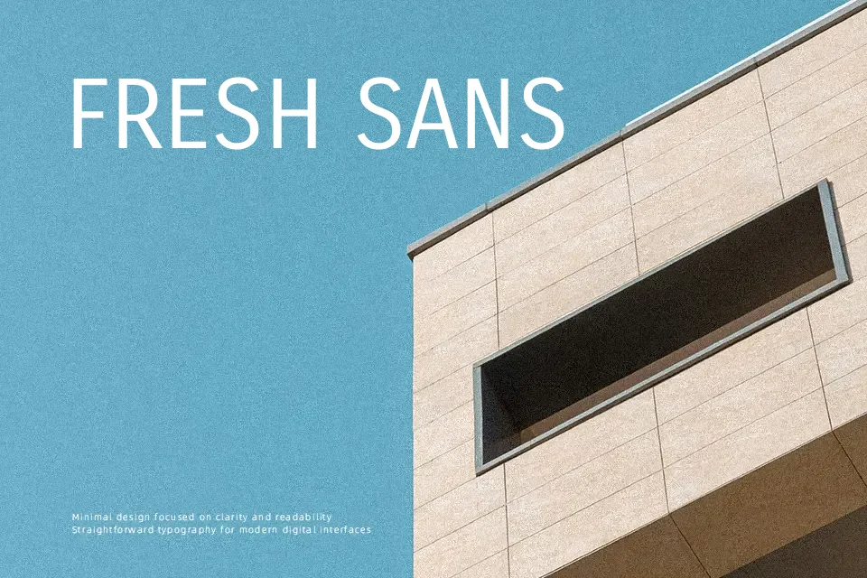
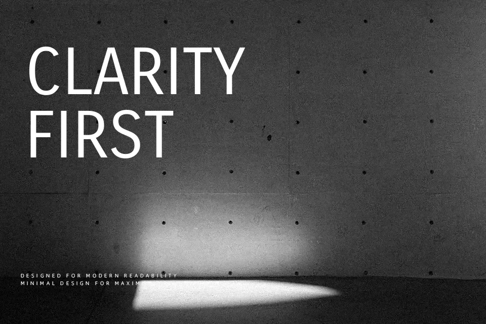
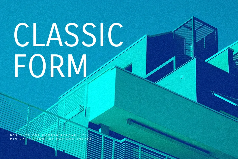
Carrois Gothic SC Font
Free for Commercial UseAbout
Carrois Gothic SC is a small caps sans serif with straight, low-contrast strokes, tight spacing, and a slightly condensed feel that helps fit more characters into restricted layouts. Its geometry leans modern and functional rather than decorative, so it reads clearly at medium sizes while still feeling distinctive in labels and short headings. In interfaces, menus, and infographic callouts, the uniform caps lend a clear, systematic voice that stays out of the way of the content. It can feel too stark and repetitive in long paragraphs or expressive branding that needs more personality, so it works best as a supporting workhorse rather than the star of the show.
Best For:
navigation menus and UI labels
dashboard and app interfaces
infographic captions and callouts
compact headings on posters or flyers
Not Ideal For:
long-form reading text
highly expressive branding
formal editorial layouts
Perfect for branding, headline, and poster, with a clean and condensed style.
License
Gallery