Carrois Gothic Font
Free for Commercial UseAbout
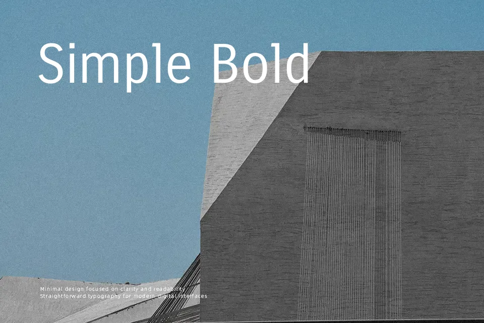
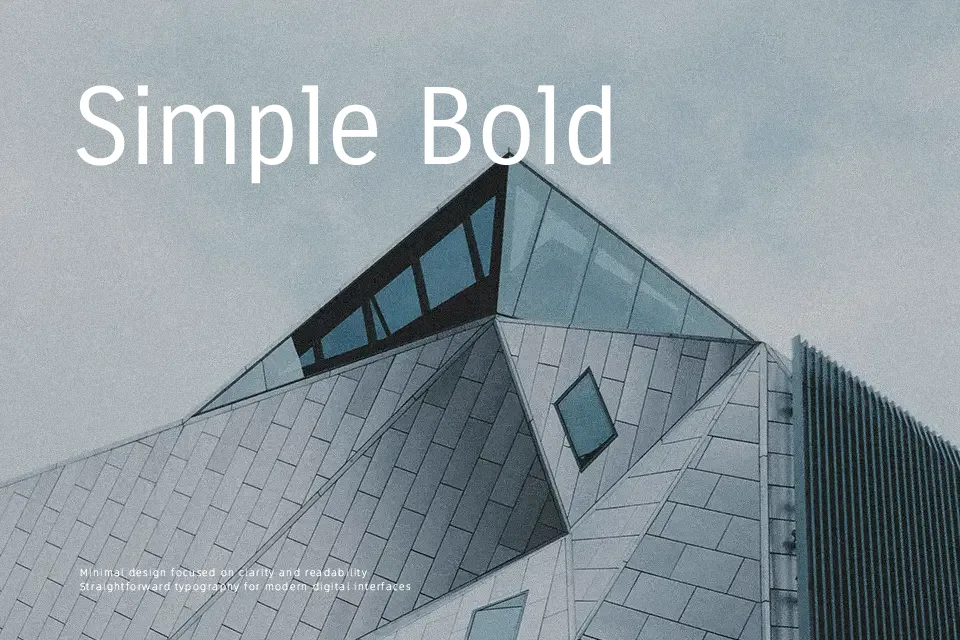
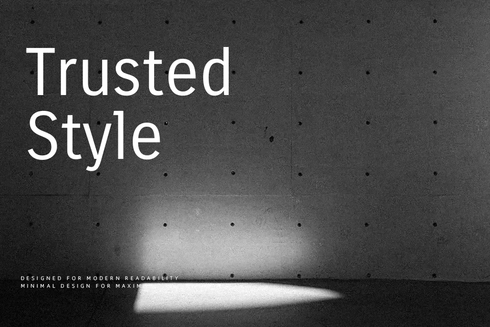
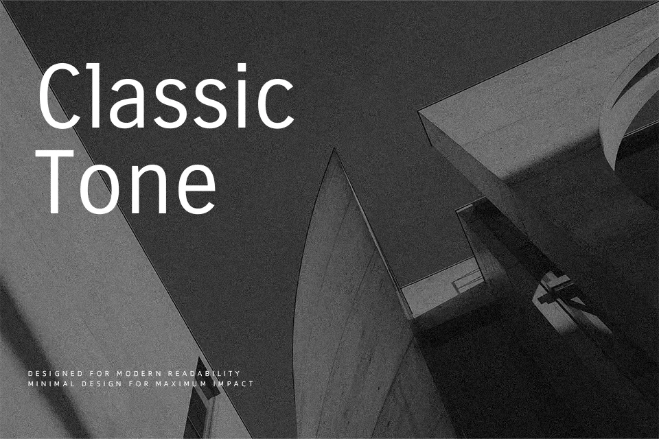
Carrois Gothic has a narrow, even stroke with minimal contrast, open counters, and generous spacing that keeps text legible without feeling airy. The overall impression is quiet and modern rather than flashy, sitting somewhere between utilitarian grotesque and understated corporate sans. It works nicely for interface labels, navigation, data-heavy dashboards, and short editorial text where you want structure and calm instead of personality overload. If you rely heavily on typographic hierarchy, the single weight can be a limitation, and it will not carry branding that needs strong character or warmth on its own.
Best For:
UI labels and menus
subtle branding systems
editorial sidebars and captions
data-heavy layouts
Not Ideal For:
long print novels
expressive display wordmarks
formal certificates
type-heavy poster design
Perfect for body text, branding, and headline, with a calm and condensed style.
License
Gallery