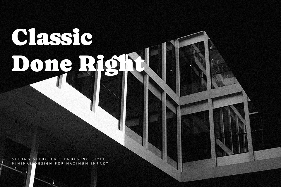
Caprasimo Font
Free for Commercial UseAbout
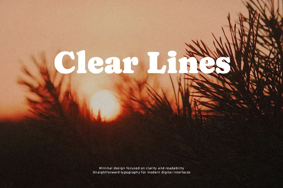
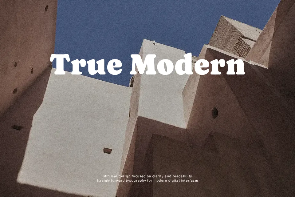
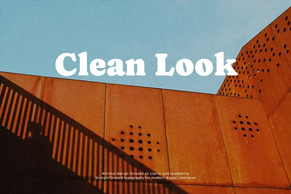
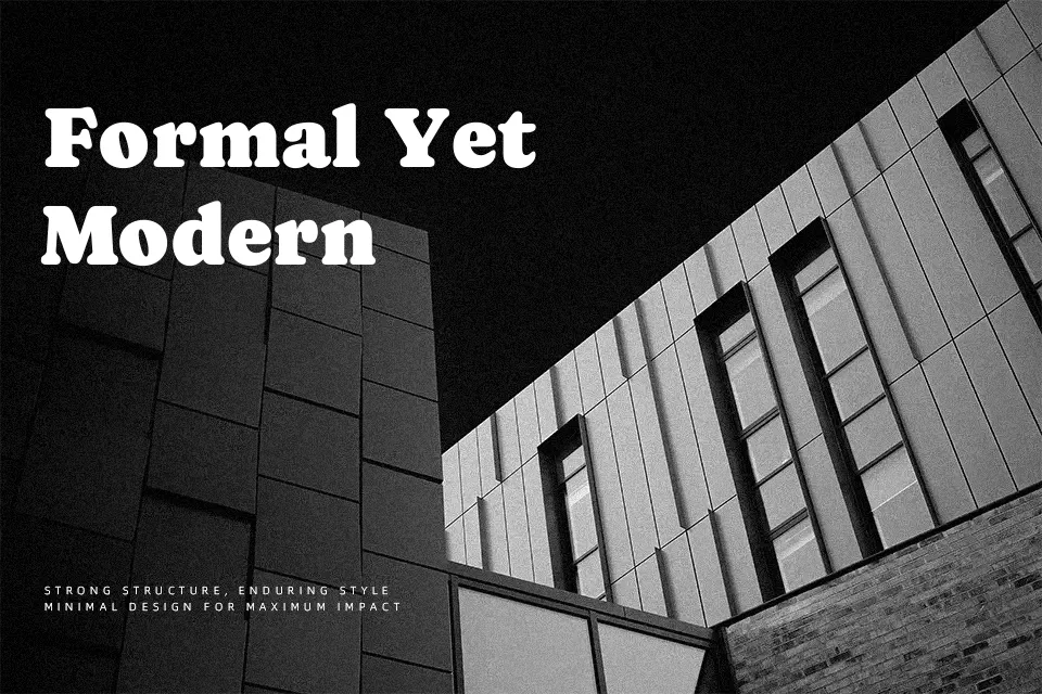
Caprasimo takes the chunky charm of early 20th‑century Cooper-style serifs and tightens it into a strong, slightly condensed silhouette with generous curves and sturdy strokes. The terminals feel soft rather than sharp, so even heavy weights read as friendly instead of aggressive. Its spacing favors short lines and big sizes, where the rounded counters and compact proportions create dense, eye-catching blocks of text for posters, wordmarks, and social graphics. I’d reach for this when a project needs retro flavor—streetwear branding, music event flyers, bold product packaging—but avoid it for long paragraphs, UI copy, or anything that requires neutral, quiet typography.
Best For:
bold headlines
retro branding systems
poster and flyer titles
short text accents on packaging
Not Ideal For:
long paragraphs
formal documents
dense UI copy
minimalist editorial layouts
Perfect for branding, headline, and logo, with a artistic and display style.
License
Gallery