Cabin Sketch Font
Free for Commercial UseAbout
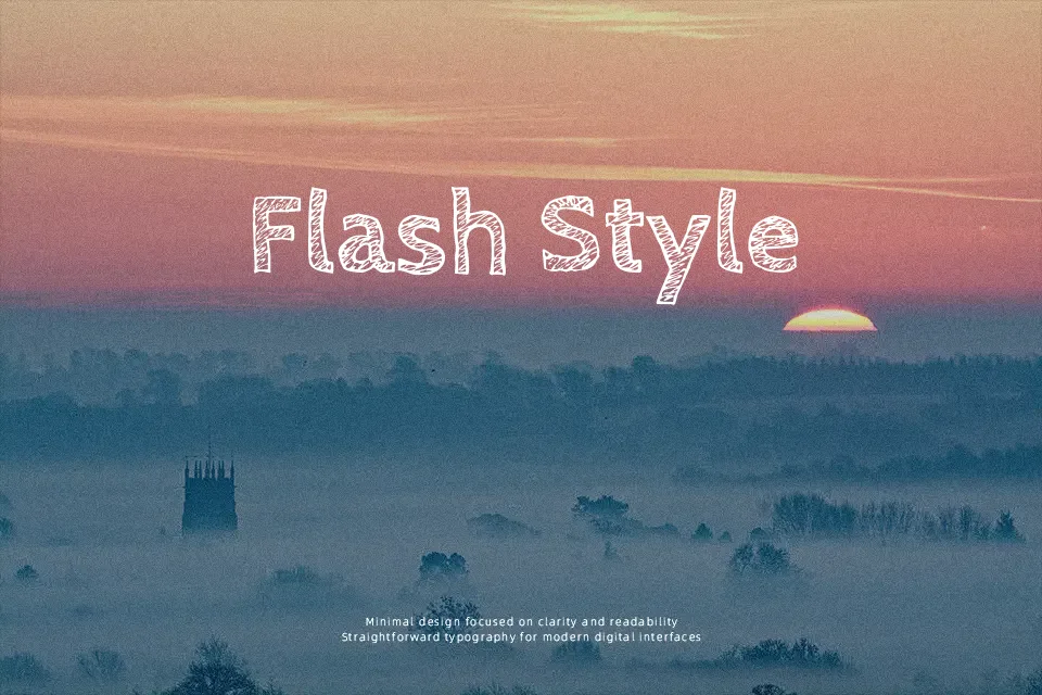
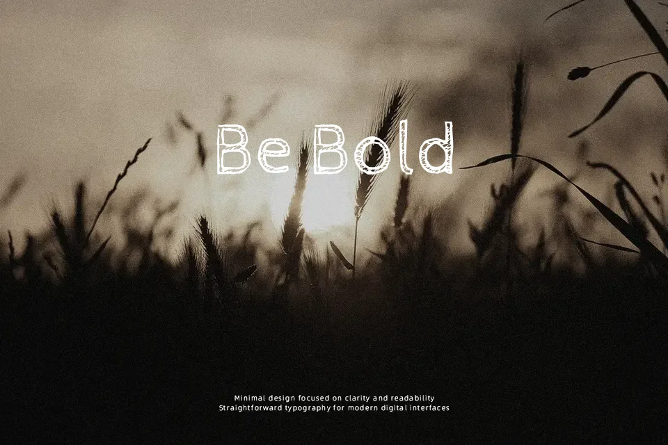
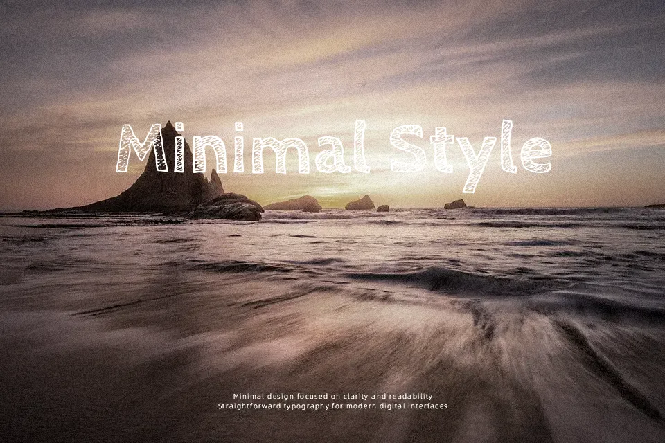
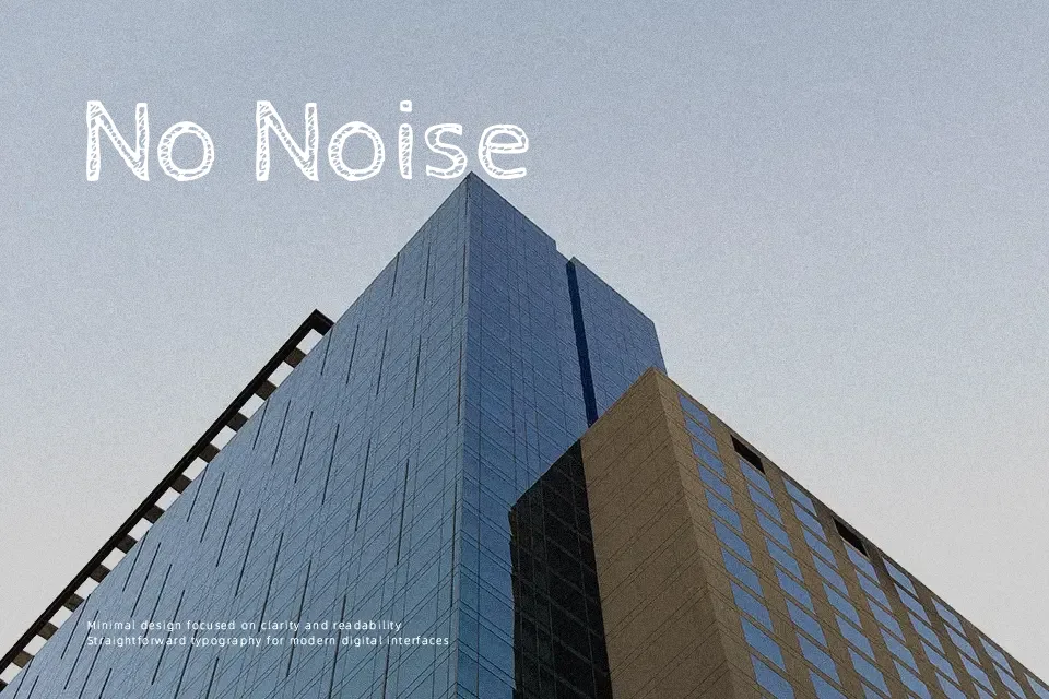
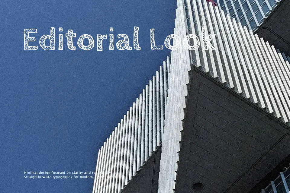
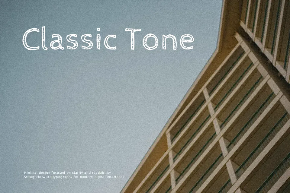
Cabin Sketch keeps the proportions and spacing of a humanist sans but replaces clean edges with jittery, double-outline strokes that read like pencil sketching. The letterforms sit on a steady structure — x-height is balanced, character spacing is generous — so short runs of text stay legible even with all the roughness. The Regular weight feels lighter and more delicate; the Bold weight leans into the sketchy quality and reads better from a distance, making it more suitable for large-format titles or screen-printed merch. Where this falls apart is anything requiring sustained reading — body copy, footnotes, or formal presentations — because the erratic linework creates fatigue quickly. It shares personality with other rough-outline display faces, but the humanist base keeps it from looking purely novelty.
Best For:
poster headlines,streetwear logo design,kids product packaging,zine-style editorial titles
Not Ideal For:
body copy,small UI labels,formal business documents,digital reading at small sizes
Perfect for branding, headline, and kids, with a artistic and decorative style.
License
Gallery