Buda Font
Free for Commercial UseAbout
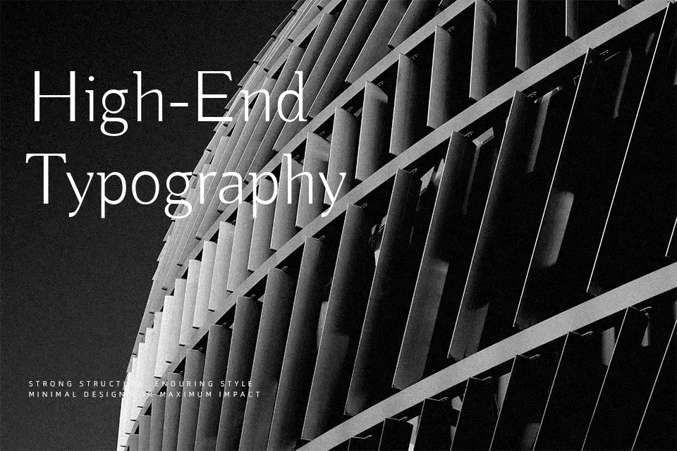
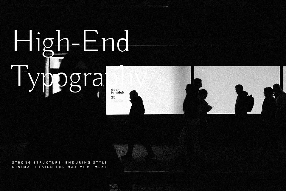
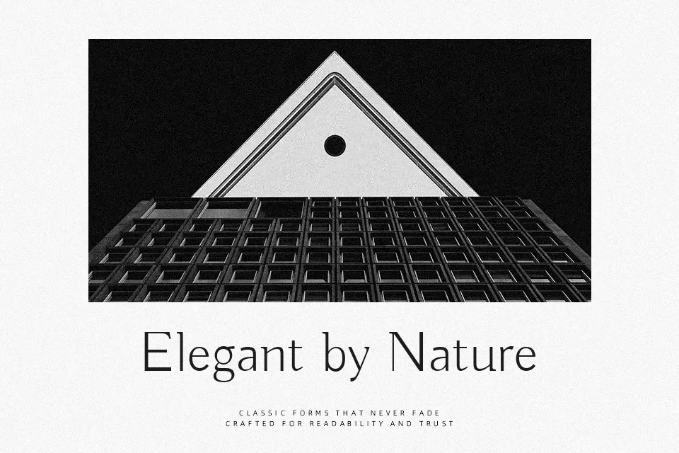
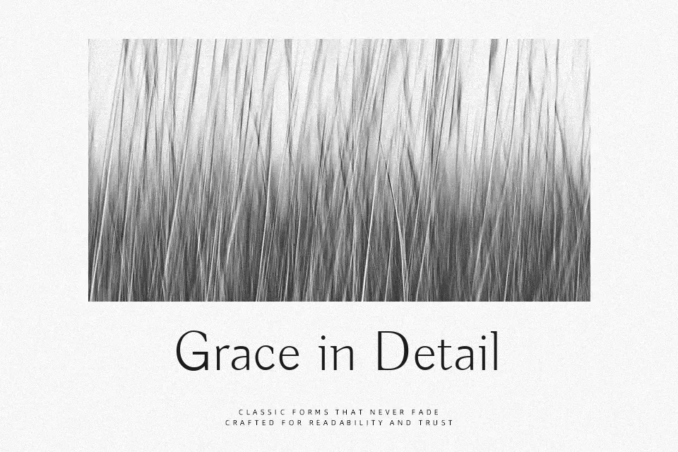
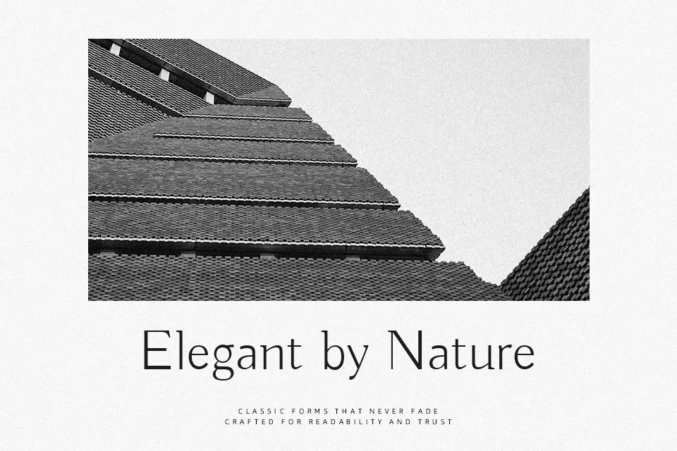
Buda leans into contrast: thin verticals sit next to sturdy, inky shapes, so every word feels carefully lit, like type on a poster wall at night. The proportions are fairly open, with generous counters and noticeable stroke modulation that gives it a slightly artistic, hand-touched character rather than a cold geometric finish. I find it shines when you give it space—title cards, chapter openings, narrow pull quotes, or branding that needs a thoughtful, literary voice. It is less convincing in dense layouts or data-heavy interfaces, where the contrast can start to flicker and tire the eye. If you like refined display serifs such as Didone-inspired styles but want something more experimental and graphic, Buda sits in that sweet spot.
Best For:
expressive headlines on posters
poetry covers or literary branding
chapter titles and pull quotes
Not Ideal For:
long paragraphs of body text
small UI labels or dense data tables
highly formal corporate documents
Perfect for branding, editorial, and headline, with a artistic and display style.
License
Gallery