Creamy Font
Free for personal useAbout
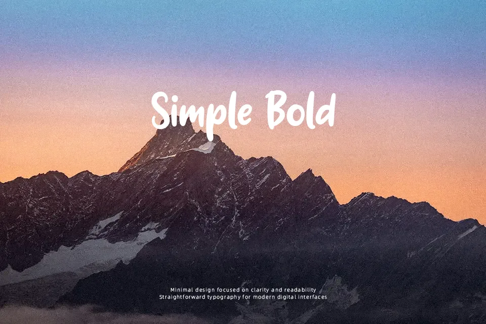
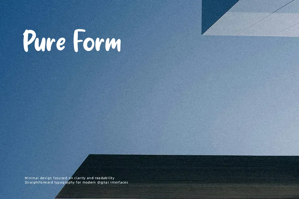
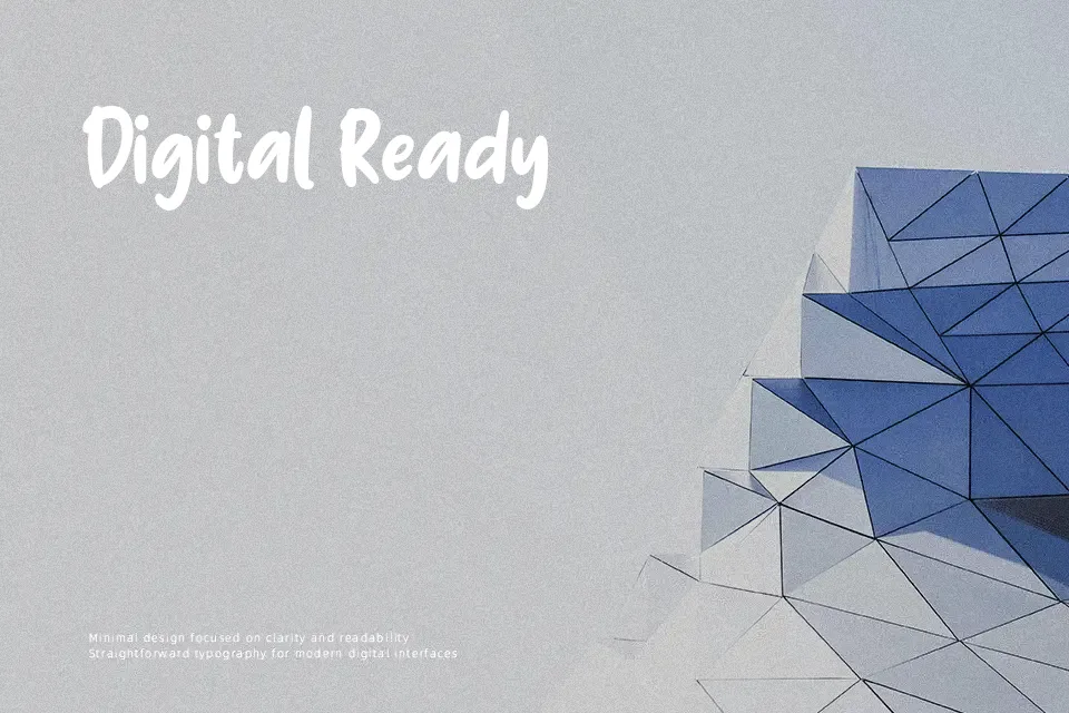
Creamy Font showcases thick, bulbous letterforms characterized by minimal stroke contrast, circular counters, and blunted corner treatments. Character spacing is relatively compact, allowing adjacent glyphs to lock together seamlessly in punchy headline compositions. The generous x-height and uniform width proportions keep the typeface readable in short bursts of text, making it suitable for toy packaging, comic strips, and casual promotional banners. However, the heavy density of the strokes significantly reduces comfort during continuous paragraph reading, where tight internal counters cause dense text blocks to clog. Designers should preserve ample tracking when setting the letterforms at intermediate sizes to prevent visual crowding.
Best For: children book covers, animated video titles, playful snack packaging, kindergarten event posters
Not Ideal For: dense editorial body text, corporate financial reports, mobile system interfaces, legal contract documents
Perfect for headline, kids, and packaging, with a bold and comic style.
License
Gallery