CorpusCare Font
Free for personal useAbout
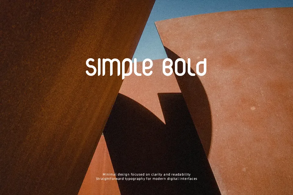
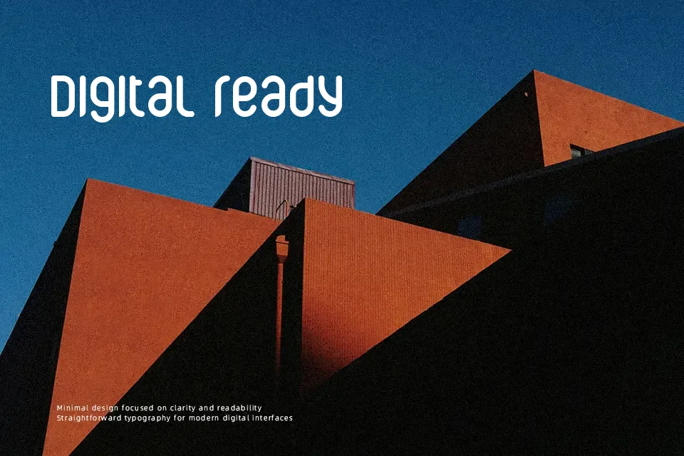
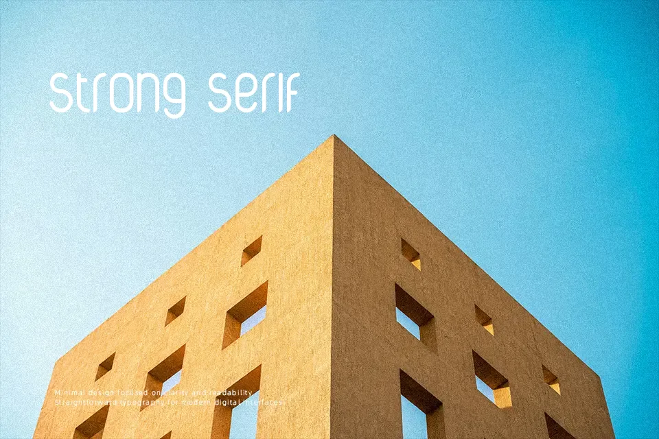
Built with elongated vertical proportions and softly curved terminals, CorpusCare Font exhibits an unconventional monoline structure that immediately commands visual attention. The letterforms feature narrow widths and tightly controlled tracking, creating a rhythmic cadence across short phrases. While the uniform stroke weight ensures consistent clarity in large headlines, title cards, and thematic merchandise branding, the condensed anatomy substantially impairs readability in small captions or body copy. The design delivers its strongest impact when deployed on poster titles or apparel graphics where individual glyph contours can breathe. Extended text blocks, however, quickly suffer from visual crowding due to the compact horizontal footprint.
Best For: music festival posters, retro apparel graphics, beverage packaging labels, bold display headlines
Not Ideal For: continuous body text, dense editorial layouts, small interface labels, legal documents
Perfect for branding, headline, and logo, with a creative and condensed style.
License
Gallery