TieofftheEnds Font
Free for Commercial UseAbout
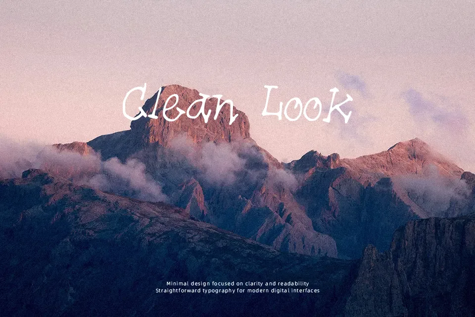
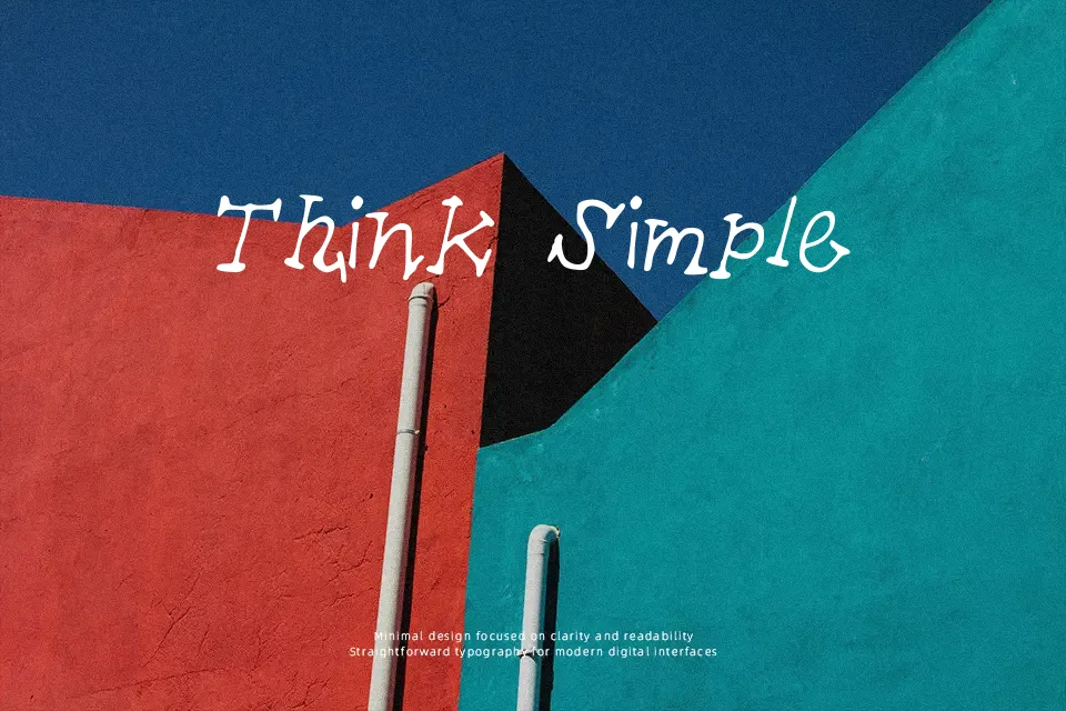
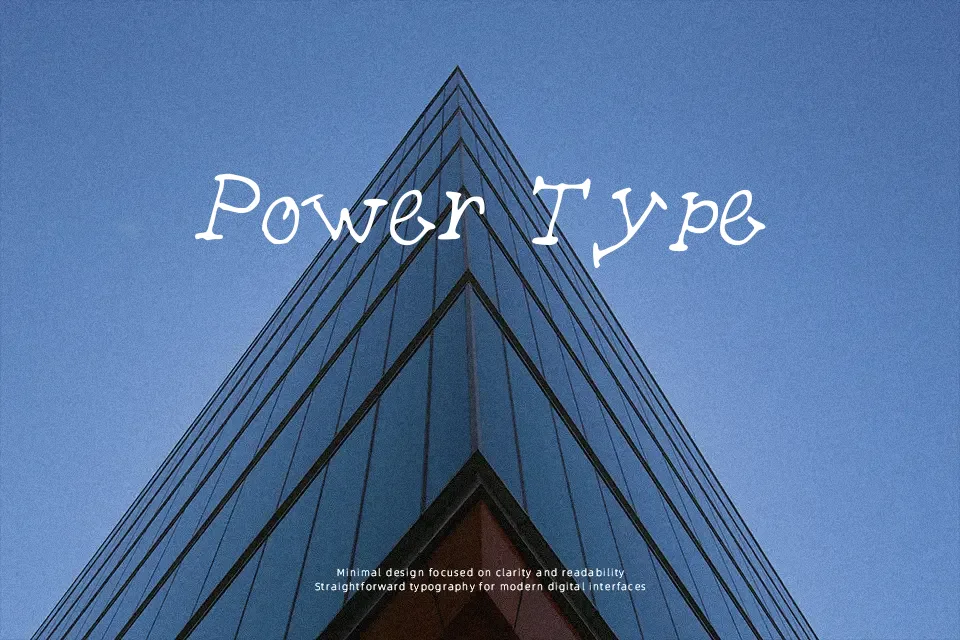
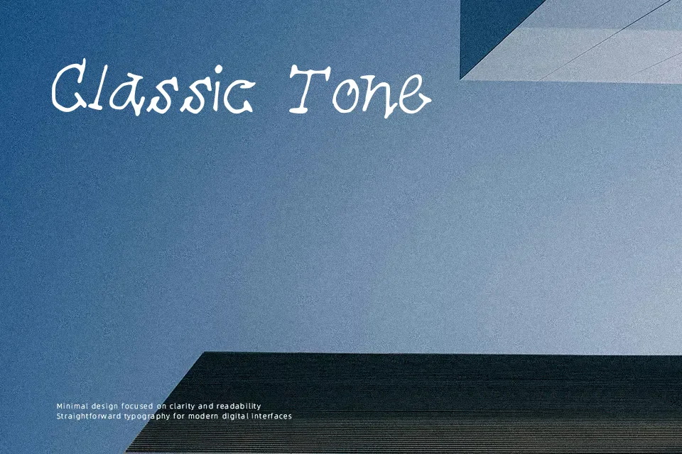
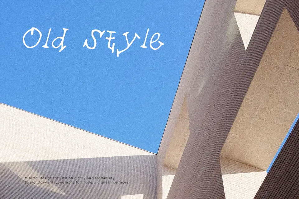
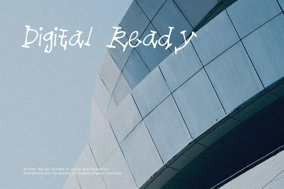
TieofftheEnds Font opens with an eccentric visual structure defined by organic stroke paths and distinctive knot-like terminal flourishes. The design maintains generous letter spacing and irregular character proportions, establishing an informal rhythm reminiscent of spontaneous brushwork. While the uniform stroke weight supports reliable silhouette definition at display sizes, intricate terminal knots generate noticeable visual friction when compressed into multi-line settings. The typeface thrives in spacious settings such as festival banners, playful logo marks, and novelty gift wrap. Decorative embellishments noticeably reduce readability in smaller captions and extended text blocks. When deployed at headline scale, the letterforms preserve distinct silhouette clarity while contributing an unmistakable tactile charm.
Best For: craft product packaging, children’s book titles, greeting card headings, playful event posters
Not Ideal For: long body text, corporate annual reports, mobile user interface copy, dense technical documentation
Perfect for headline, logo, and packaging, with a artistic and decorative style.
License
Gallery