Thin Franq Font
Free for Commercial UseAbout
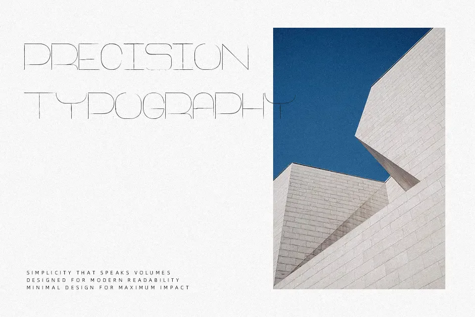
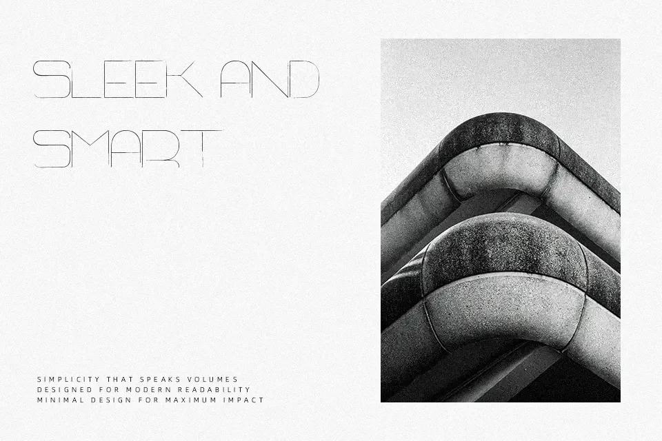
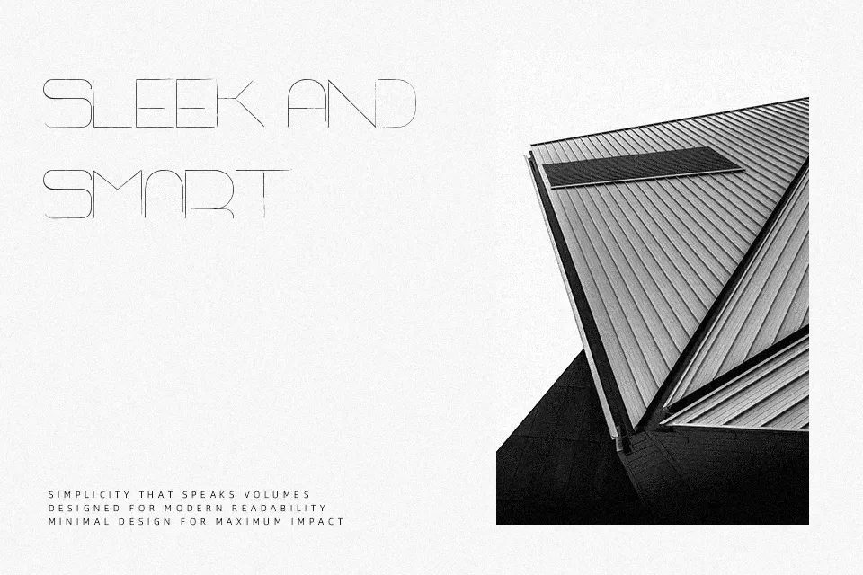
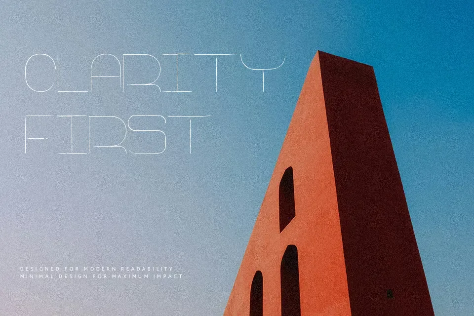
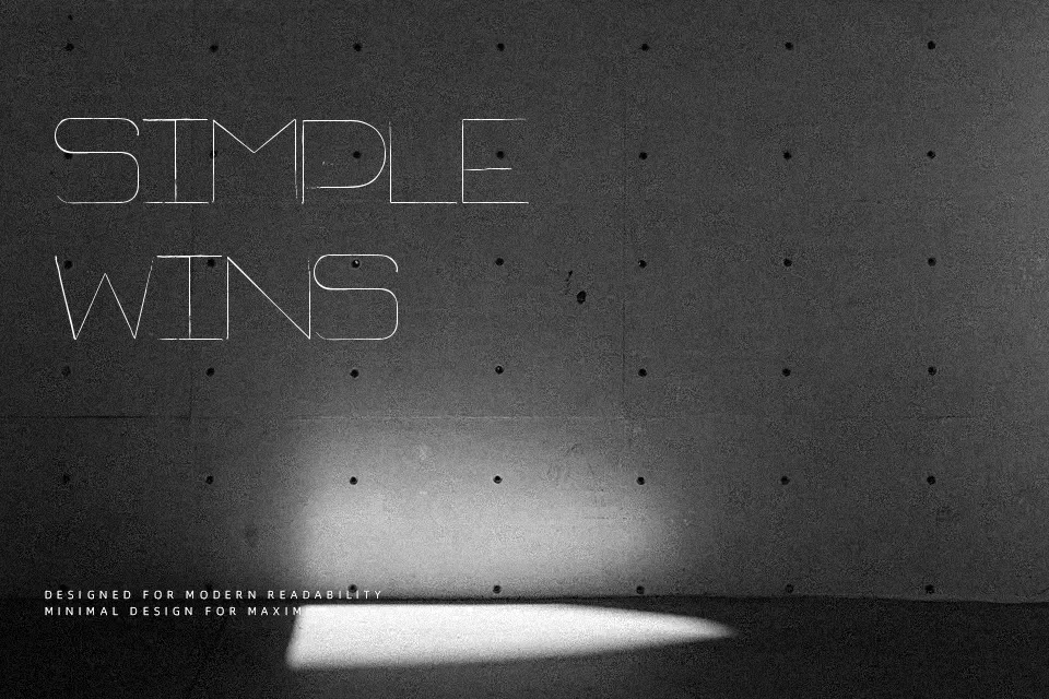
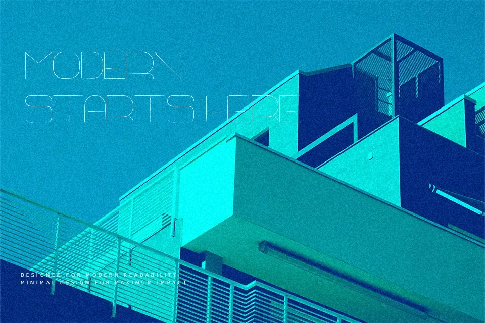
Defined by slender linear strokes, Thin Franq Font presents an airy aesthetic built upon tall vertical proportions and wide character tracking. The typeface maintains consistent monoline thickness across every glyph, giving uppercase and lowercase shapes an open, uncluttered cadence. Spacing remains intentionally wide, allowing generous breathing room that preserves letterform distinction at scale. In practical application, the design excels in modern exhibition banners, cosmetic packaging titles, and luxury editorial titles. However, the delicate stroke weight loses definition at small sizes and dissolves against textured backgrounds. The letterforms ultimately reward generous scale where the quiet elegance can breathe properly.
Best For: art exhibition posters, cosmetic packaging, website hero headlines
Not Ideal For: long paragraph text, small interface labels, dense technical manuals
Perfect for editorial, fashion, and headline, with a clean and display style.
License
Gallery