Thermals Font
Free for personal useAbout
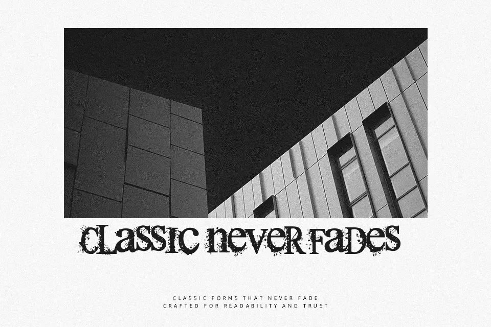
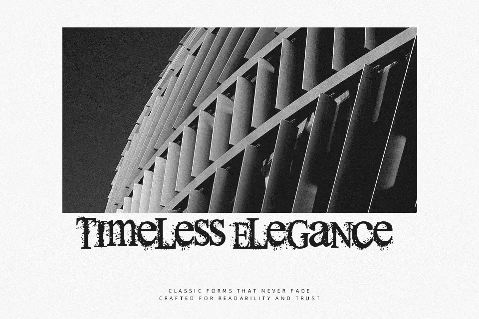
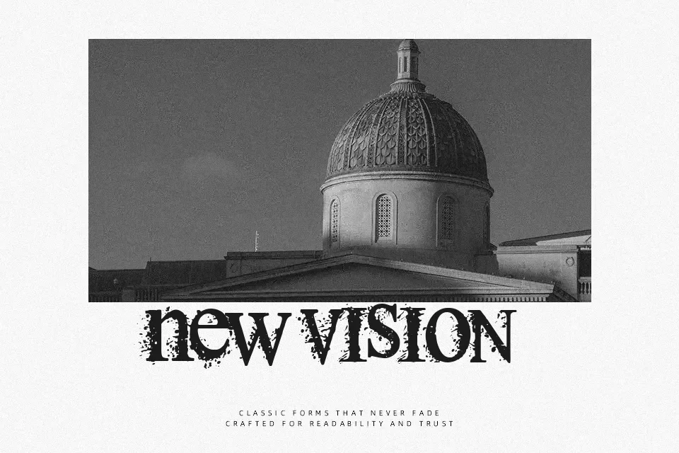
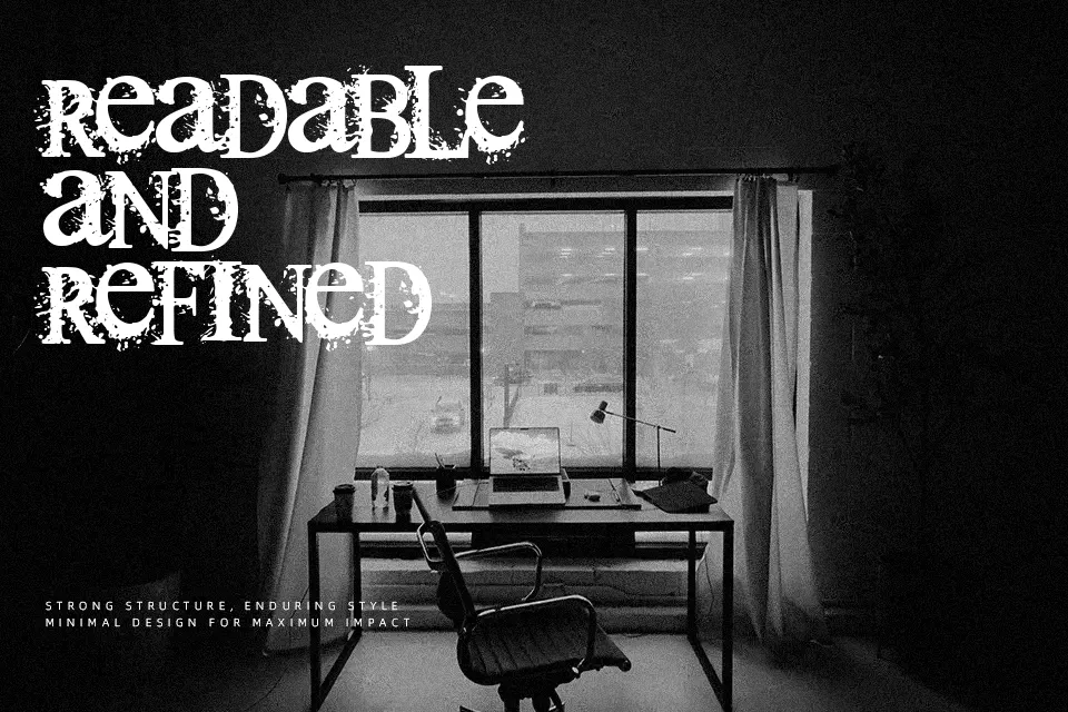
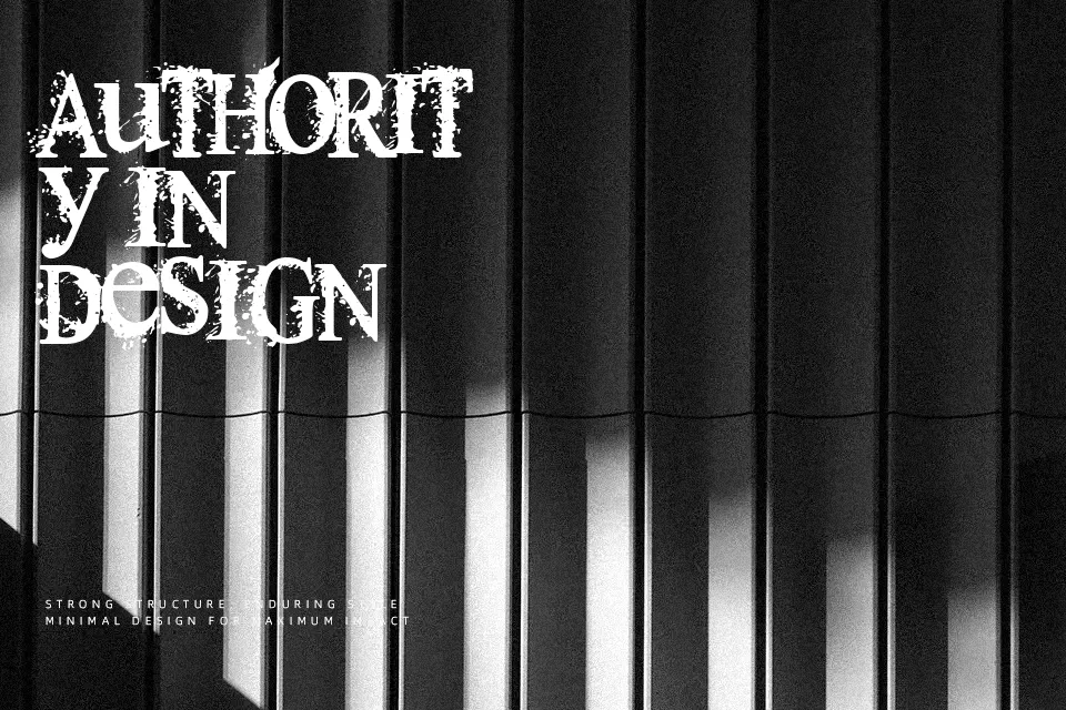
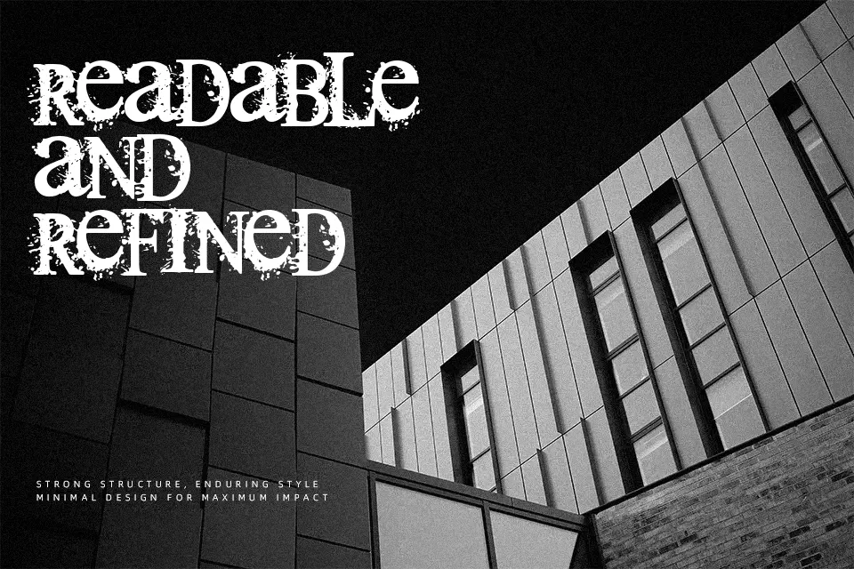
Thermals Font performs best when set at large display scales where its sharp serifs and distressed texture remain clearly defined. Built upon classic proportions, the typeface incorporates uneven, splatter-flecked stroke edges that lend each letterform a raw, eroded presence. Character spacing is relatively tight to keep headlines cohesive, though optical balance prevents adjacent glyphs from colliding. While readability remains dependable in brief titles, album covers, and promotional banners, the intricate perimeter distressing becomes muddy at smaller point sizes. Consequently, the design is unsuited for dense paragraph typesetting or administrative documents, serving instead as a focused tool for atmospheric display headings.
Best For: horror film title sequences, heavy metal album covers, halloween event posters, thriller book jackets
Not Ideal For: long paragraph text, mobile app user interfaces, corporate spreadsheets, dense editorial layouts
Perfect for film, halloween, and headline, with a dark and decorative style.
License
Gallery