The Grinder Font
Free for personal useAbout
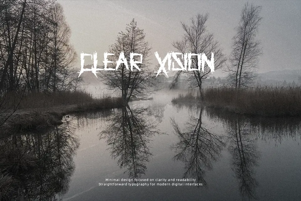
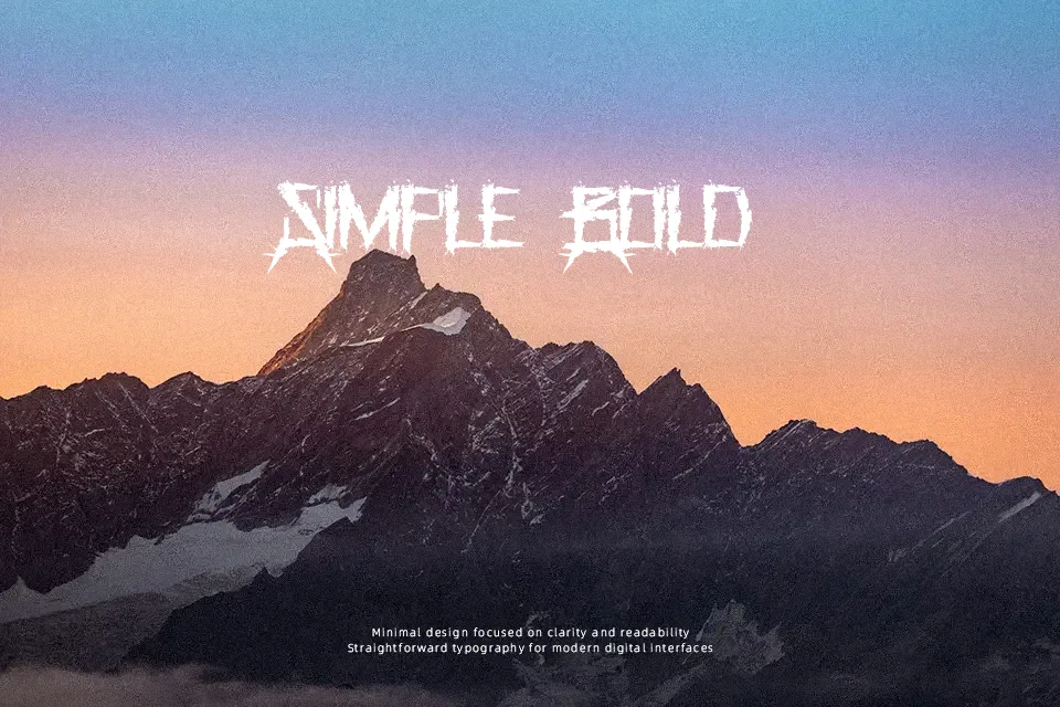
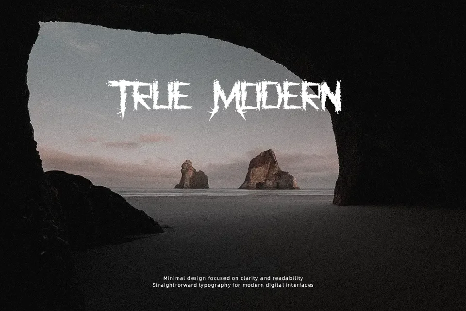
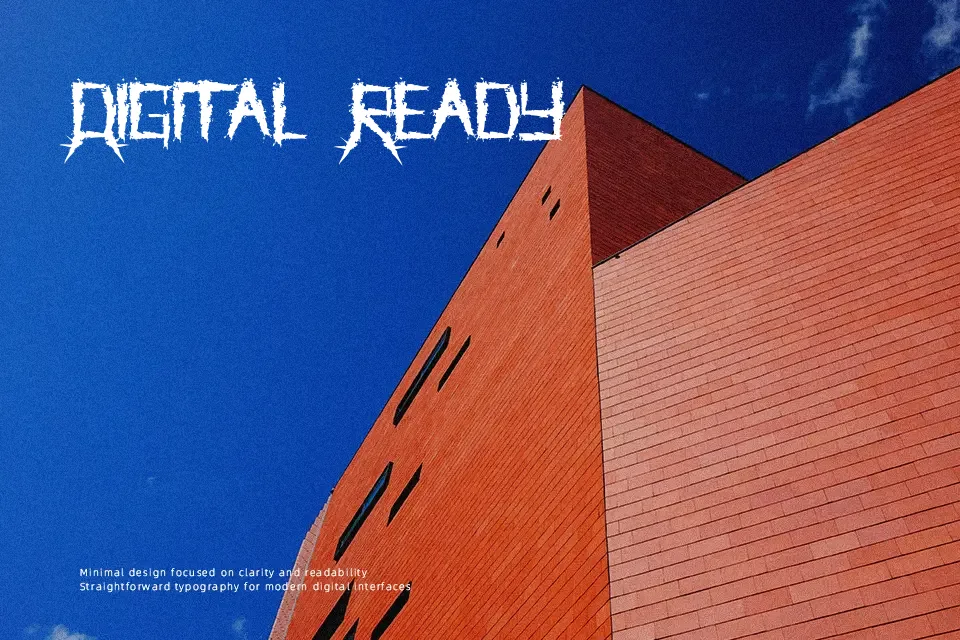
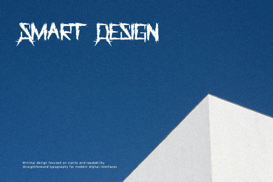
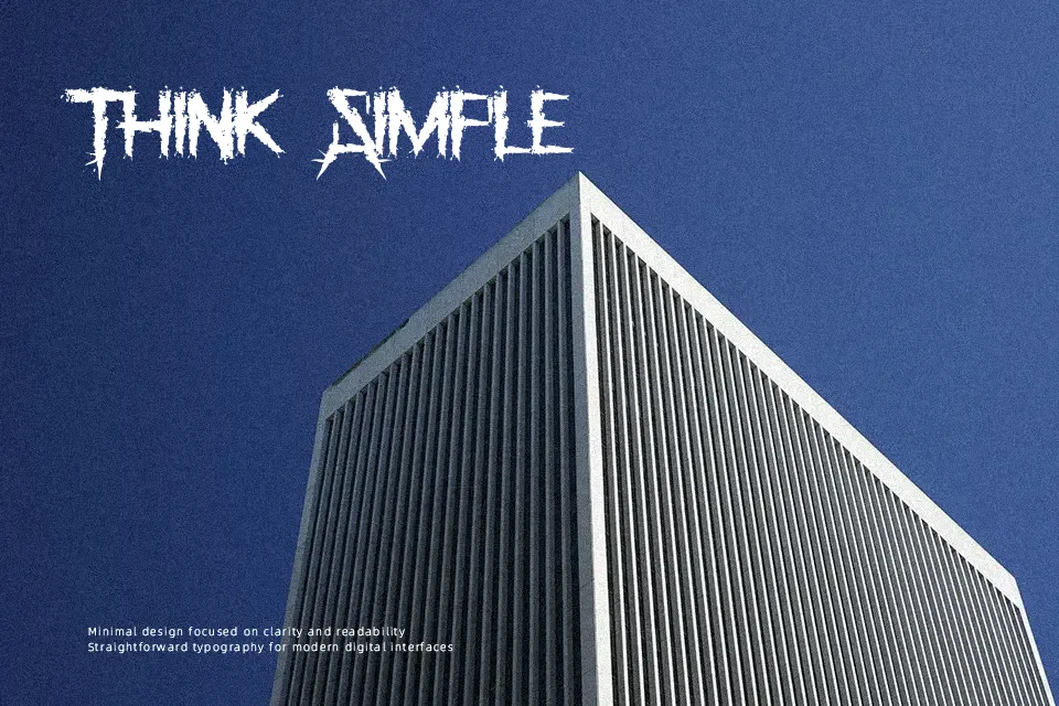
The Grinder Font makes an immediate visual impression through its jagged, weathered letterforms that emphasize raw tactile energy. The typeface relies on heavy, condensed proportions with sharp angular terminals, irregular erosion along the contours, and tight character spacing that creates an imposing block of text. Because the strokes carry significant visual weight and distressed details, the design maintains solid legibility in large headline treatments and short title banners. However, the compact spacing and coarse perimeter artifacts reduce character definition when reduced to small sizes, making it less suitable for continuous paragraphs or technical layouts.
Best For: horror movie posters, metal album covers, apparel graphics, haunted attraction signage
Not Ideal For: long paragraph text, mobile interface labels, corporate reports, dense editorial layouts
Perfect for branding, film, and headline, with a bold and decorative style.
License
Gallery