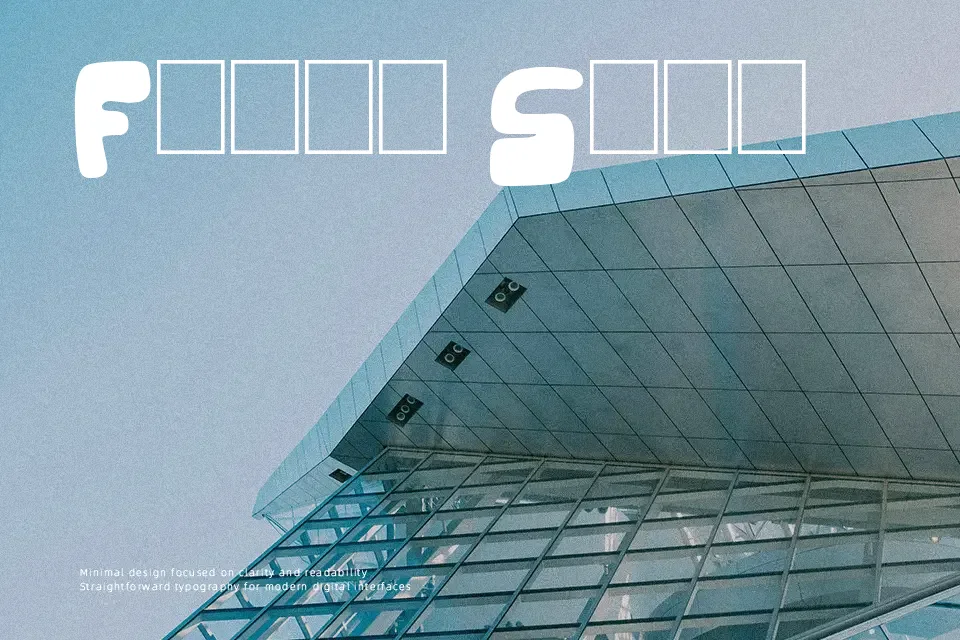
The Duke Of Prunes Font
Free for personal useAbout
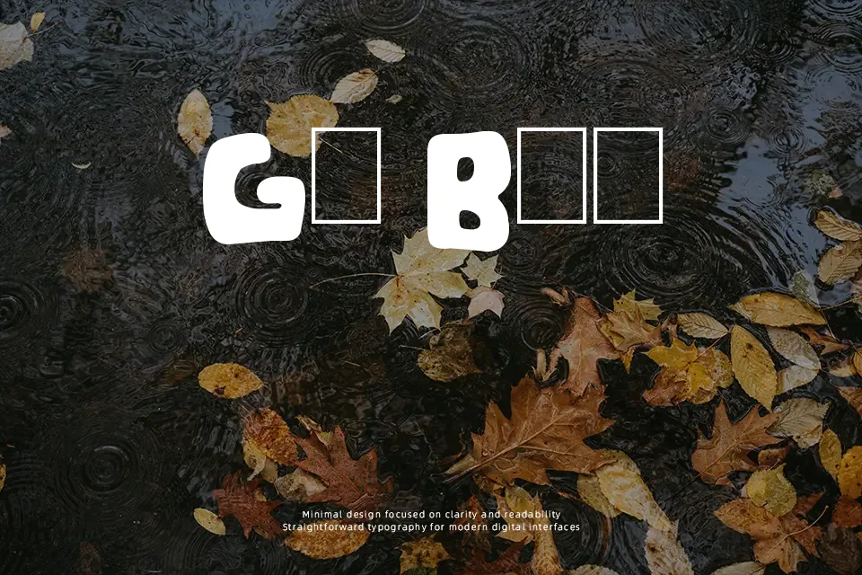
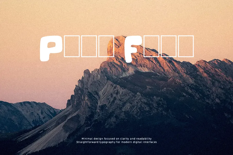
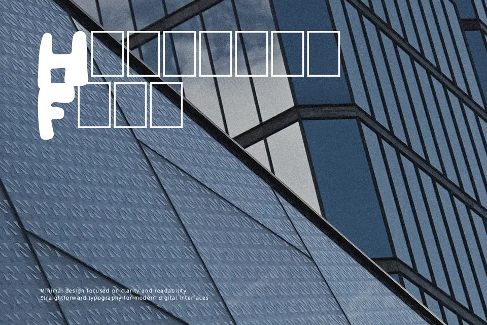
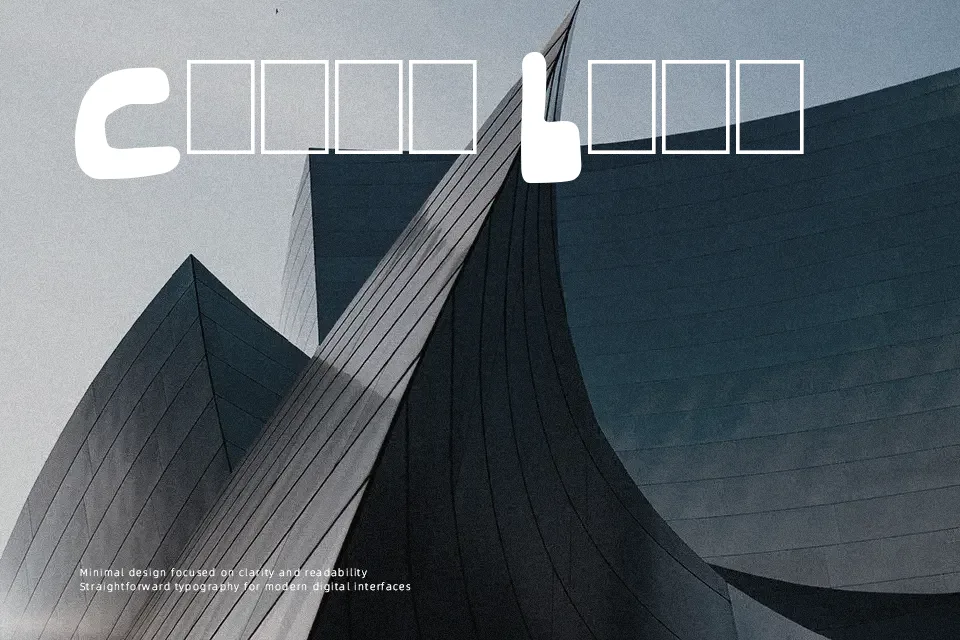
The Duke Of Prunes Font showcases bulbous display letterforms characterized by exceptionally thick, inflated strokes and minimal internal counter spaces. Organic curves and tight horizontal tracking give the glyphs a chunky, bouncy cadence across titles and signage, ensuring bold visibility in short display settings. Because the swollen contours prioritize visual weight over interior definition, letterforms lose clarity when scaled down to small sizes. The design performs exceptionally well for cartoon titles, youth branding, and novelty packaging where punchy character matters, though dense forms reduce comfort during extended reading.
Best For:
animated title screens
children book covers
snack food packaging
comic convention banners
Not Ideal For:
long paragraph text
mobile interface labels
corporate legal agreements
dense technical documents
Perfect for headline, kids, and logo, with a bold and cartoon style.
License
Gallery