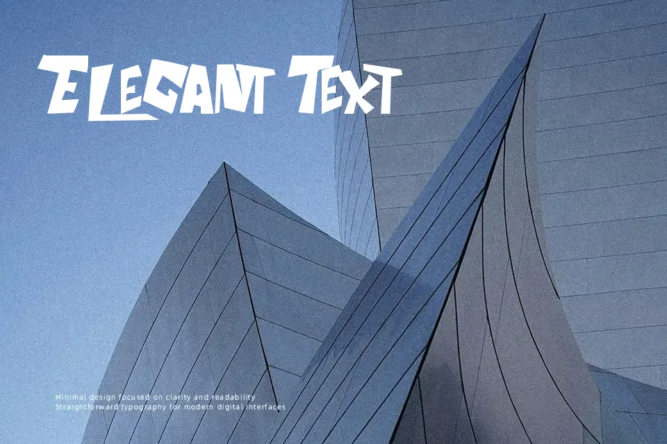
The Aquabats! Font
Free for personal useAbout
The Aquabats! Font immediately catches the eye with exaggerated geometric shapes, heavy uniform strokes, and playful curves reminiscent of vintage comic books. Generous character widths pair with tight spacing to produce high visual impact across short phrases, while uppercase forms maintain steady weight throughout. Numerals echo the rounded, punchy aesthetic of the primary letterforms, ensuring consistent balance in numeric callouts. The typeface performs best when displayed at larger sizes where bold silhouettes remain distinct, though dense geometry severely reduces legibility across continuous editorial paragraphs.
Best For:
comic convention flyers
children party invitations
retro band merchandise
arcade cabinet graphics
Not Ideal For:
long paragraph text
corporate financial reports
small mobile interface labels
Perfect for gaming, headline, and kids, with a bold and cartoon style.
License
Gallery