Tahiti Sans Font
Free for personal useAbout
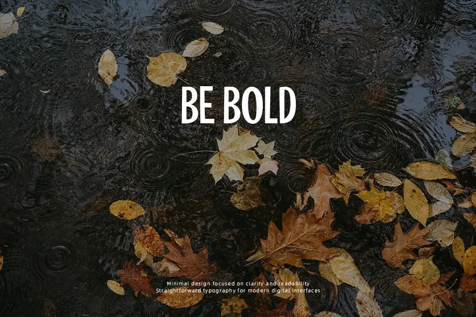
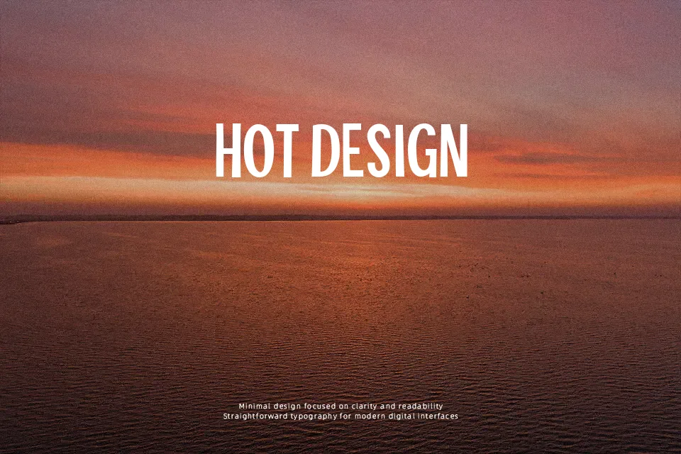
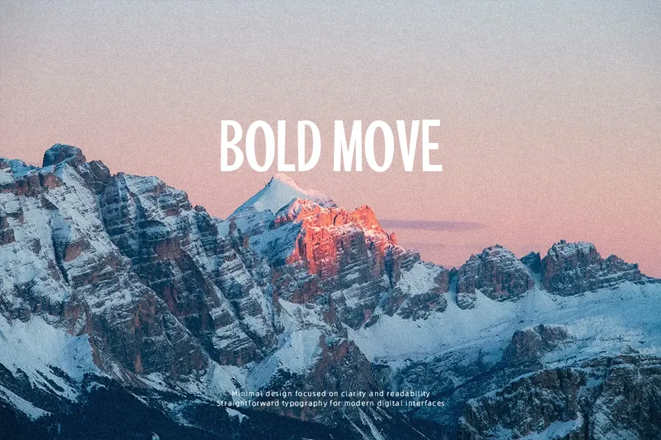
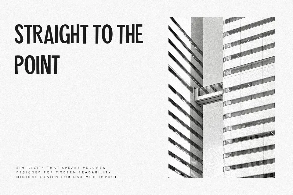
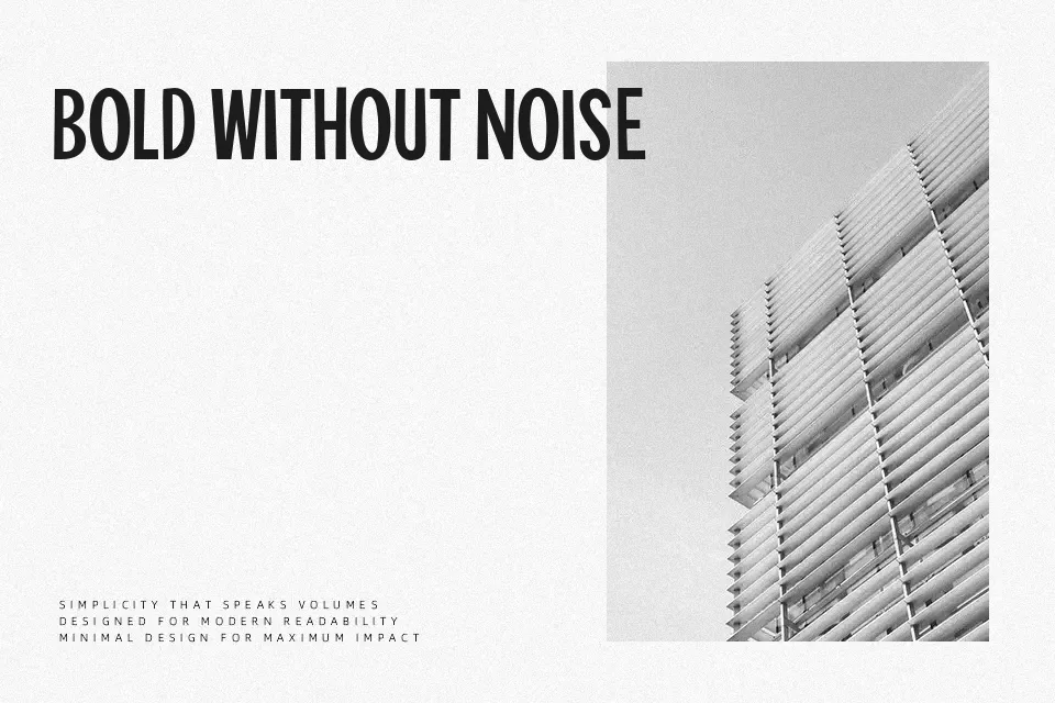
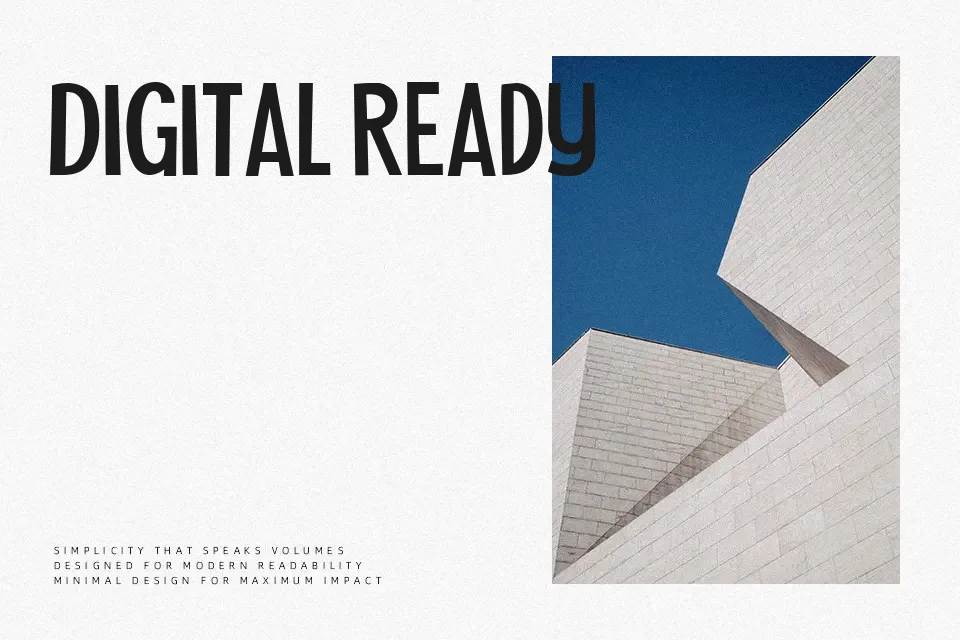
Tahiti Sans Font works best in larger display settings, where its tall uppercase forms, even-weight strokes, and subtly uneven baseline placement remain clear. The letterforms combine mostly straightforward sans-serif construction with small shifts in angle and spacing, producing a loose, childlike rhythm without becoming difficult to recognize. Its narrow vertical proportions help short headlines fit into limited space, while the outline version can add contrast in simple graphic layouts. The typeface is a practical choice for short promotional text that needs a playful edge. Its irregular alignment is less comfortable for extended reading and can look unsettled in dense copy.
Best For: youth sports posters,social media graphics,children’s event signage,playful advertising headlines
Not Ideal For: long paragraph text,small interface labels,corporate reports,dense editorial layouts
Perfect for advertising, headline, and kids, with a creative and cartoon style.
License
Gallery