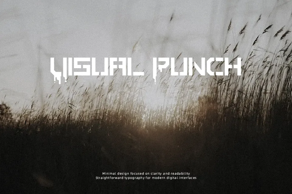
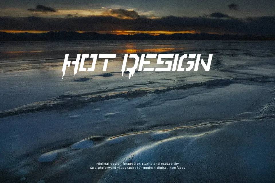
Stencile Or Die Font
Free for personal useAbout
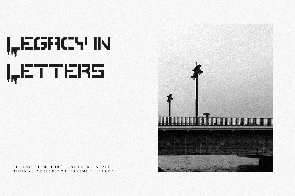
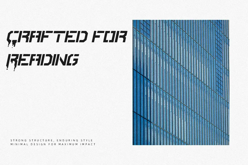
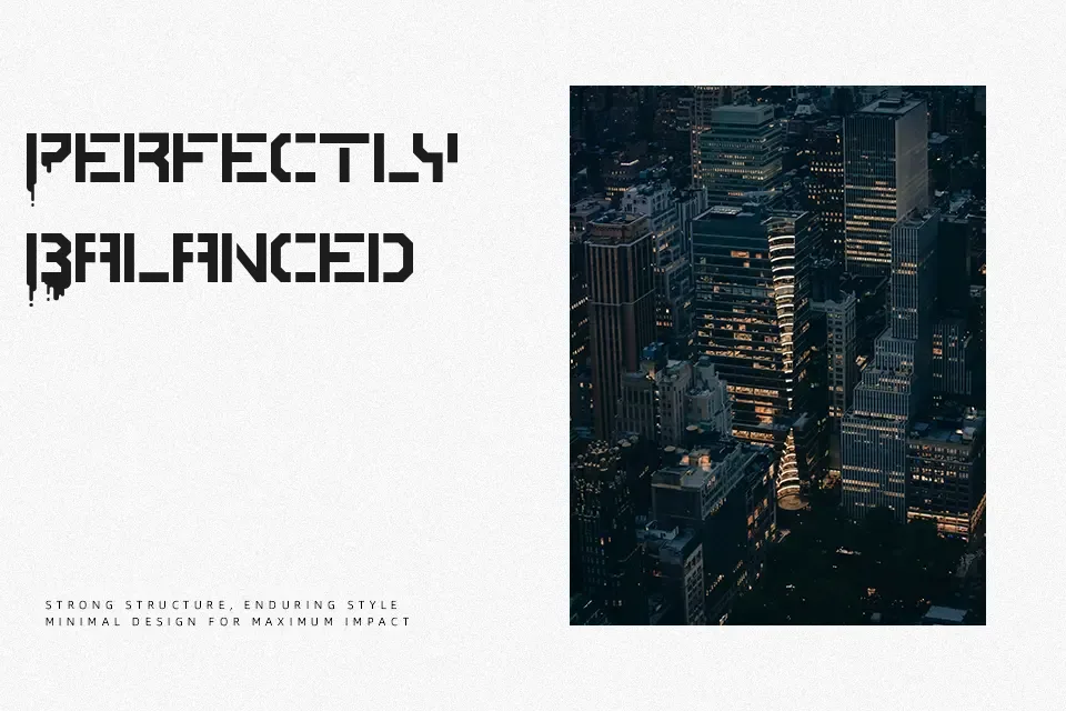
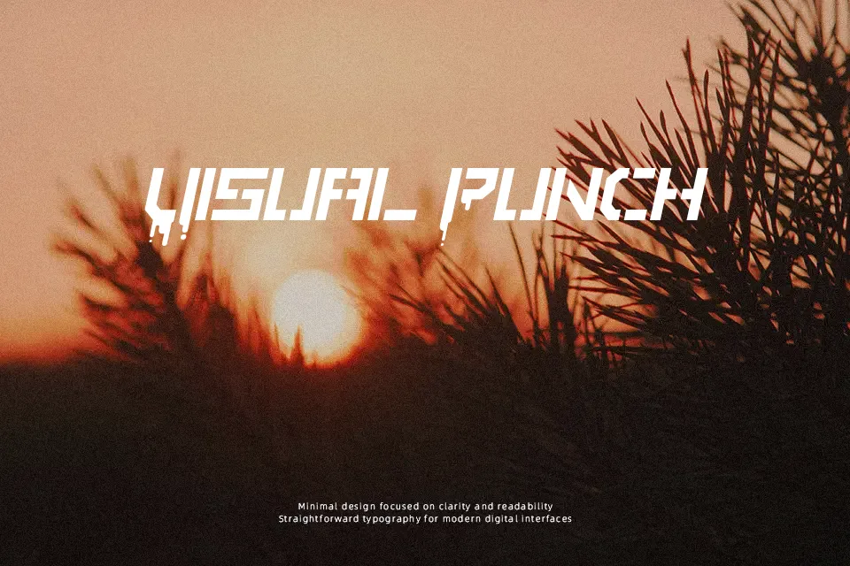
Stencile Or Die Font commands attention through rigid geometric contours, heavy stroke weights, and deliberate horizontal bridges that evoke raw urban spray graphics. The uniform stroke thickness and balanced letter spacing give the uppercase glyphs strong visual weight, making the typeface exceptionally effective for music event flyers, streetwear branding, and display signage. Solid glyph proportions help maintain immediate legibility across wide viewing distances when set at substantial scales. However, the disconnected stroke segments and dense inner counters significantly impair continuous reading comfort in lengthy body copy. The design functions best when applied as a punchy headline element rather than dense textual matter.
Best For: streetwear apparel graphics, music festival posters, industrial packaging labels, skateboard deck graphics
Not Ideal For: continuous paragraph text, mobile user interface labels, corporate business reports, dense spreadsheets
Perfect for branding, headline, and packaging, with a bold and display style.
License
Gallery