So Run Down Font
Free for Commercial UseAbout
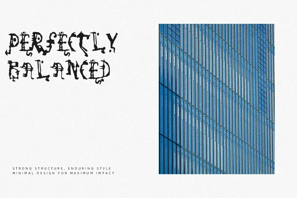
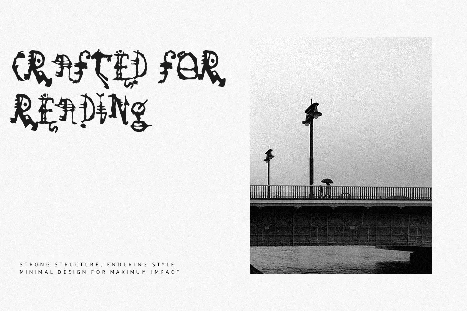
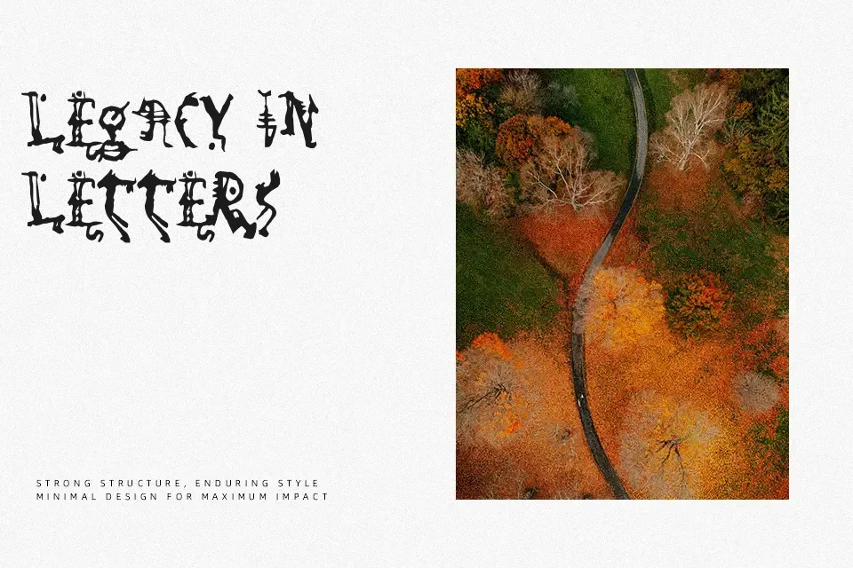
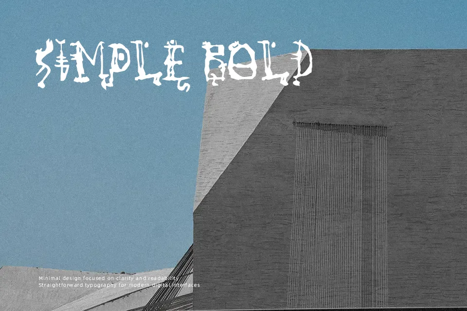
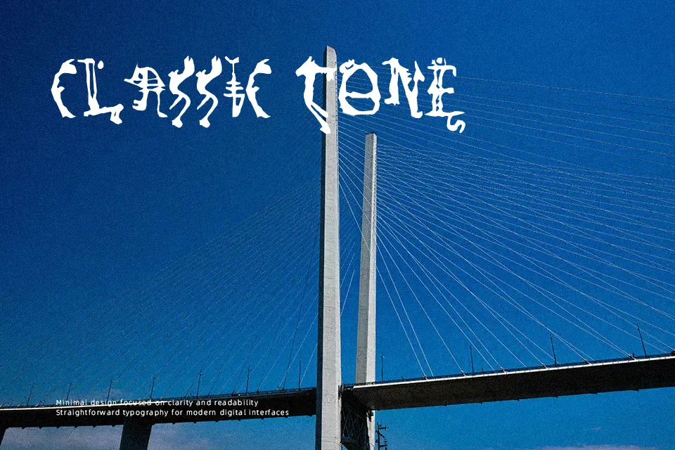
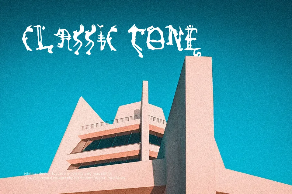
So Run Down Font uses irregular, broken-looking letterforms with jagged contours and a deliberately unstable rhythm. The strokes appear uneven in weight, while the narrow counters and fragmented edges create a dense, distressed display texture. Its proportions and spacing give short words a tense, worn appearance that works best at large sizes. The typeface is most effective for brief headlines, title cards, and themed graphics where atmosphere matters more than smooth reading. Decorative detail becomes harder to parse in small sizes, so it is a poor choice for paragraphs or compact labels.
Best For: horror movie titles,Halloween posters,dark music event flyers,spooky game graphics
Not Ideal For: long paragraph text,small interface labels,legal documents,dense editorial layouts
Perfect for advertising, film, and halloween, with a dark and decorative style.
License
Gallery