Skinny CapKick Font
Free for personal useAbout
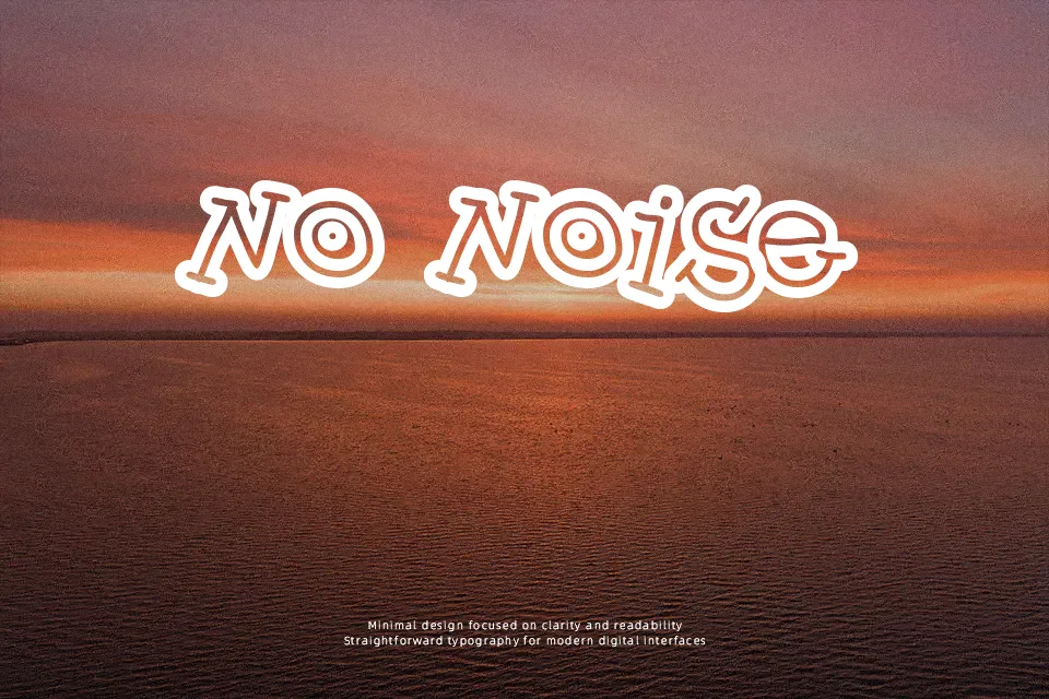
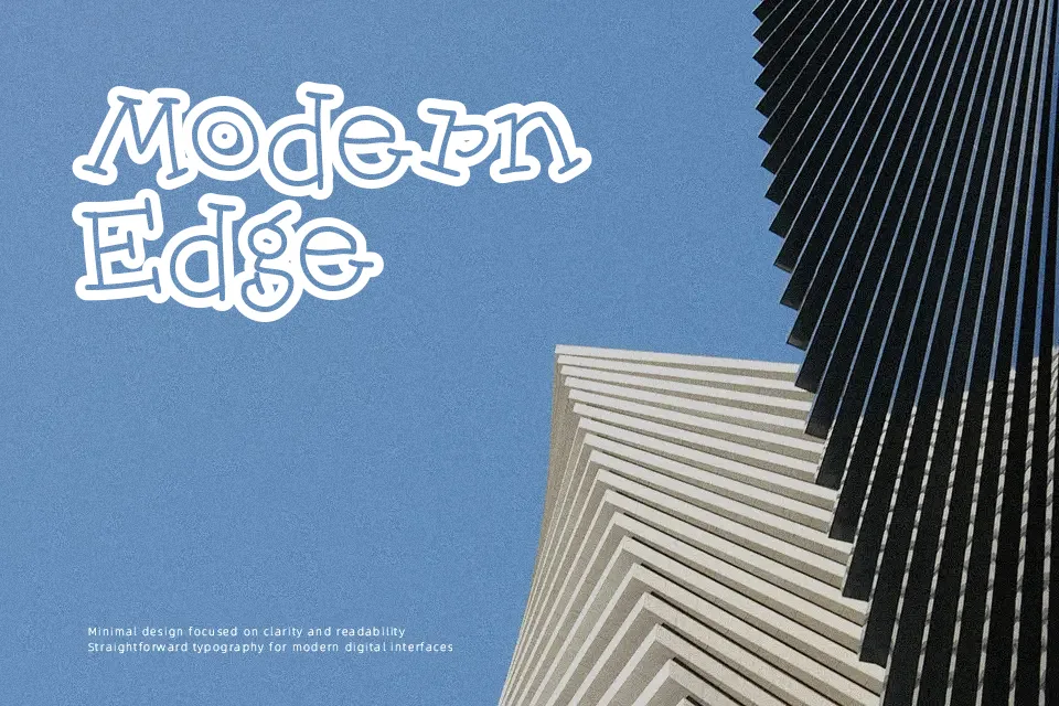
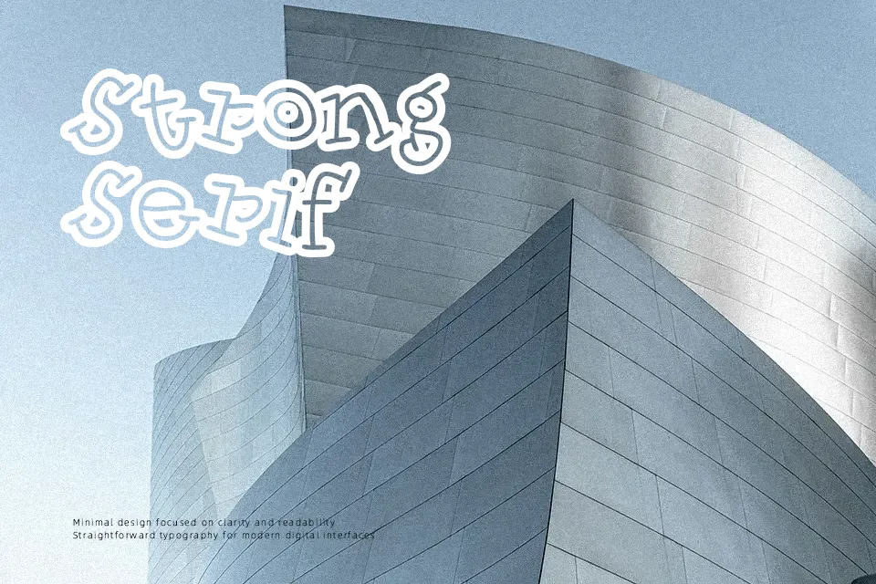
Skinny CapKick Font presents an ultra-narrow display structure defined by elongated vertical strokes, subtle hand-drawn quirks, and compact letter spacing. The irregular stroke weights and lively baseline shifts give the uppercase and lowercase characters an informal, animated appearance. Proportions remain heavily condensed throughout the entire character set, allowing headlines to fit comfortably into tight horizontal compositions. However, the compressed forms and decorative stroke irregularities significantly reduce legibility at small sizes, making the typeface impractical for continuous body paragraphs or technical documentation. In practice, the letterforms deliver their strongest visual appeal when displayed in large comic headers, poster titles, and playful product packaging.
Best For: children’s book covers, animated video titles, comic strip headlines, playful merchandise labels
Not Ideal For: continuous body paragraphs, technical documentation, small interface labels, formal corporate stationery
Perfect for headline, kids, and packaging, with a creative and cartoon style.
License
Gallery