Silly Summer Font
Free for personal useAbout
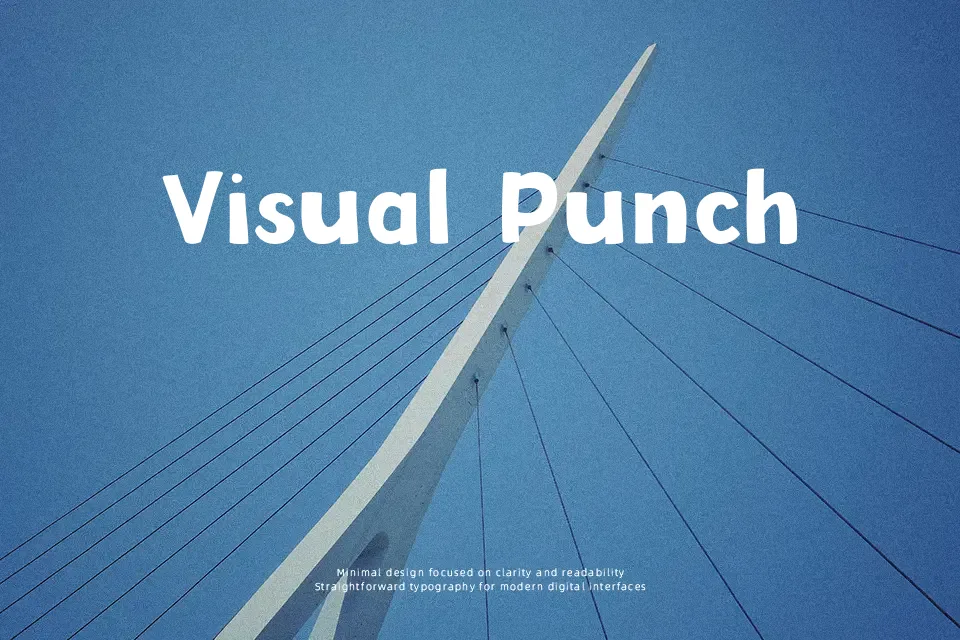
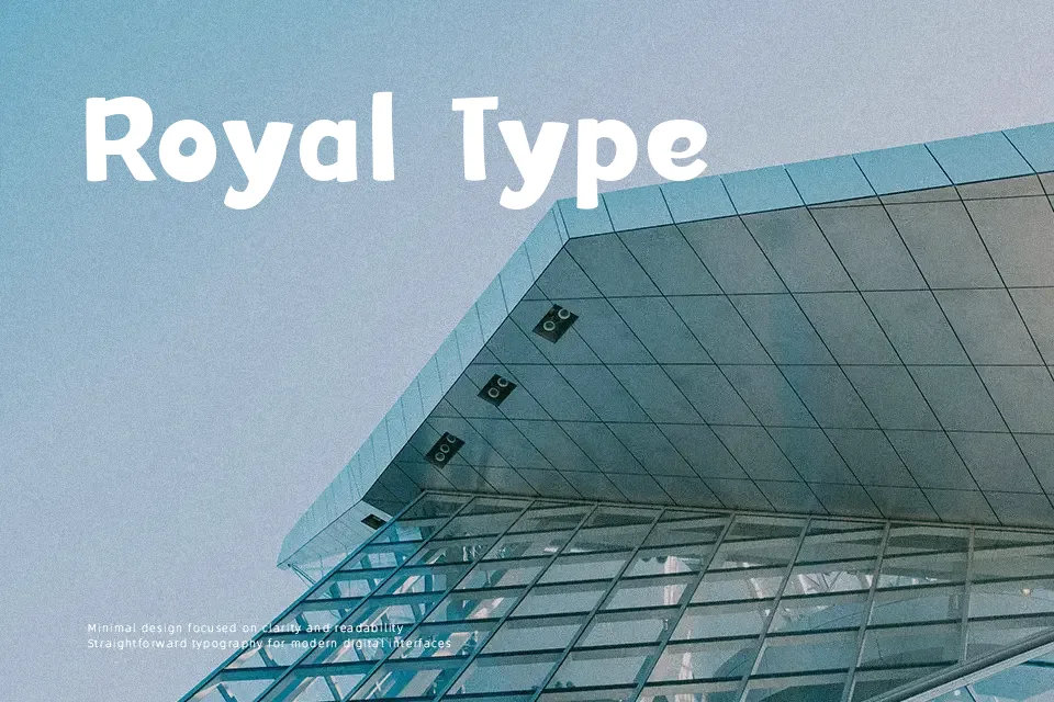
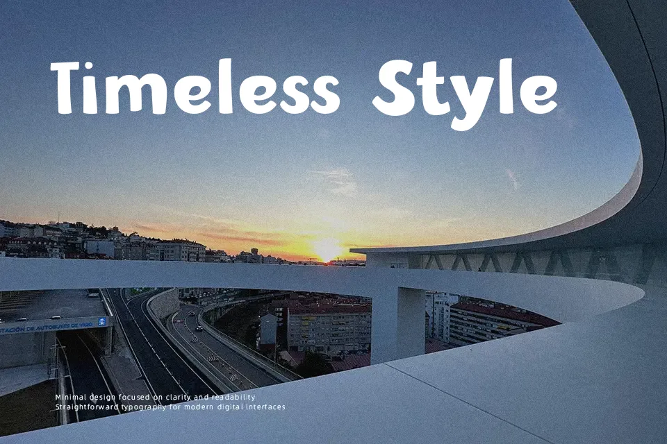
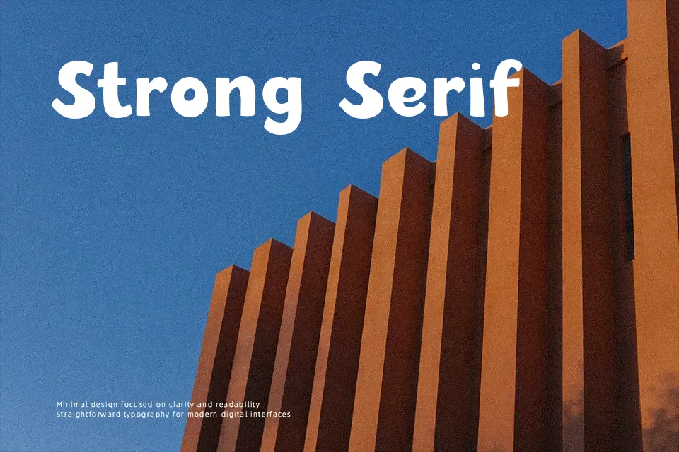
Silly Summer Font is defined by thick, rounded strokes, playful weight distribution, and irregular baselines that create an energetic visual rhythm. Each character features soft contours with minimal contrast between vertical and horizontal stems, producing an approachable, hand-crafted appearance across uppercase and lowercase sets. Spacing remains relatively compact to preserve cohesion among the plump letterforms, allowing short headlines and packaging labels to stand out clearly. However, the exaggerated curves and dense structure reduce legibility when set at small point sizes or across multi-line paragraphs. The design functions most effectively as a prominent display choice for youth-oriented branding and event posters.
Best For:
– children book covers
– summer camp event posters
– playful food packaging labels
– birthday invitation headlines
Not Ideal For:
– long editorial paragraphs
– corporate annual reports
– fine-print legal disclosures
– dense technical documentation
Perfect for headline, kids, and packaging, with a bold and cartoon style.
License
Gallery