Childs Play Font
Free for personal useAbout
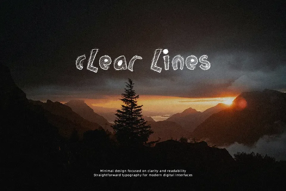
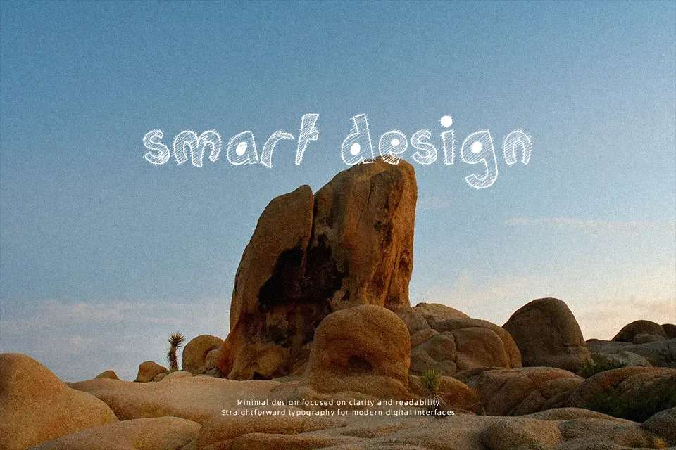
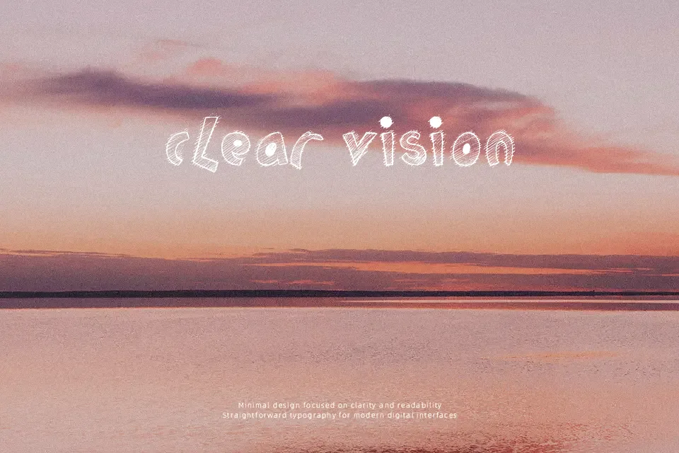
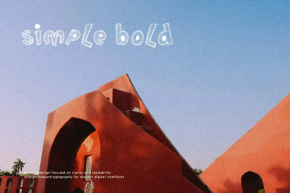
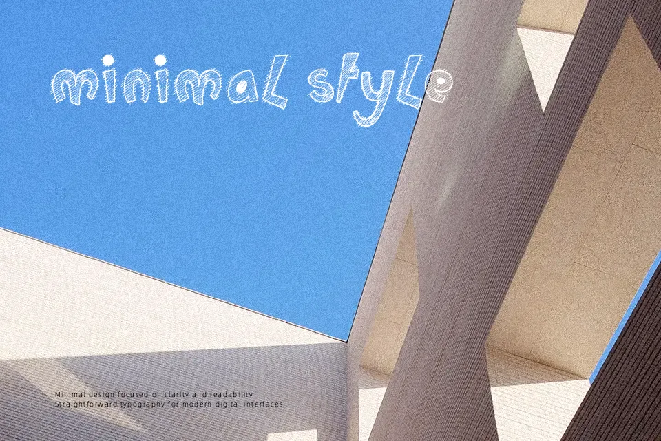
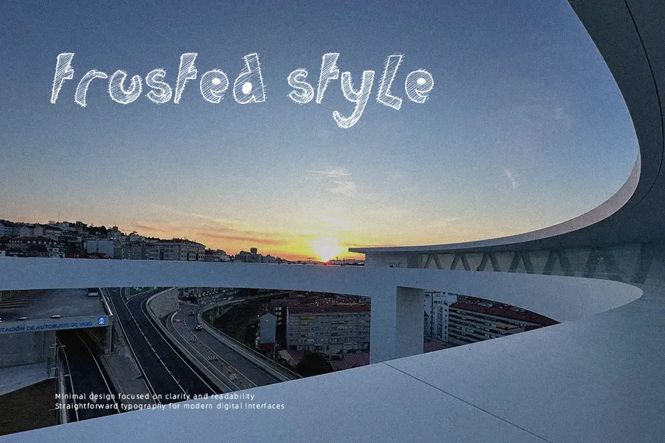
Childs Play Font features animated letterforms defined by rounded contours, robust stroke weights, and asymmetric proportions that capture a carefree aesthetic. The characters exhibit irregular baselines and lively contours, producing an organic visual rhythm across headline compositions. Moderate letter spacing preserves individual character definitions at larger display sizes, while the generous counters maintain overall clarity across short phrases. However, the expressive distortion and heavy outlines make continuous reading difficult across dense paragraphs. In practical application, the typeface delivers excellent visual energy for youth branding, though small caption sizes cause overlapping counters and reduced legibility.
Best For: children book covers, toy packaging, animated video titles, youth event posters
Not Ideal For: dense body text, corporate annual reports, technical documentation, small legal notices
Perfect for headline, kids, and logo, with a creative and cartoon style.
License
Gallery