Belanosima Font
Free for Commercial UseAbout
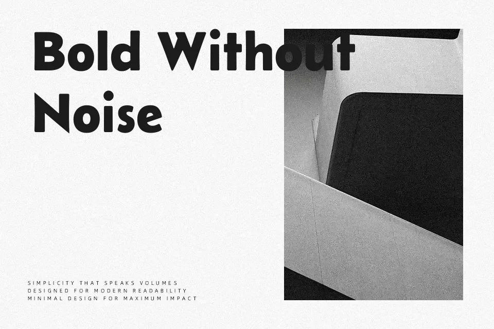
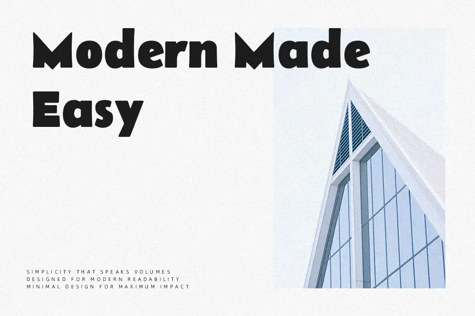
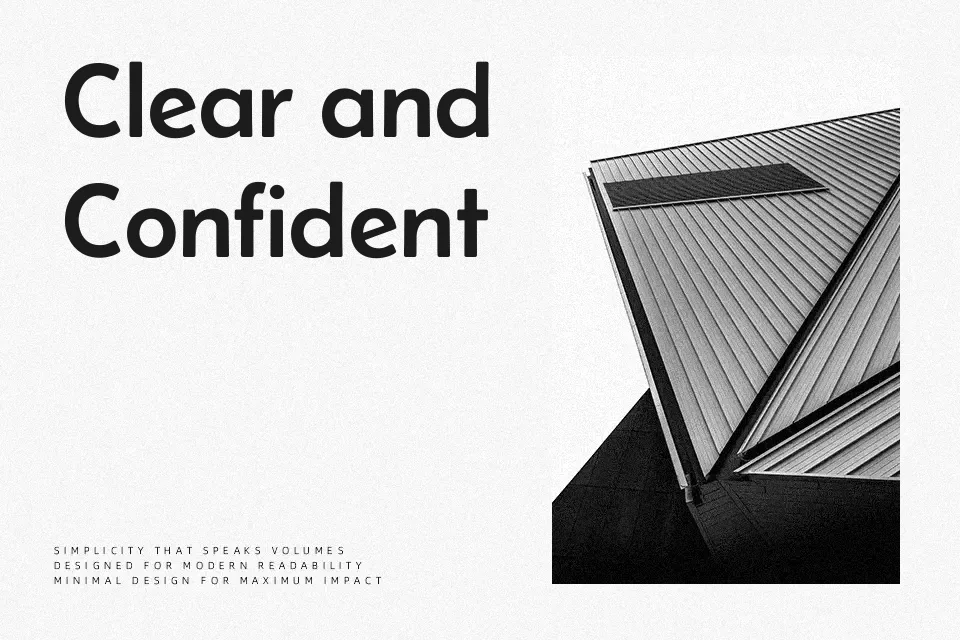
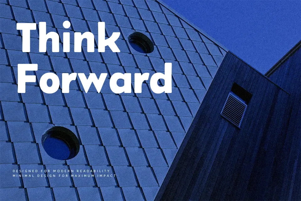
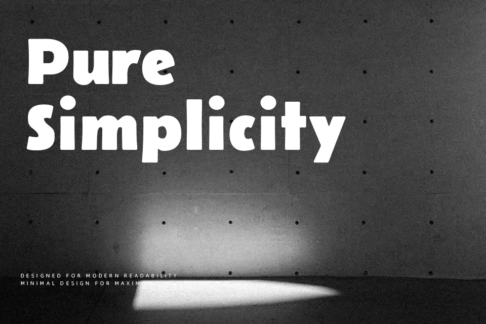
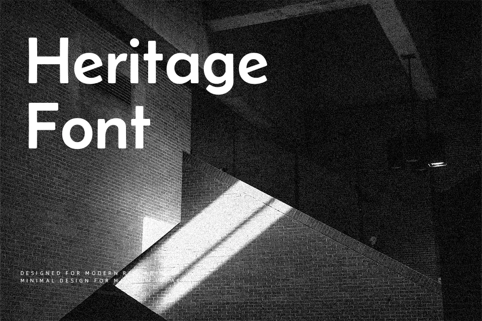
Belanosima takes the slender, geometric skeleton of Josefin Sans and sharpens it into a more robust display family, with clean strokes, moderate contrast, and compact vertical proportions that feel distinctly 1920s-inspired. The spacing leans on the tighter side, which helps headlines feel cohesive and punchy but can look cramped if you push it into dense body copy. Visually, it sits somewhere between a classic geometric sans and a retro display face: serious enough for product packaging or editorial mastheads, yet expressive enough for music artwork or social media graphics. Use it when you want a modern-vintage tone with consistent letterforms; skip it for long reading text or projects that need a strictly neutral voice.
Best For:
branding headlines
editorial titles
website hero text
product or poster taglines
Not Ideal For:
long paragraphs
formal legal documents
small UI labels
dense technical manuals
Perfect for branding, headline, and logo, with a bold and display style.
License
Gallery