Catastrophic Consequences Font
Free for personal useAbout
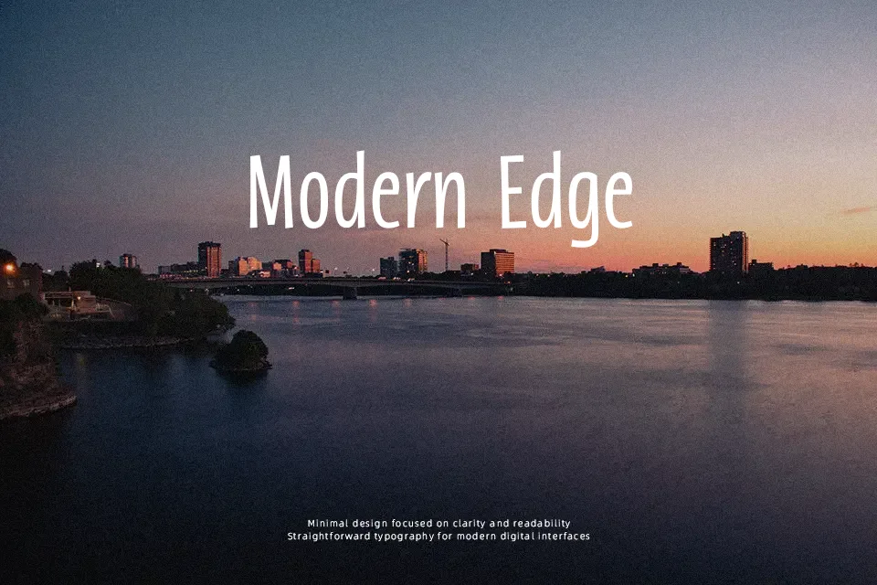
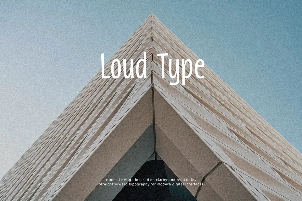
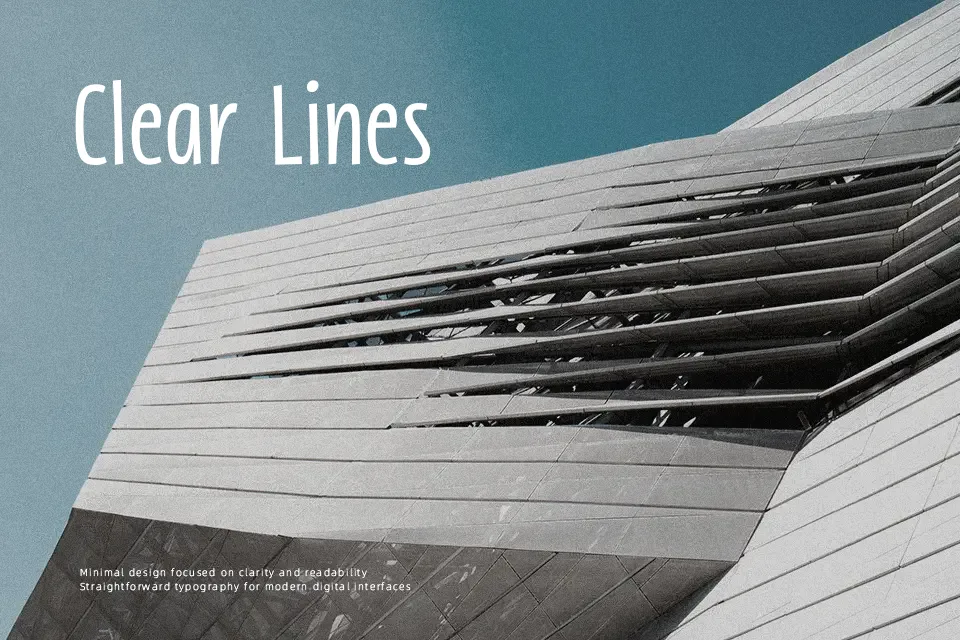
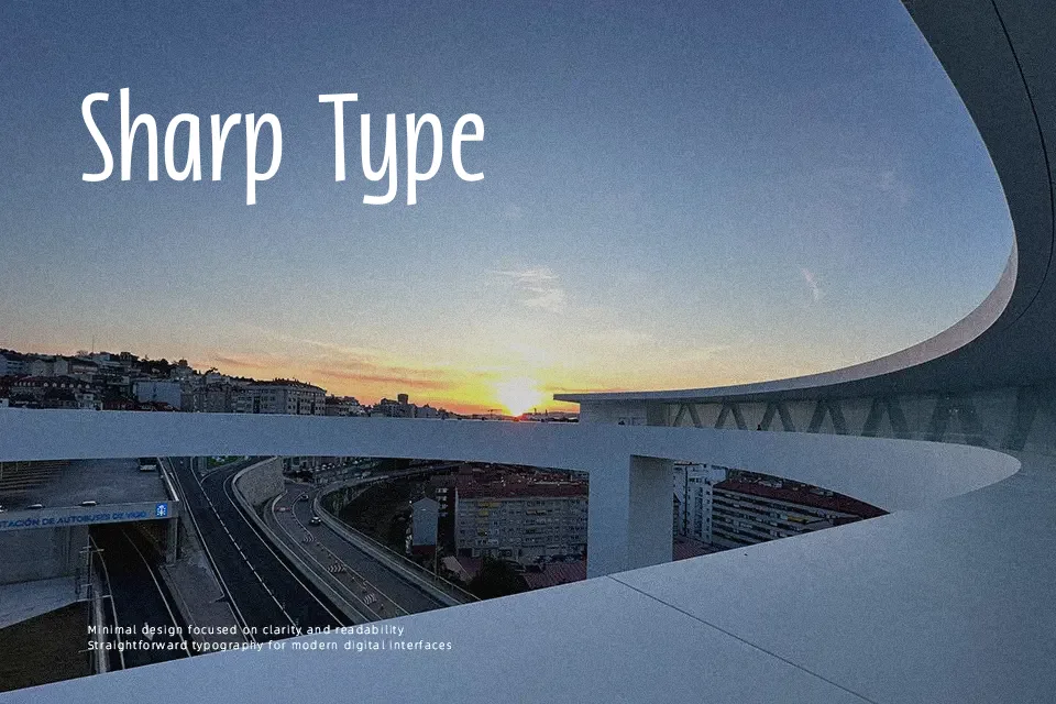
Catastrophic Consequences Font opens with a bold display structure defined by sharp contours, condensed proportions, and distinct stroke dynamics that instantly draw the eye. The typeface maintains disciplined baseline alignment across its glyph set while incorporating angular terminal treatments and narrow internal counters. Spacing between characters is closely calibrated to preserve compact typographic density in headline settings. Small captions lose legibility due to these compressed spaces, making the letterforms ill-suited for continuous body text or intricate data charts. When deployed in event flyers, music merchandise, or editorial covers, the design provides an assertive presence that functions effectively at large display scales.
Best For: theatrical poster headlines, thematic packaging, music merchandise, film title screens
Not Ideal For: continuous body text, mobile interface labels, dense spreadsheet tables, long paragraph reading
Perfect for advertising, headline, and logo, with a artistic and condensed style.
License
Gallery