Razor Keen Font
Free for Commercial UseAbout
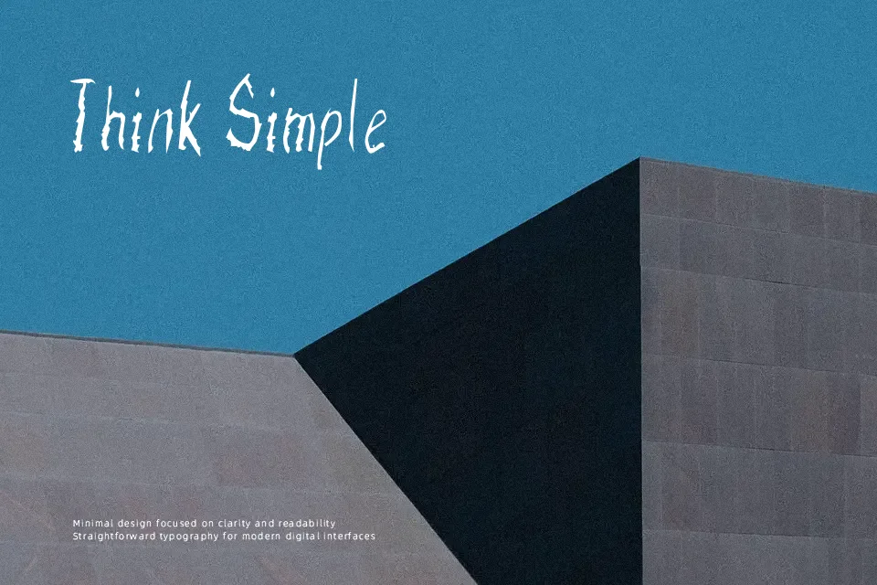
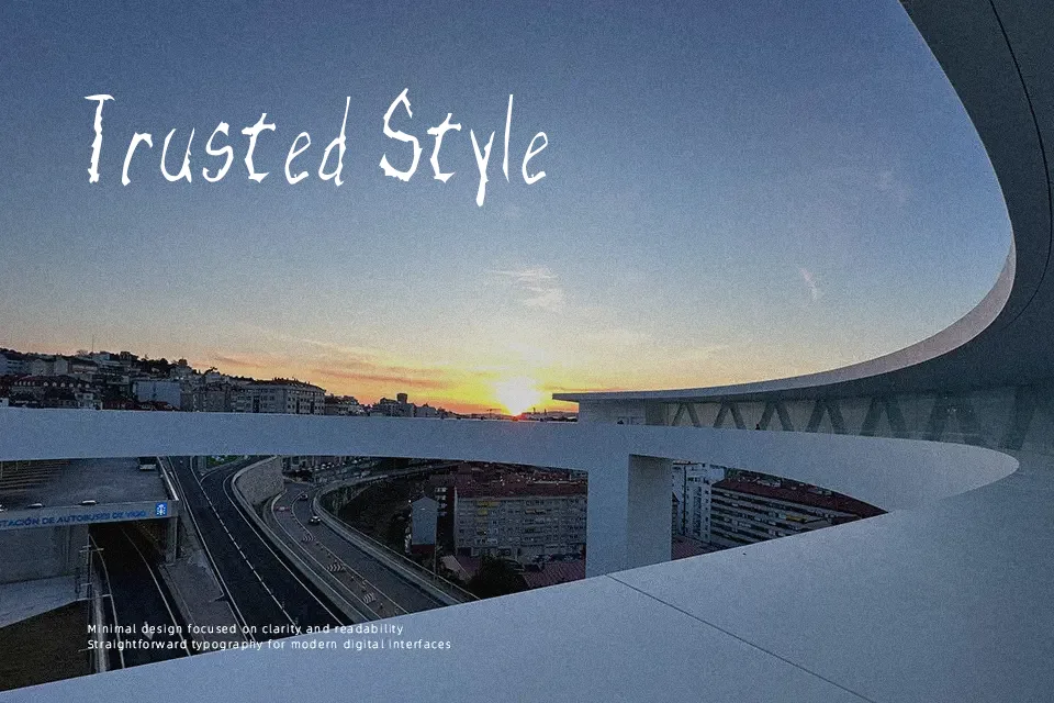
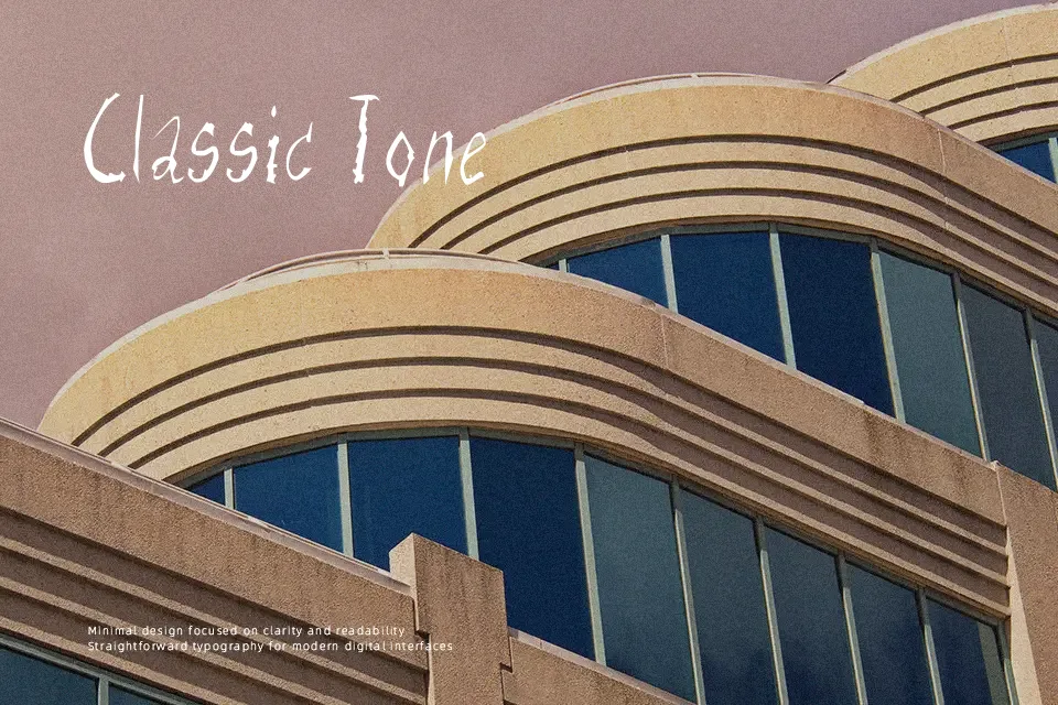
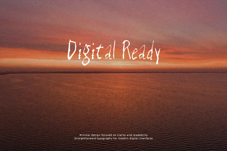
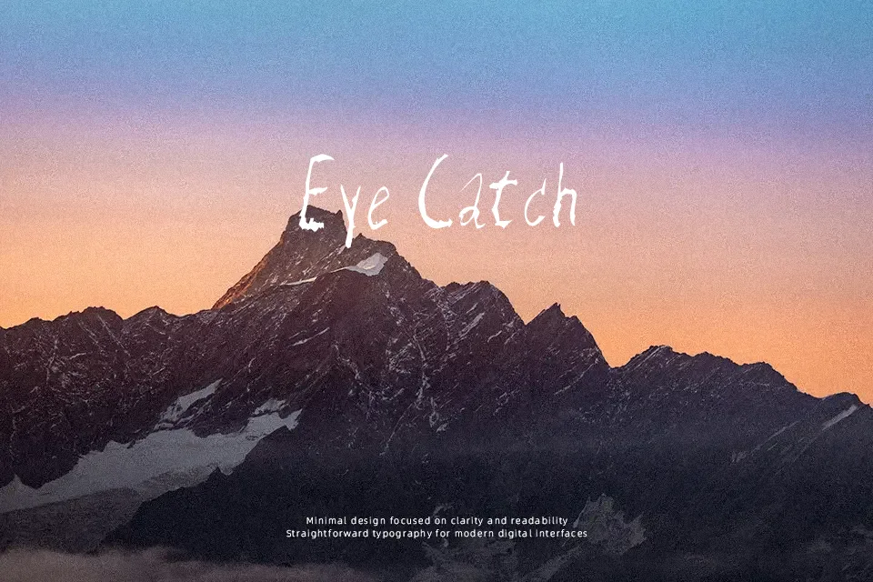
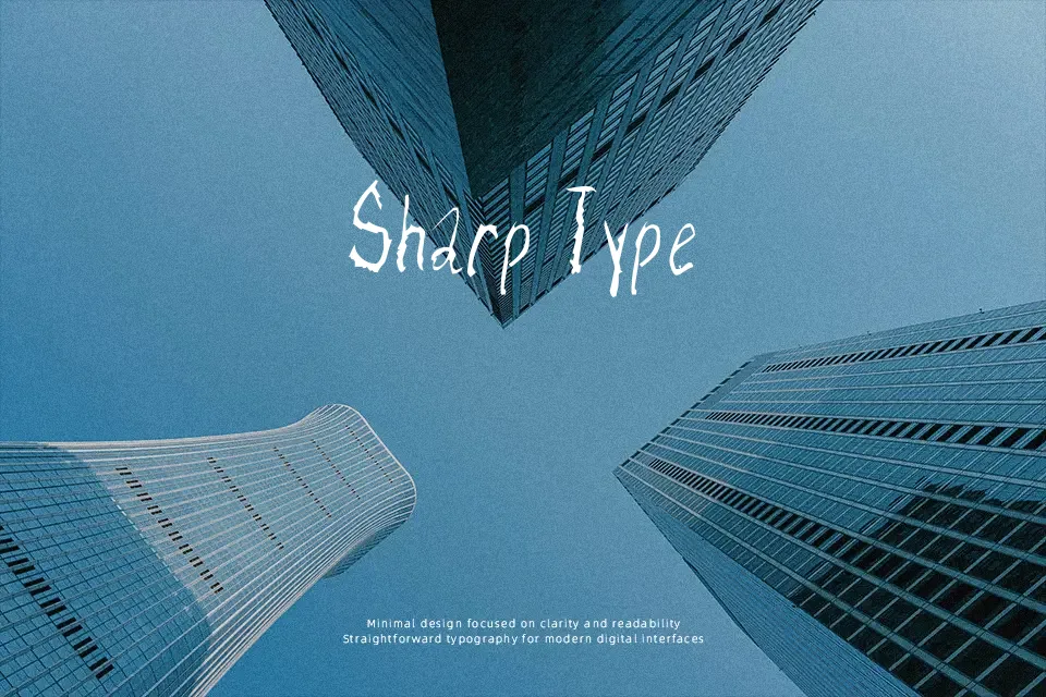
Defined by its erratic, scratchy letterforms, Razor Keen Font mimics the chaotic strokes of a mapping quill dragged across coarse paper. The irregular baselines and sharp, jagged terminals immediately establish a frightening, unstable visual rhythm. Because the uppercase and lowercase characters rely on heavy texture and unpredictable proportions, the spacing feels intentionally restless. This aggressive display typeface performs exceptionally well on horror book jackets, thriller movie posters, and seasonal event flyers where an unsettling atmosphere is required. However, the heavily textured details become completely lost at smaller sizes, drastically reducing continuous reading comfort. The chaotic spacing helps maintain a menacing aesthetic in large headlines, but it makes the typeface wholly unsuitable for dense editorial layouts or interface design.
Best For:
horror movie posters
thriller novel covers
haunted house branding
Halloween event flyers
Not Ideal For:
continuous paragraph text
corporate documentation
small interface labels
dense editorial layouts
Perfect for halloween, headline, and packaging, with a dark and decorative style.
License
Gallery