Averia Gruesa Libre Font
Free for Commercial UseAbout
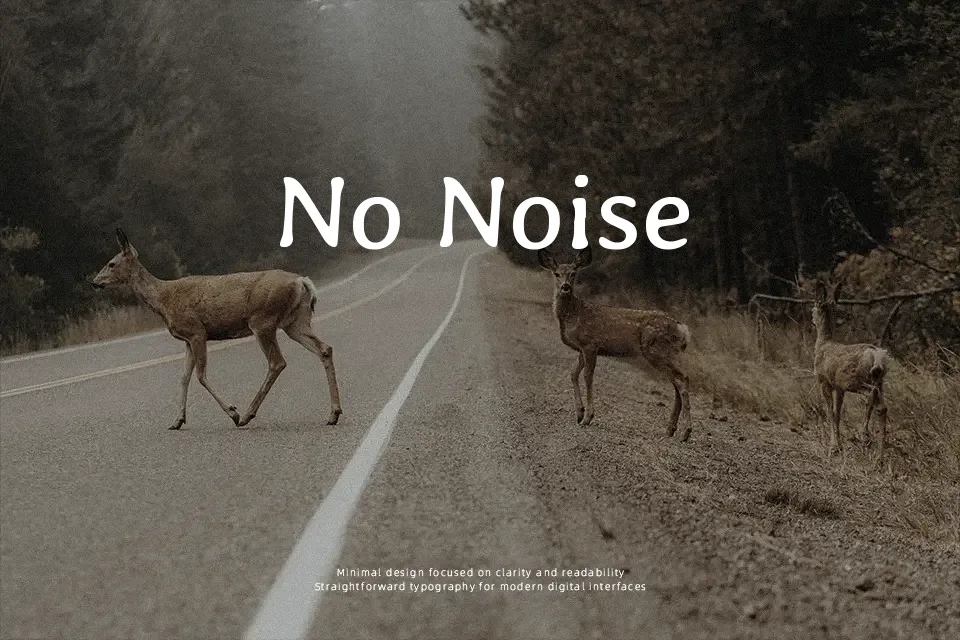
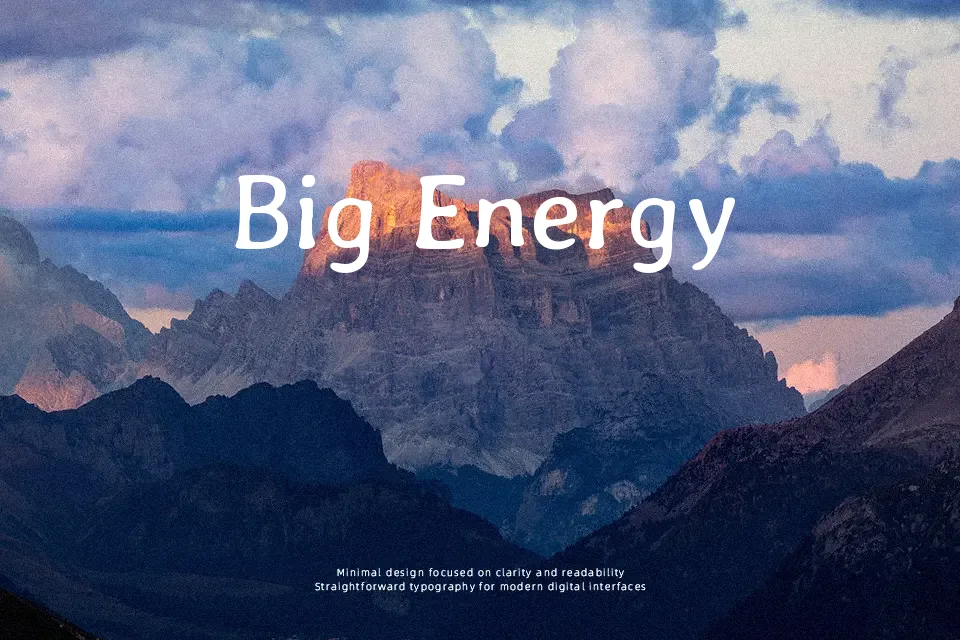
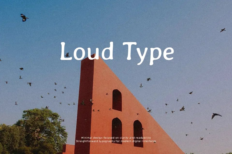
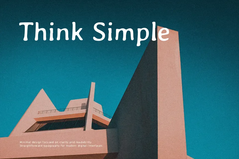
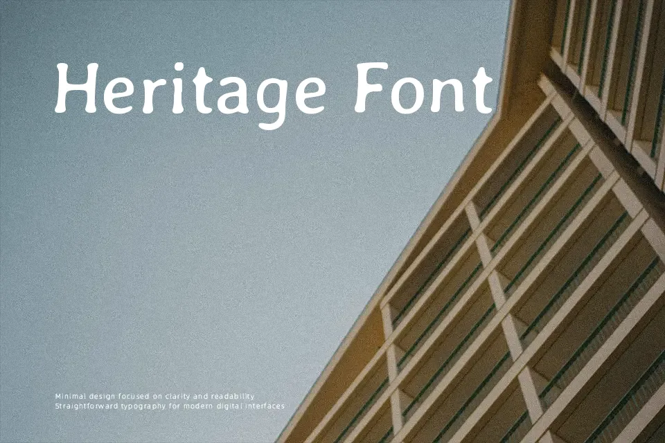
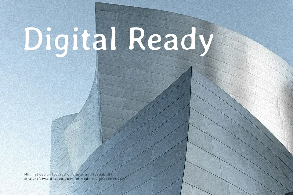
Averia Gruesa Libre has thick, irregular strokes, soft contours, and slightly wobbly outlines that give it an intentionally “imperfect” texture on the page. Spacing is fairly open, so letters breathe even at larger sizes, but the shapes remain dense and weighty, reading as casual rather than refined. The design comes from averaging hundreds of existing fonts, so it feels like a friendly mashup of serif and sans influences rather than a clean geometric system. I tend to reach for it when a title, poster, or YouTube thumbnail needs a scruffy, human touch, especially for DIY, indie, or community-focused projects. It struggles in long paragraphs, small UI text, or serious corporate settings, where its rough edges can look clumsy instead of charming.
Best For:
bold headlines
playful branding
poster design
YouTube thumbnail text
Not Ideal For:
long paragraphs
formal documents
small UI labels
strict corporate branding
Perfect for branding, headline, and kids, with a artistic and display style.
License
Gallery