Poppin Pills Font
Free for personal useAbout
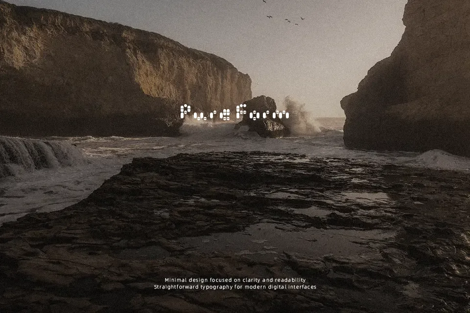
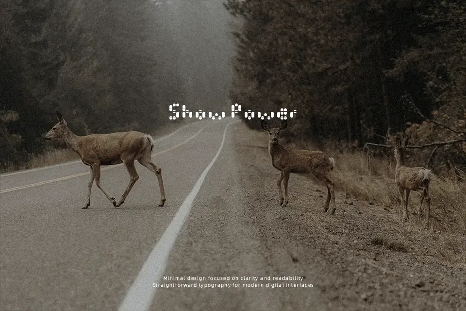
The visual structure of the Poppin Pills Font immediately stands out through its inventive use of repeating capsule shapes that form every character. Instead of traditional solid strokes, this typeface utilizes distinct pill-like units arranged in a dotted sequence to build its letterforms. The characters feature uniform proportions with somewhat open spacing to accommodate the dense, clustered composition. While these heavily stylized forms offer high visual impact for bold headlines and thematic packaging, they become exceptionally difficult to read in continuous reading scenarios. Dense forms reduce comfort during extended reading, meaning the design performs best when displayed at larger sizes where the individual overlapping elements remain distinct and recognizable.
Best For:
medical themed event posters
pharmaceutical packaging concepts
playful health campaign headlines
creative merchandise graphics
Not Ideal For:
long paragraph text
small interface labels
corporate reports
dense editorial layouts
Perfect for advertising, headline, and packaging, with a creative and decorative style.
License
Gallery