Atkinson Hyperlegible Next Font
Free for Commercial UseAbout
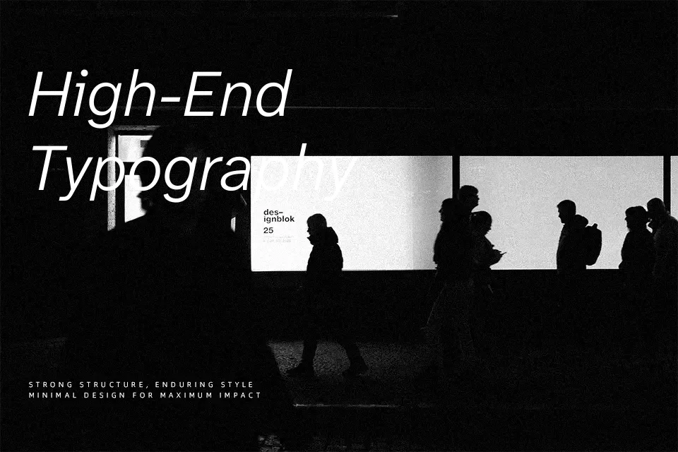
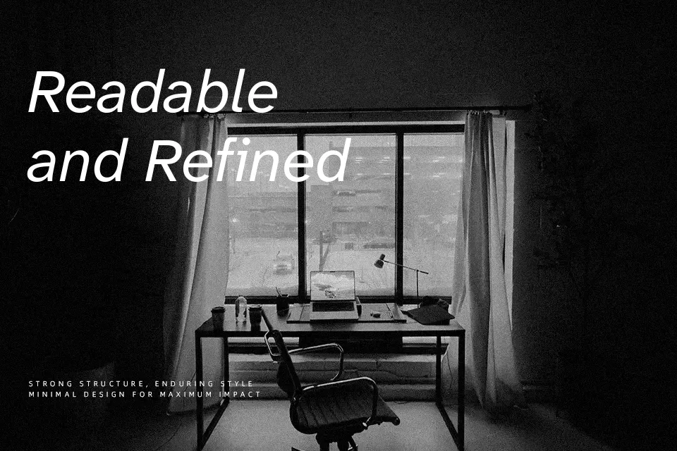
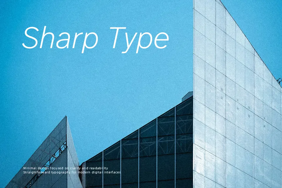
Atkinson Hyperlegible Next is a humanist sans serif with generous spacing, open counters, and clearly differentiated letterforms that stay readable even at smaller sizes. Ascenders and descenders are emphasized, strokes are sturdy rather than delicate, and ambiguous characters like I/l/1 are structurally distinct, which helps users with low vision or cognitive fatigue track text more comfortably. The overall impression leans functional and **serious** rather than flashy, so it fits accessibility-first branding, public wayfinding, transport maps, dashboards, and long-form digital reading better than ornamental display tasks. Compared with more neutral workhorses like classic grotesque sans serifs, it occupies a bit more space and can feel too plain or static for expressive headlines or fashion-led visuals, but that tradeoff pays off when readability and inclusivity sit at the top of your design brief.
Best For:
accessible user interfaces
wayfinding and signage systems
reading-heavy web or app layouts
inclusive public information materials
Not Ideal For:
highly expressive display logos
ultra-condensed layouts with tight space
luxury fashion or beauty branding
ornamental event invitations
Perfect for advertising, body text, and headline, with a calm and geometric style.
License
Gallery