Play Time Font
Free for personal useAbout
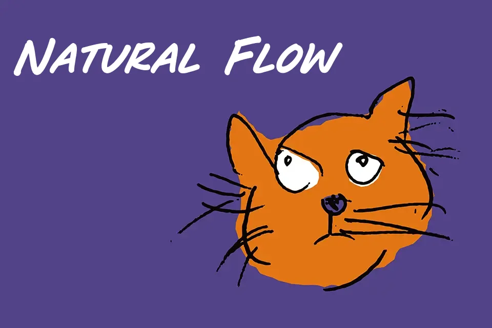
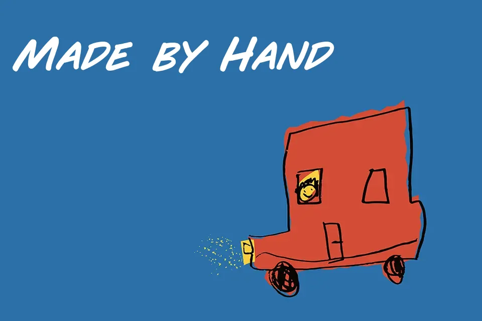
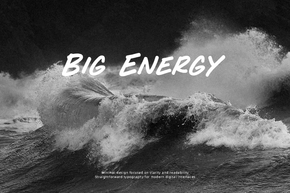
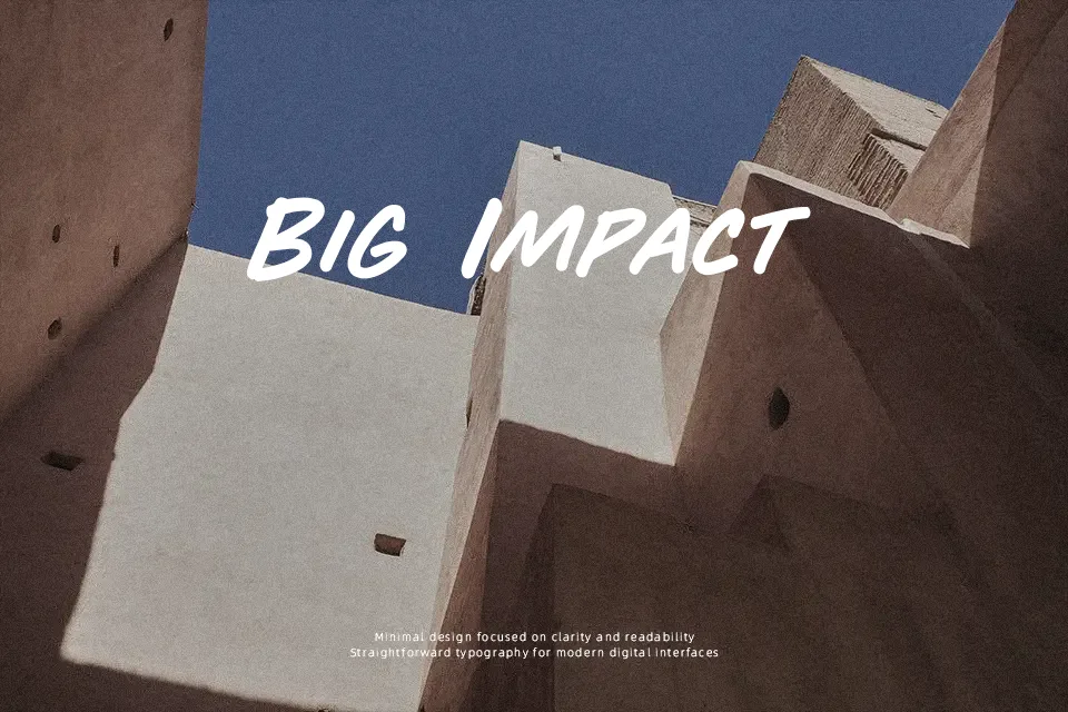
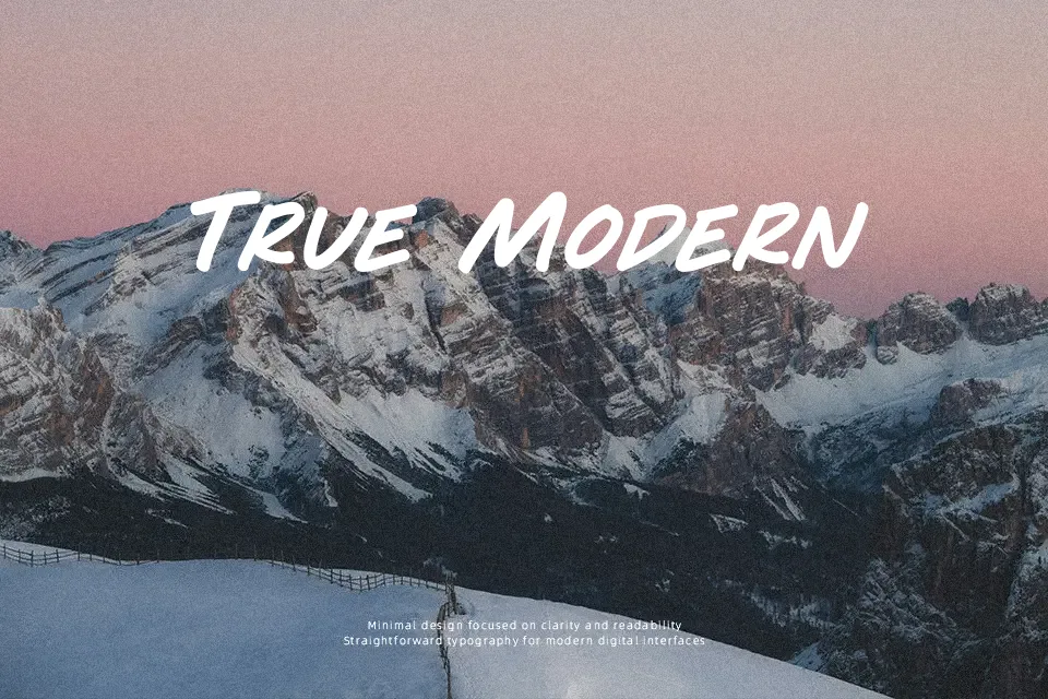
Play Time Font works best in large, short-form display settings where its handwritten brush construction can remain clear. The letterforms use thick, marker-like strokes with uneven edges and a loose, expressive rhythm, while the proportions feel broad rather than compact. Spacing gives individual characters room to retain their shape in headlines and simple graphic layouts. It suits playful posters, packaging titles, and informal promotional artwork more naturally than restrained brand systems. The design has strong visual movement at larger sizes, but its textured stroke treatment becomes less comfortable in small copy or continuous reading.
Best For: children’s event posters,casual product packaging,social media headlines,playful apparel graphics
Not Ideal For: long paragraph text,small interface labels,corporate reports,dense editorial layouts
Perfect for headline, kids, and packaging, with a creative and brush style.
License
Gallery