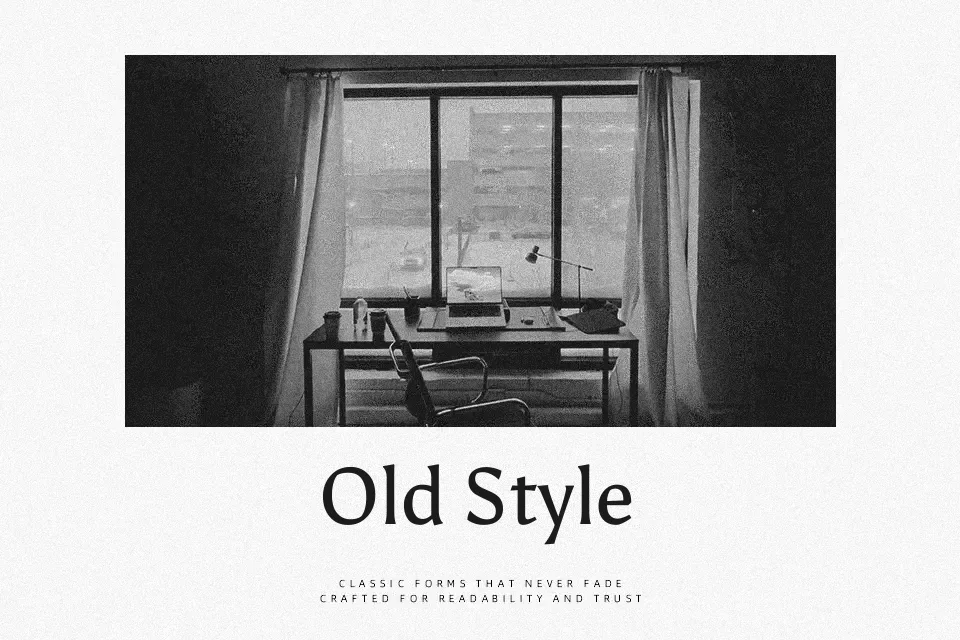
Asul Font
Free for Commercial UseAbout
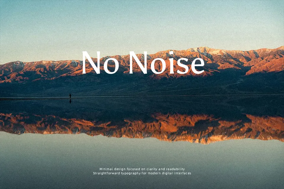
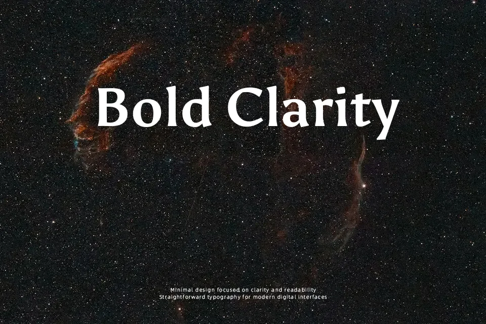
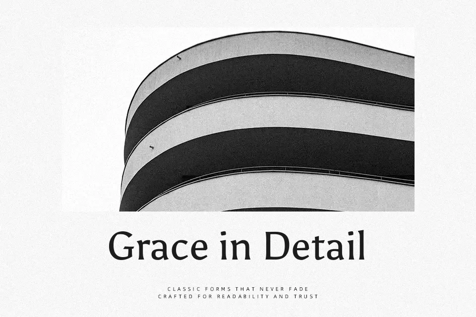
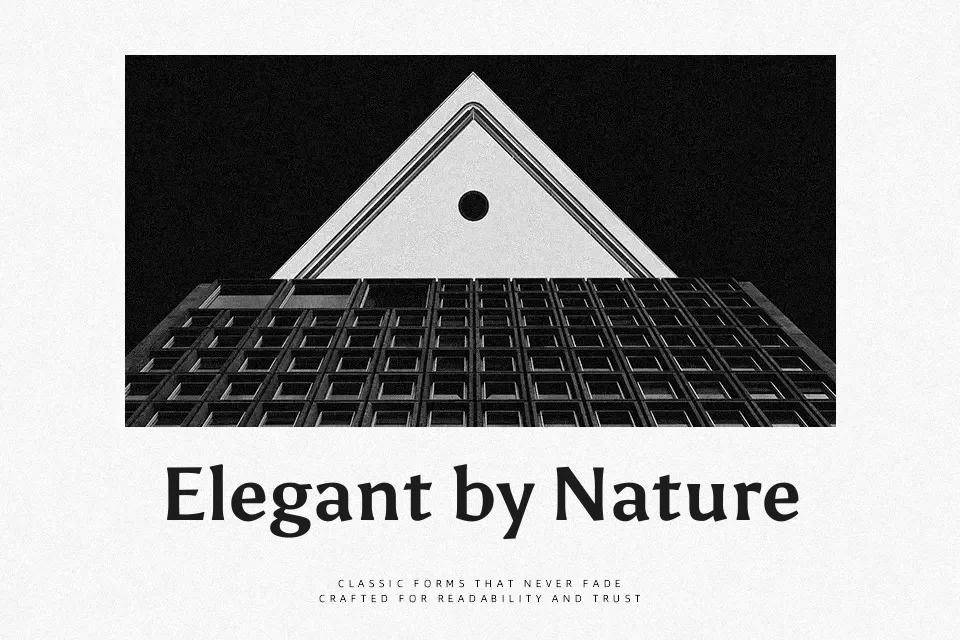
Asul sits in that interesting space between serif and sans serif: semi-serifs, moderate contrast, and compact capitals give it a refined, slightly vintage voice that still feels usable in modern layouts. Strokes are sturdy rather than delicate, with open counters and fairly generous spacing that keep headlines and short paragraphs legible on screens and in print. It was developed as a revival of early 20th‑century Argentinian editorial type, so it naturally lends itself to magazine covers, opinion columns, blog titles, and cultural posters where you want a bit of historical flavor without slipping into nostalgia pastiche. In my experience it holds up nicely from about medium to large sizes; for dense, long-form body copy or highly corporate documents, a more neutral workhorse family will usually read more comfortably.
Best For:
editorial headlines
magazine-style web titles
culture or arts posters
blog feature images
Not Ideal For:
long-form body text
highly formal corporate reports
tiny UI captions
technical documentation
Perfect for branding, editorial, and headline, with a classic and display style.
License
Gallery