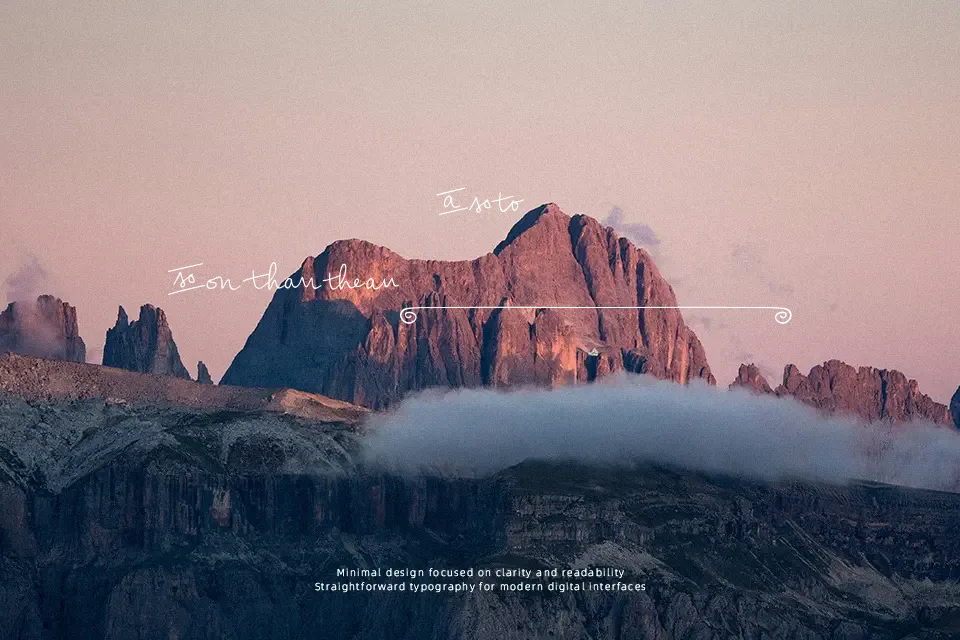
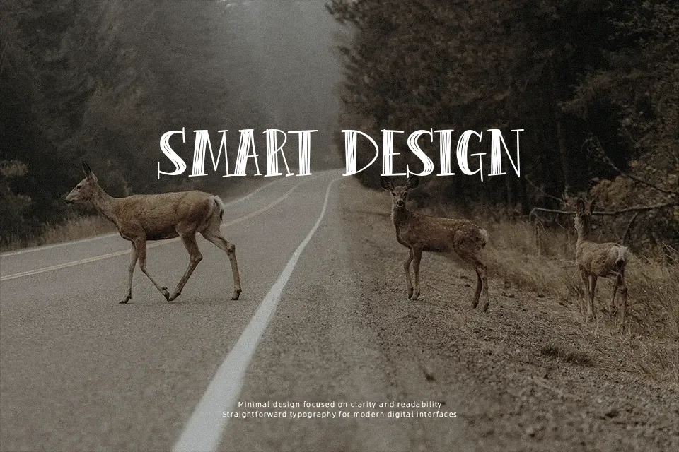
Peas & Carrots Font
Free for personal useAbout
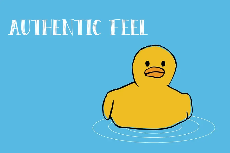
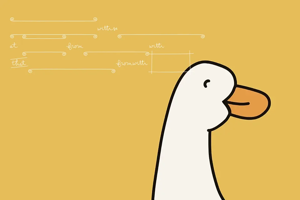
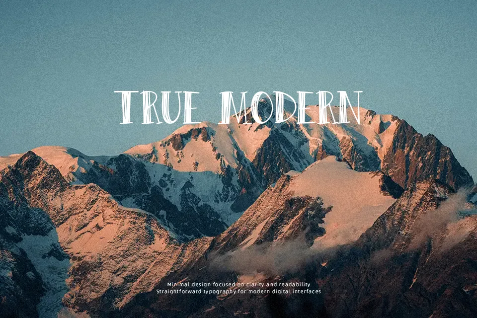
Peas & Carrots Font uses rough, hand-drawn uppercase forms with uneven outlines and alternate letter shapes that create a deliberately casual rhythm. The strokes appear monoline and slightly irregular, while the broad proportions keep individual characters noticeable in short phrases. Spacing feels most effective when the type is given room to breathe in large headlines, labels, or poster copy. Its visual texture makes plain wording feel more informal and handmade. The typeface remains clear in larger display settings, but the sketchy edges and decorative character variation reduce comfort in small sizes or extended reading.
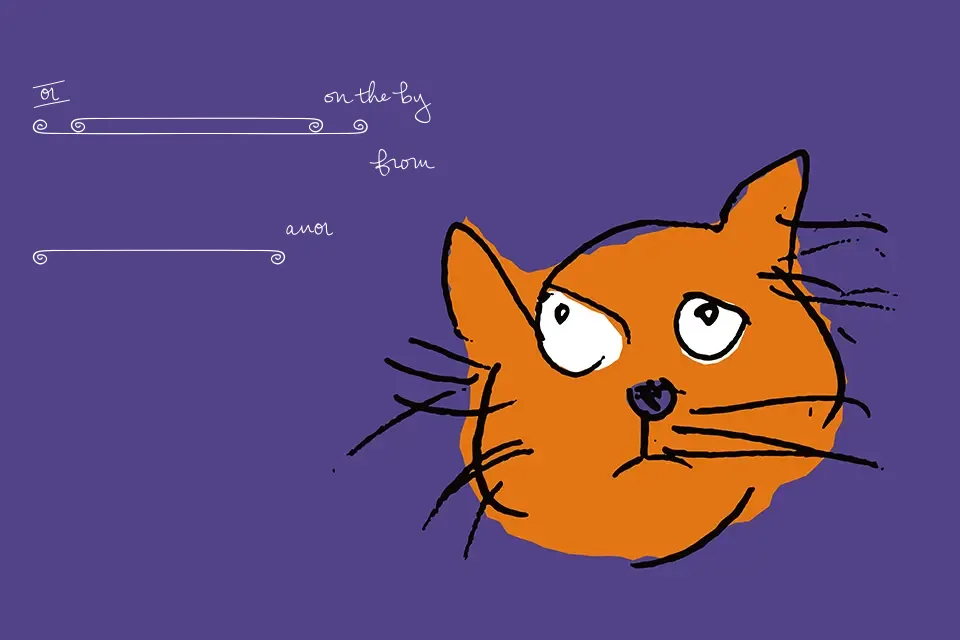
Best For: children’s party invitations,classroom posters,playful product labels,social media headlines
Not Ideal For: long paragraph text,small interface labels,legal documents,dense editorial layouts
Perfect for headline, kids, and packaging, with a creative and decorative style.
License
Gallery