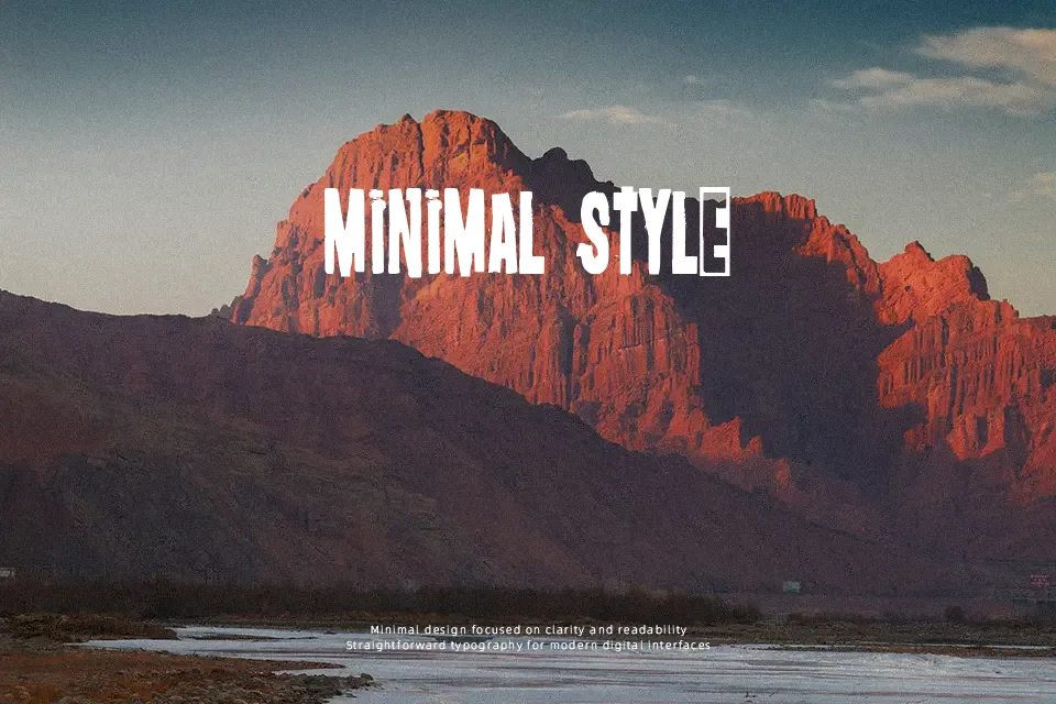
Oi! Survive Poster Font
Free for personal useAbout
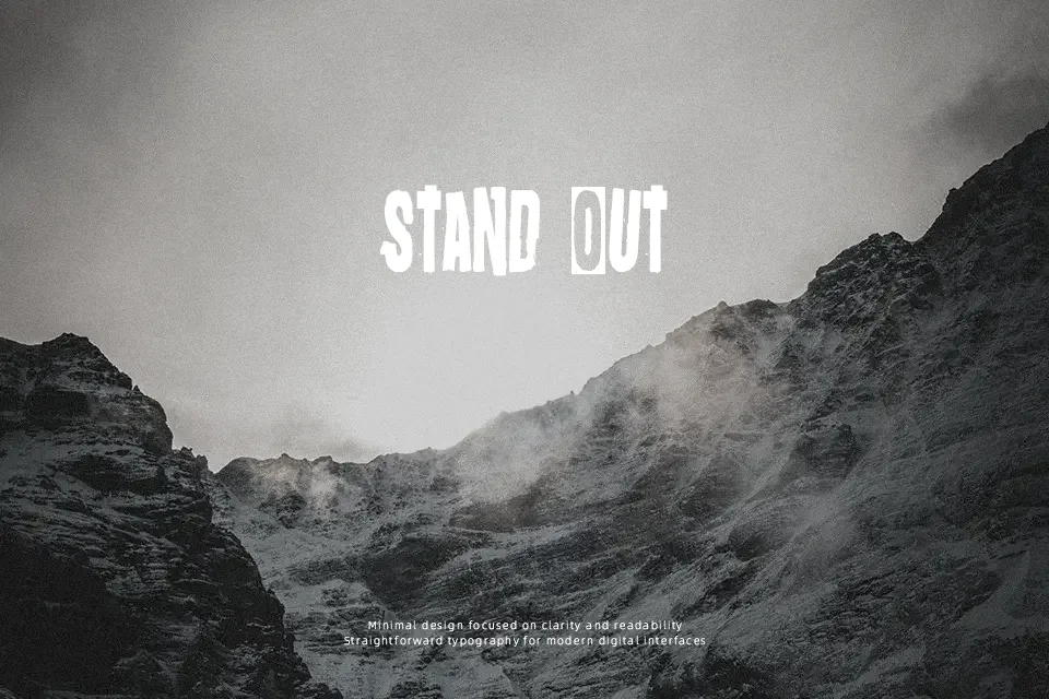
Oi! Survive Poster Font works best as large display lettering for designs that need an abrasive, handmade look. The letterforms use thick strokes, uneven contours, and compact proportions that create a dense, forceful rhythm. Spacing appears tight, helping short words hold together in poster layouts and graphic headlines. Its rough shapes remain recognizable at larger sizes, particularly in music artwork, stickers, and apparel prints. However, the distressed construction makes small text and extended reading less comfortable. The typeface is most effective when used sparingly, with enough surrounding space to preserve each character’s silhouette.
Best For: punk music posters,album cover titles,apparel graphics,event flyers
Not Ideal For: long paragraph text,small interface labels,corporate reports,dense editorial layouts
Perfect for fashion, headline, and music, with a bold and decorative style.
License
Gallery