Armata Font
Free for Commercial UseAbout
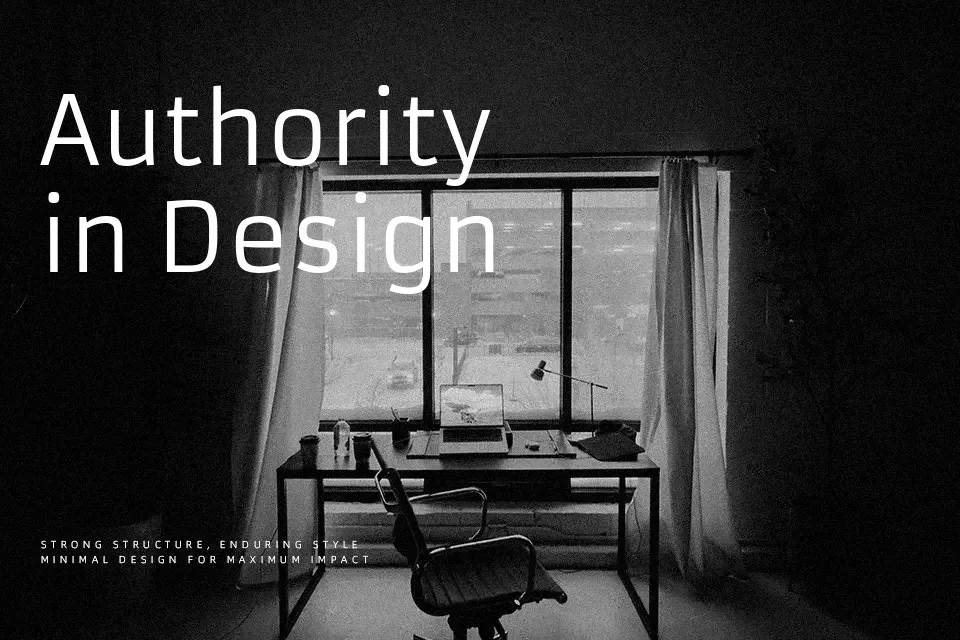
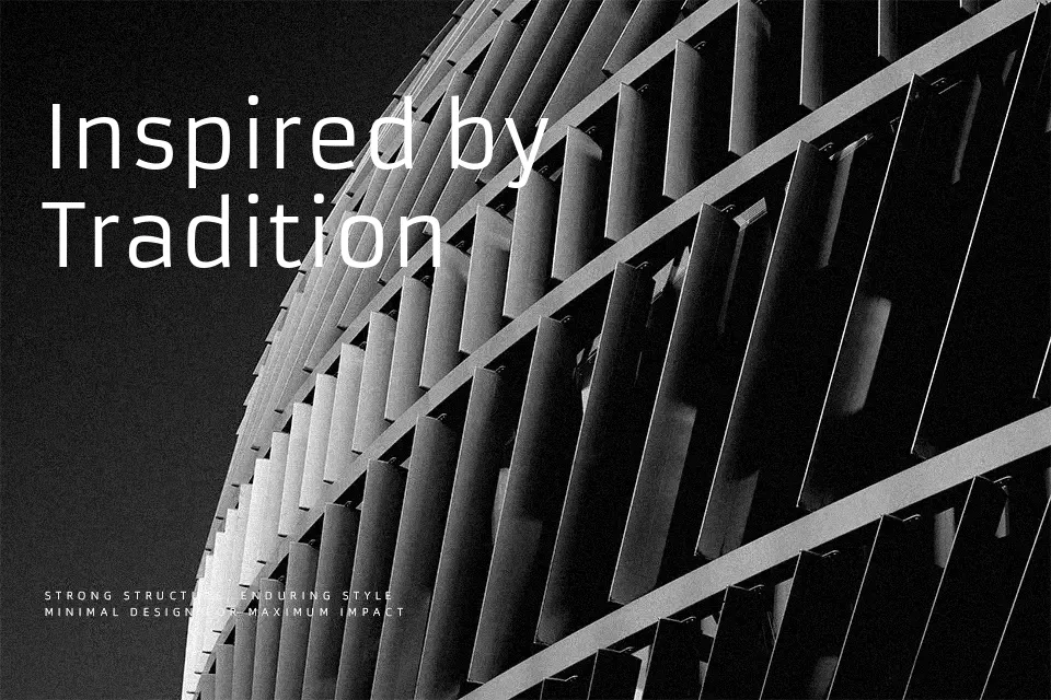
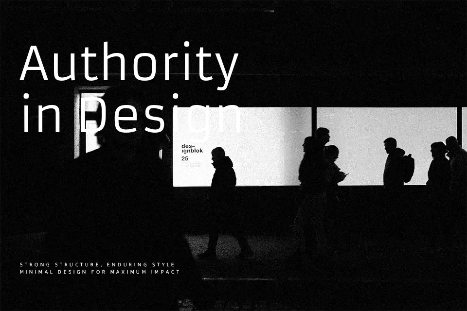
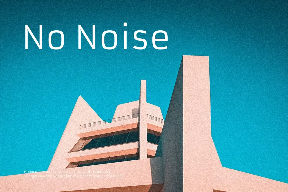
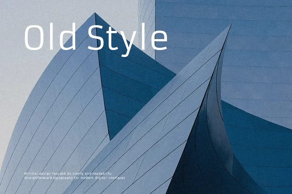
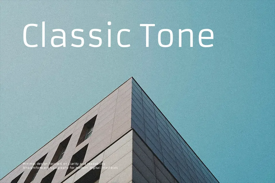
Armata has a low contrast stroke, compact proportions, and tidy spacing that give it a sturdy, engineered look with just enough warmth to avoid feeling cold. Its glyphs sit upright and stable, with simplified terminals and a fairly even rhythm, so text blocks feel controlled and unornamented. This works particularly well for interface labels, technical diagrams, minimalist landing pages, and small captions where you want information to feel dependable rather than expressive. If you need highly expressive branding, decorative logos, or very long immersive reading, Armata can feel a bit rigid and monotonous compared with more humanist sans options.
Best For:
UI labels and menus
technical diagrams and charts
minimalist web layouts
small captions and footnotes
Not Ideal For:
long-form book typesetting
highly expressive branding
playful kids products
ornate invitations
Perfect for business card, editorial, and headline, with a clean and geometric style.
License
Gallery