Calvus Font
Free for Commercial UseAbout
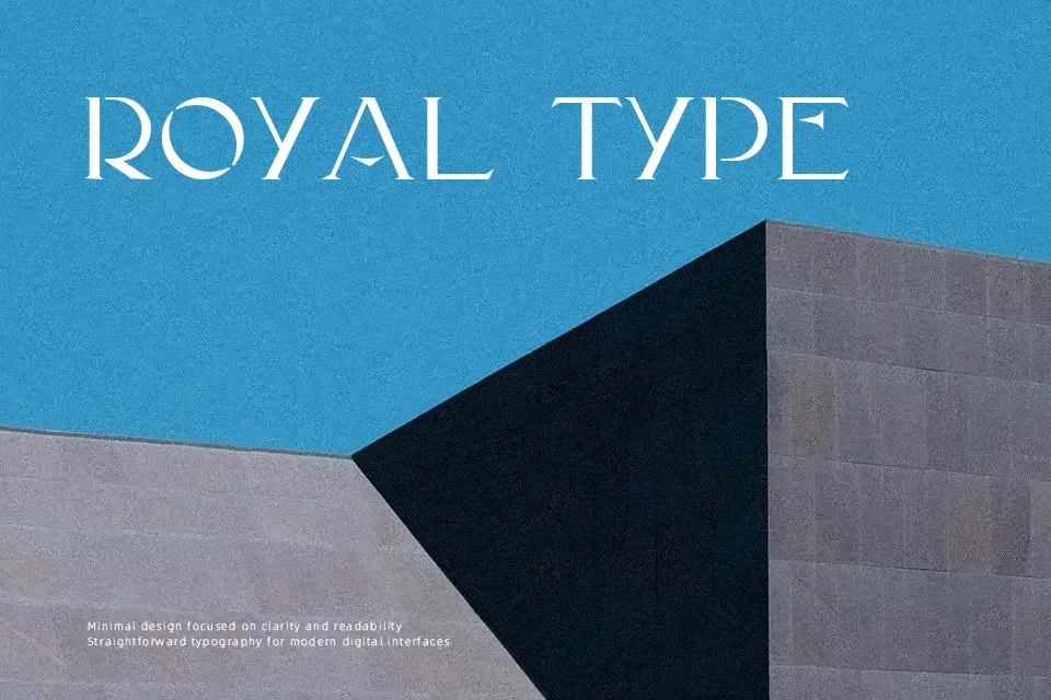
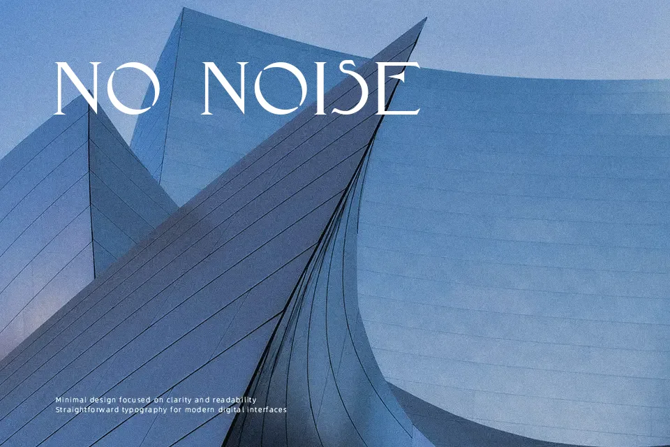
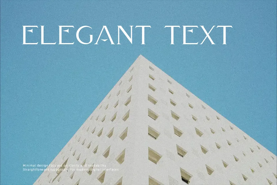
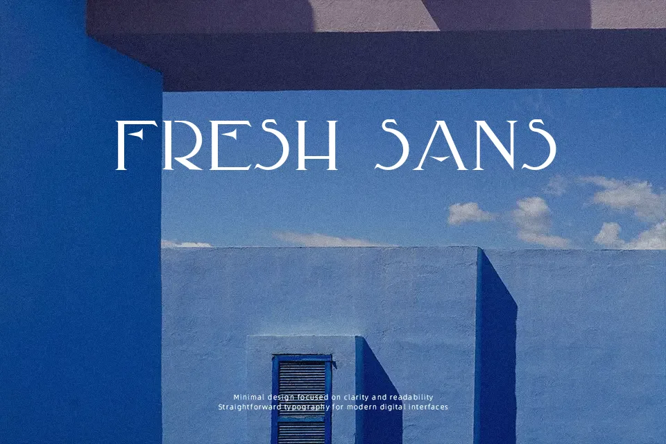
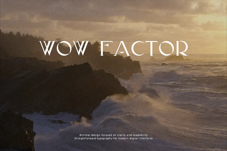
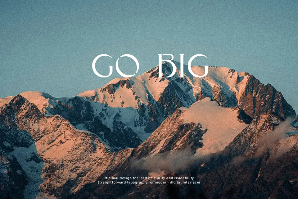
Calvus Font takes its cue from stone inscriptions in Chaumont, translating those chiseled shapes into a sharp stencil construction with narrow, upright proportions. Strokes feel deliberate rather than flashy, so the letters read as strong and structured instead of decorative clutter. The mix of ancient forms and Art Deco rhythm gives it a slightly historical, almost ceremonial tone that works well on covers, exhibition posters, museum signage concepts, or boutique branding that wants a carved-metal vibe without going full vintage pastiche. It tends to hold up best at larger sizes; for long paragraphs, the stencil gaps and tight rhythm can become tiring, so pairing it with a simpler sans serif for body text usually leads to a more balanced layout.
Best For:
exhibition or museum posters and titles
branding for architecture or heritage-focused projects
editorial covers and large section openers
packaging that needs a carved or engraved feel
Not Ideal For:
long body text or dense paragraphs
small UI labels or mobile app interfaces
very casual or child-oriented designs
highly minimal layouts needing neutral tone
Perfect for branding, editorial, and headline, with a artistic and display style.
License
Gallery