Bruno Book Font
Free for personal useAbout
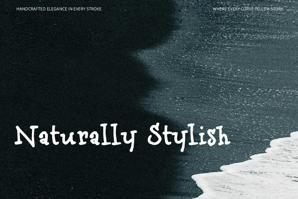
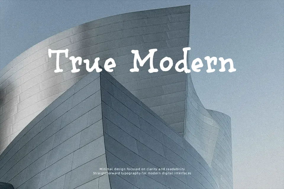
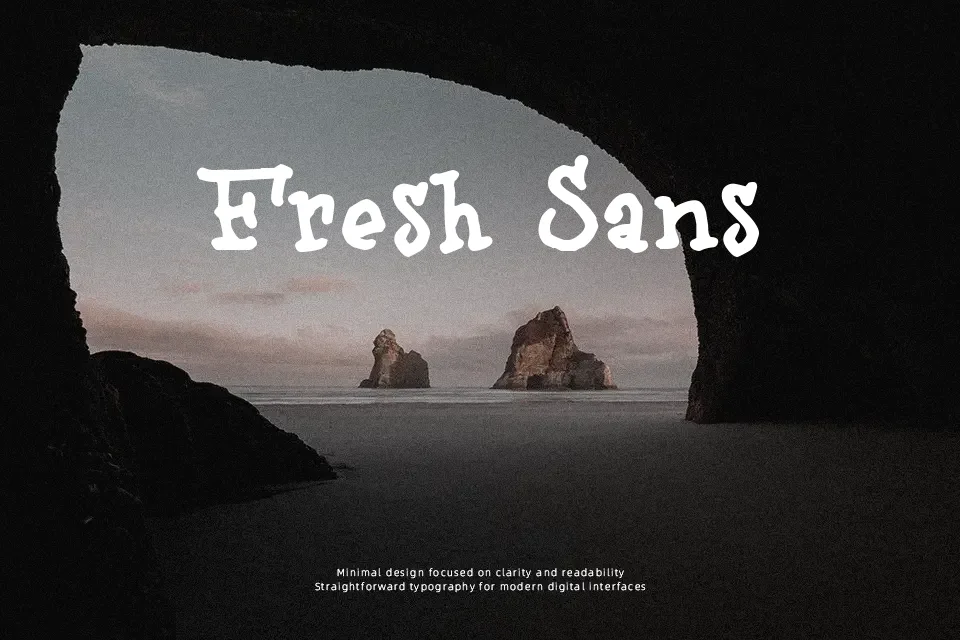
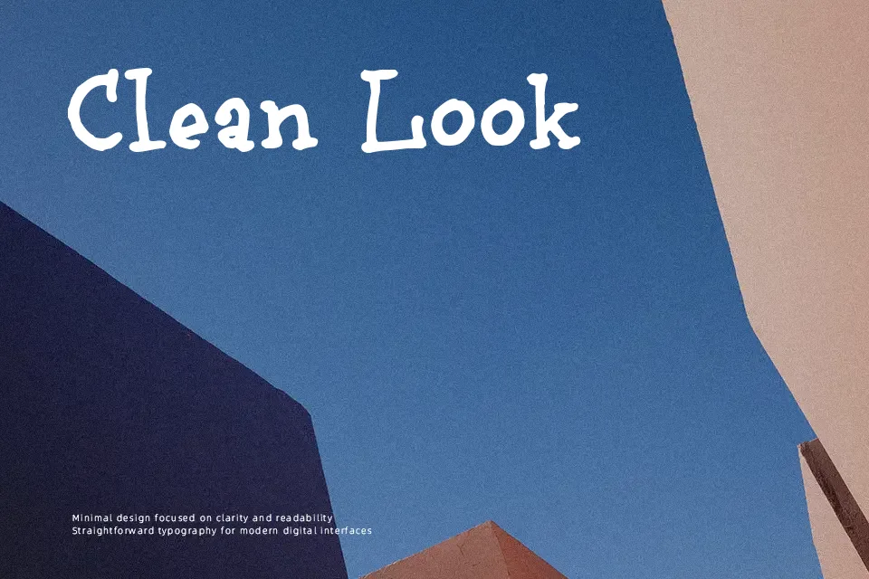
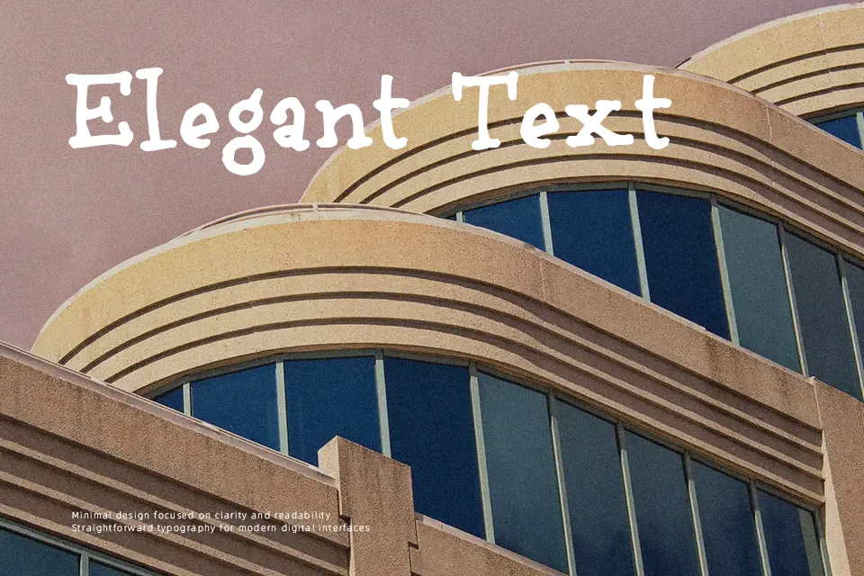
Bruno Book looks like it was dashed off with a thick pen: irregular lines, inconsistent curves, and slightly wobbly spacing give it a raw, hand-drawn character. The letters sit loosely on the baseline and the weight shifts from stroke to stroke, so nothing feels too rigid or mechanical. Visually it reads as a playful, informal display style, closer to notebook lettering than to classic script or clean sans serif. This makes it useful for headlines on posters, music flyers, zines, or social media graphics where you want a human, unpolished tone rather than a corporate feel. It struggles in long paragraphs, small UI labels, or brand systems that demand strict precision, so it is best kept for short, expressive text blocks.
Best For:
hand-lettered style posters
casual music or event flyers
informal social media graphics
Not Ideal For:
long body copy or articles
formal corporate branding
tiny UI labels or dense interfaces
Perfect for advertising, headline, and poster, with a artistic and display style.
License
Gallery