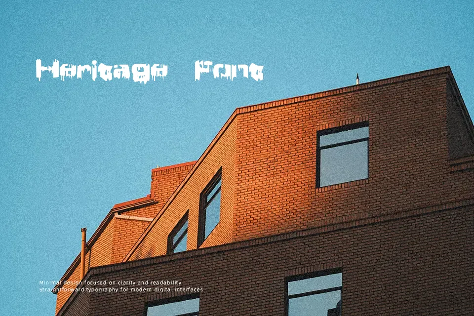
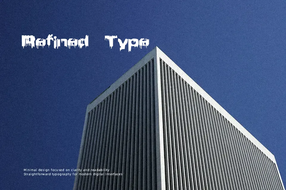
Brain Damage Font
Free for personal useAbout
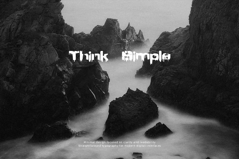
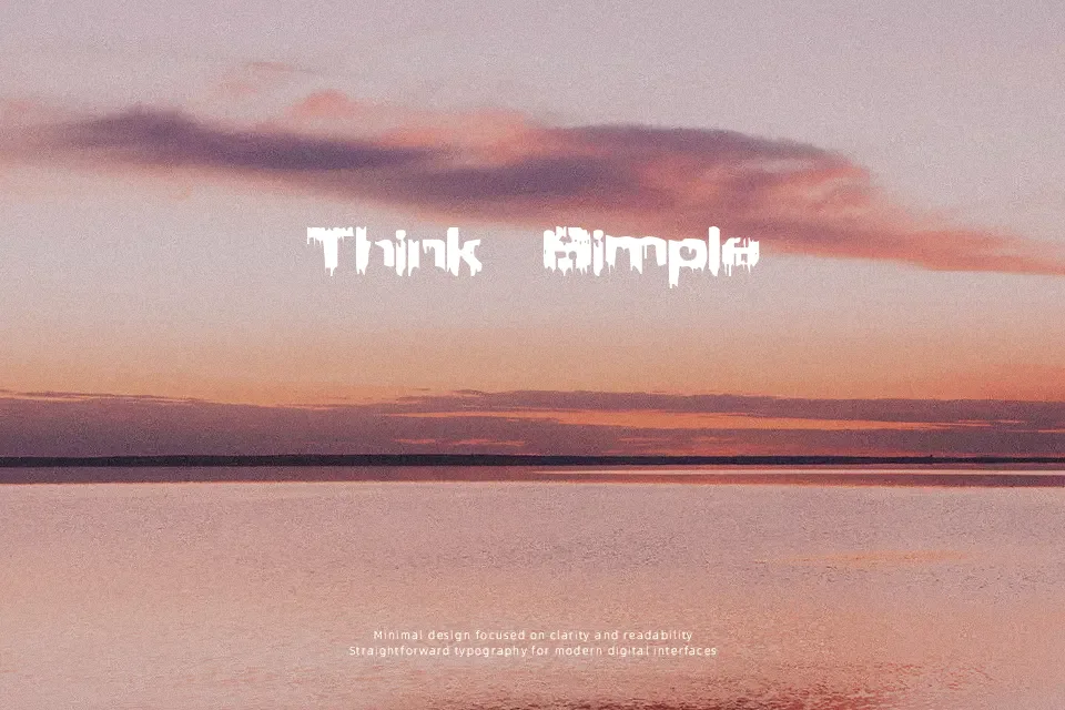
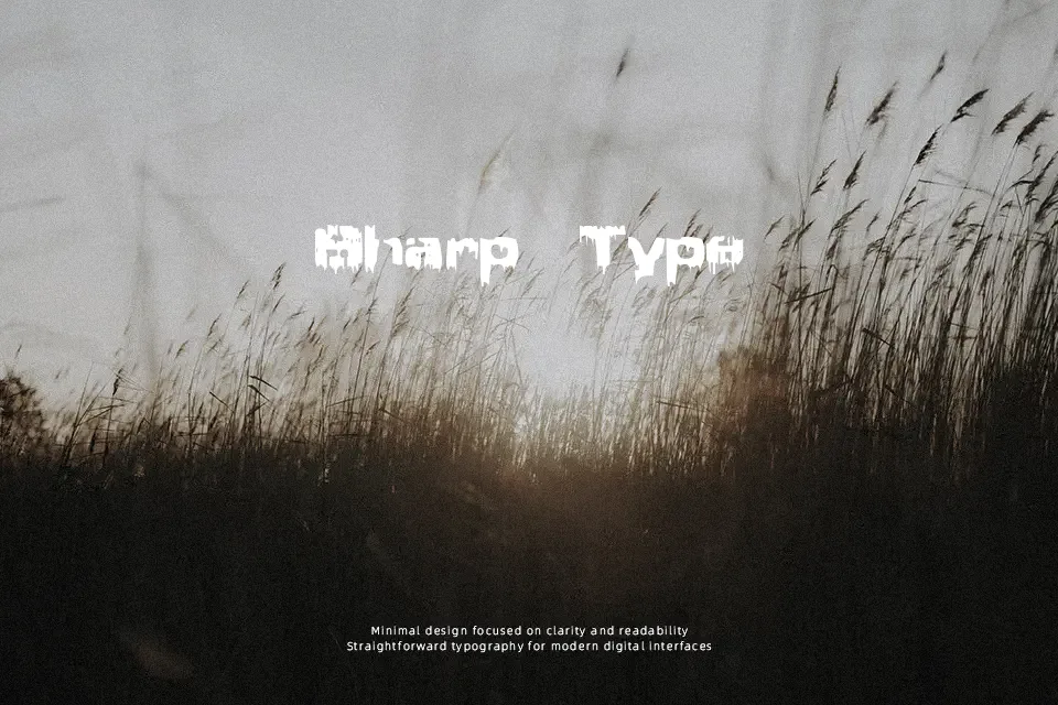
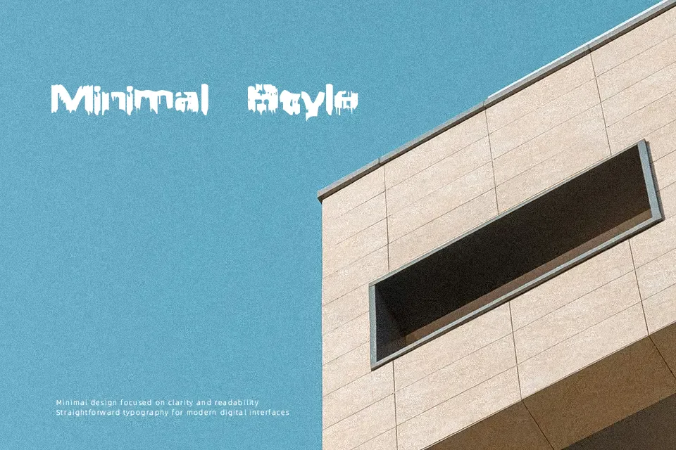
Brain Damage leans into thick, irregular strokes that sag and drip downward, giving every letter a warped, oozing silhouette. The spacing feels tight and chaotic, so text locks together in a dense block of horror rather than reading as clean lines. Overall it behaves as a loud, decorative display face squarely in the horror space, more like hand-cut gore lettering than a polished logo mark. It shines when you set just a few words large on posters, movie titles, or event graphics where legibility is still possible at a glance but nuance is less important. For long copy, UI, or serious branding, the distorted forms become tiring and can feel unprofessional, so it is better kept as a special-effect accent than a workhorse typeface.
Best For:
short horror headlines and logos
Halloween posters and haunted house flyers
slasher or thriller movie title cards
spooky social media promos and event graphics
Not Ideal For:
body text or long paragraphs
professional or corporate branding systems
small-size UI labels or in-app text
clean minimalist layouts needing subtle typography
Perfect for advertising, halloween, and headline, with a creative and decorative style.
License
Gallery