Bonte Divine Font
Free for Commercial UseAbout
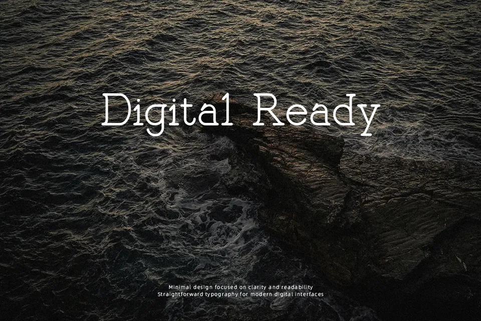
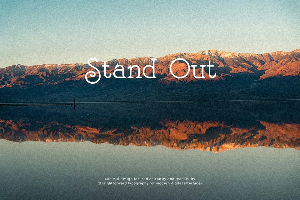
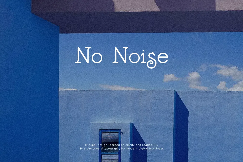
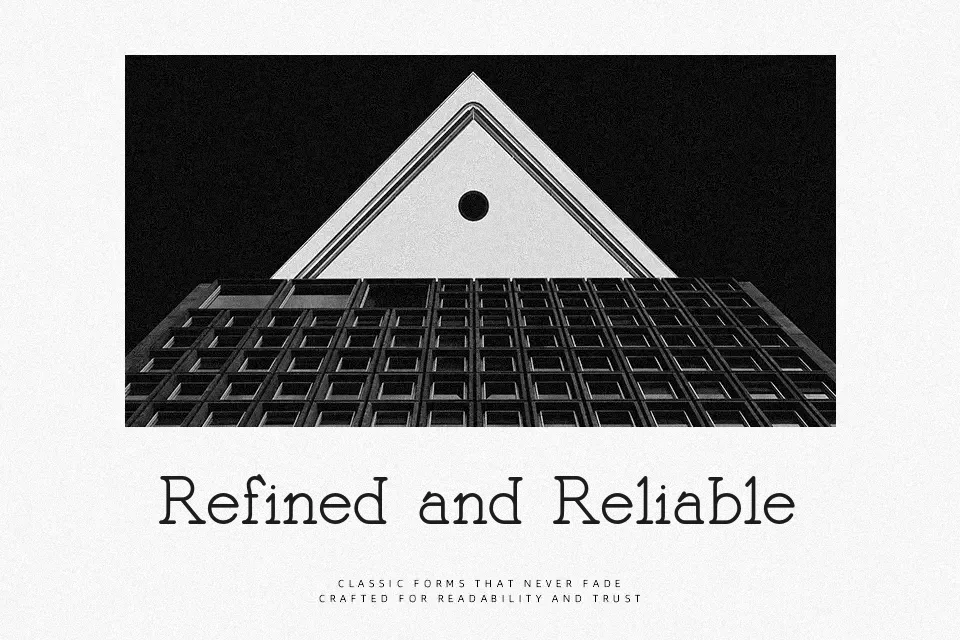
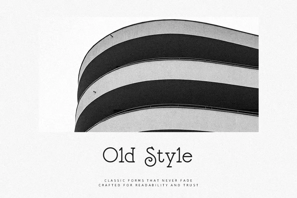
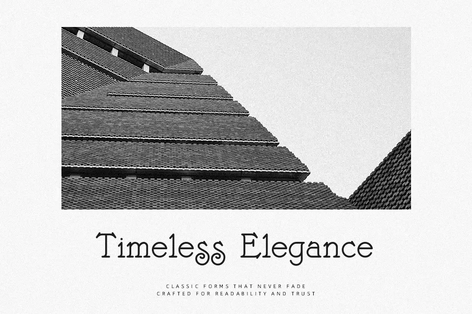
Bonte Divine mixes a slim serif structure with a touch of typewriter roughness, so letters feel a bit worn in rather than mechanically clean. Strokes are light, spacing is airy, and the outlines show tiny irregularities that give text a quiet, human rhythm. Visually it leans decorative and retro, closer to a display serif than a strict text face, which works nicely for titles, pull quotes, and logo wordmarks that need warmth over precision. It holds up well at medium sizes on posters or social graphics, but long paragraphs or small UI labels will feel fragile and harder to scan, so it is better used as a supporting accent than a workhorse family.
Best For:
Retro music or event posters
Soft vintage-flavored branding
Social media quotes and title cards
Not Ideal For:
Long editorial body copy
Tiny UI labels or dense data layouts
Highly formal corporate documents
Perfect for branding, headline, and logo, with a creative and display style.
License
Gallery