Big Fish Ensemble Font
Free for personal useAbout
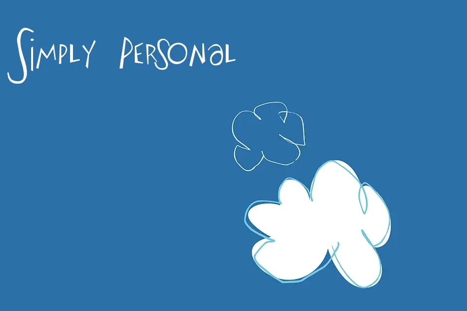
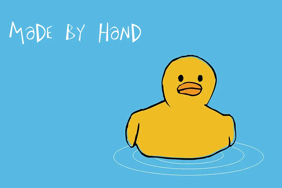
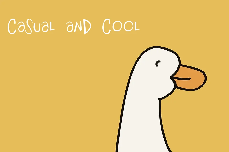
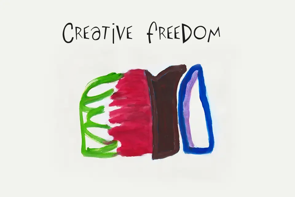
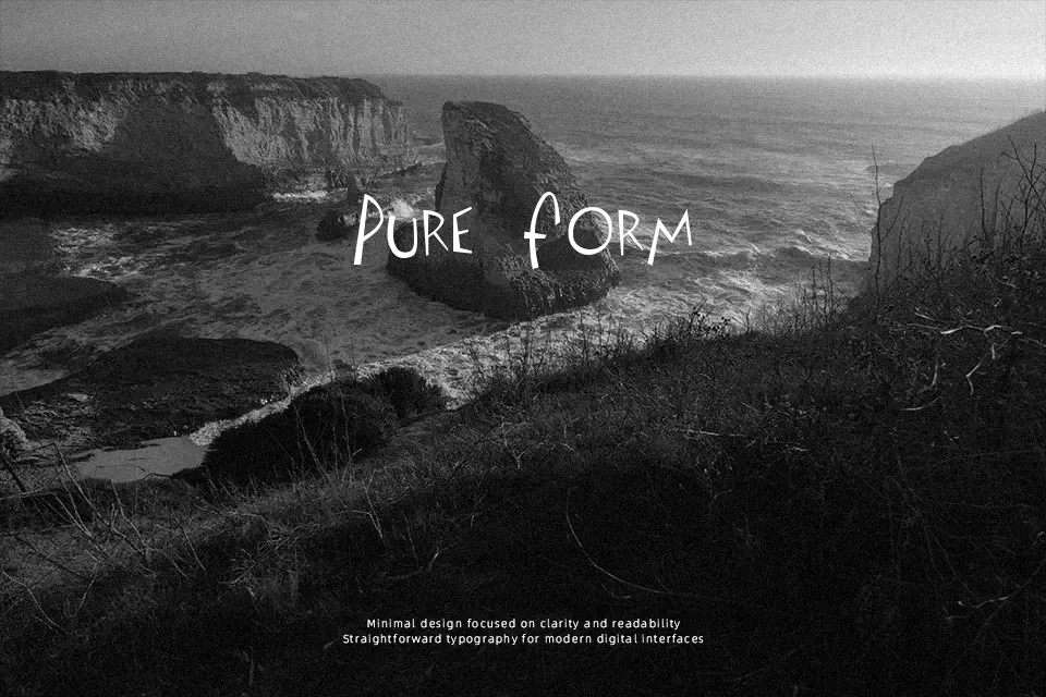
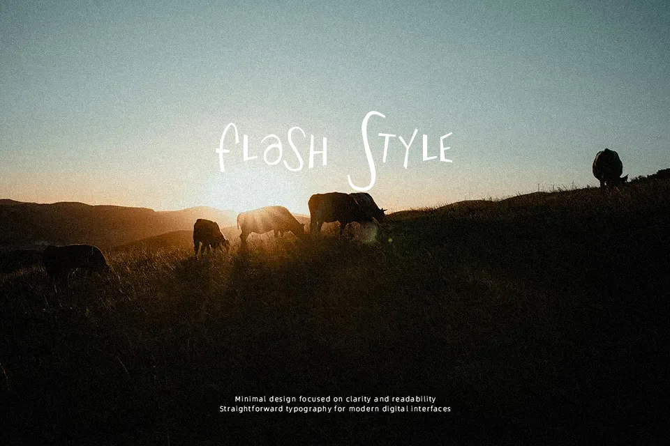
The characters tilt and bounce with deliberate irregularity, mimicking the casual energy of lettering sketched by hand rather than refined on screen. Stroke weight stays relatively consistent throughout, giving it a marker-like appearance that feels approachable rather than formal. Spacing between letters varies naturally, reinforcing the organic, unpolished aesthetic that works well for projects tied to indie culture, DIY branding, or retro music design. It fits scenarios where authenticity matters more than precision—think album covers, band merchandise, or zine layouts. However, the uneven baseline and limited glyph set (only 80 characters) make it impractical for anything requiring extended text or multilingual support. This font shines in short bursts but struggles when readability or consistency across platforms becomes necessary. It’s best reserved for decorative headlines where character trumps clarity.
Best For:
– indie band posters and album artwork
– DIY zine titles and creative headers
– retro music event flyers
– casual cafe chalkboard signage
Not Ideal For:
– body text or long paragraphs
– multilingual content or special characters
– corporate branding or formal communication
– mobile app interfaces requiring uniform spacing
Perfect for branding, headline, and music, with a creative and cartoon style.
License
Gallery