Bestime Font
Free for Commercial UseAbout
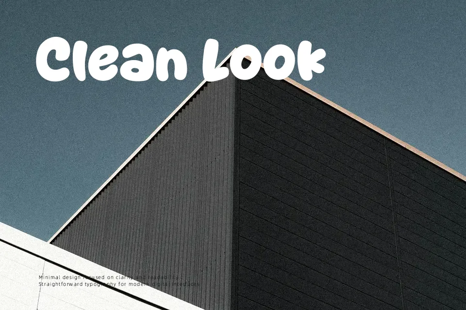
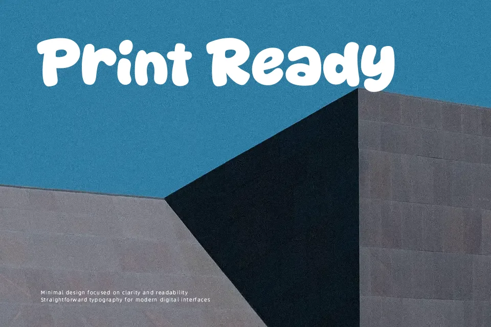
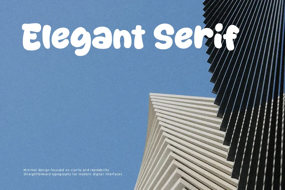
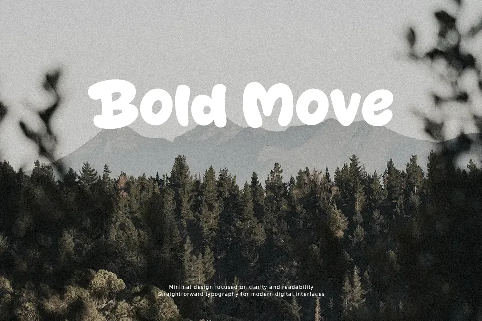
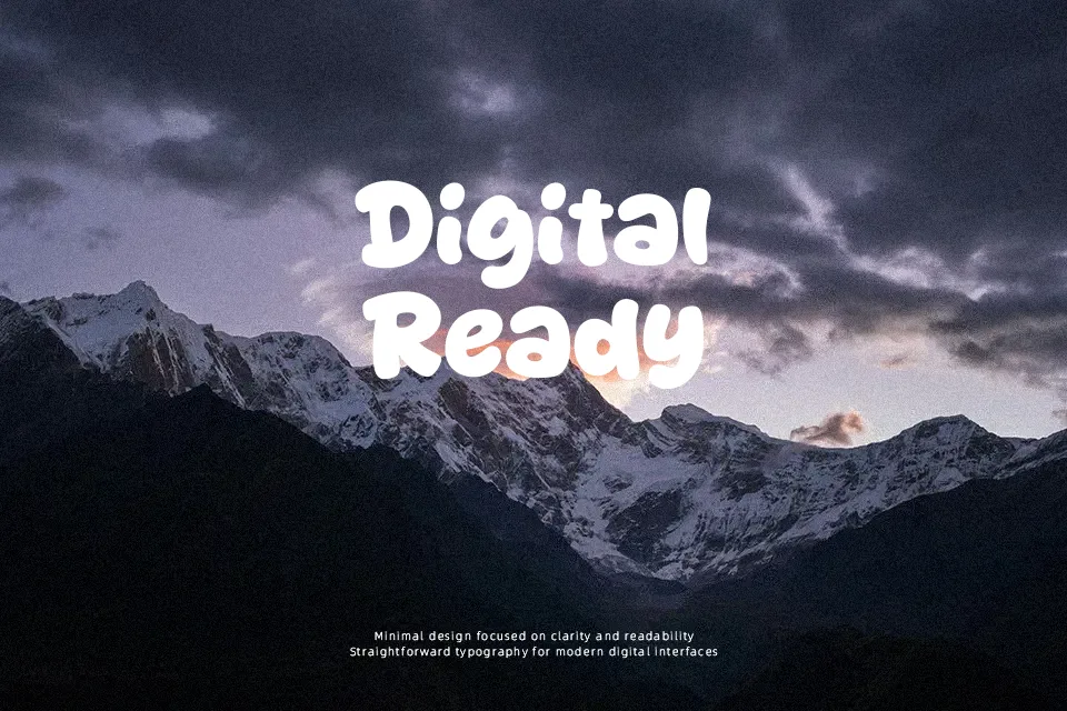
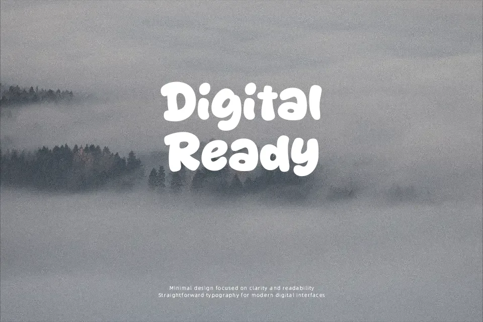
Thick strokes, zero contrast, and tightly rounded terminals give Bestime its signature chubby look — the kind of letterform that reads instantly as approachable and fun. The spacing is generously open, which helps individual characters pop at large sizes. Designed by Khurasan, this cartoon display font suits social media graphics, kids’ product labels, and event titles where lightness in tone matters more than refinement. That said, the uniform stroke weight and overly bubbly structure limit its versatility — it struggles to carry weight in formal branding or text that runs longer than a headline. Use it when the audience skews young or the project calls for warmth over authority; skip it when the brand needs to signal trust or precision.
Best For:- Children’s book covers and activity packaging
– Social media post headers and story titles
– Birthday event signage and party branding
– Food and snack packaging targeting younger audiences
Not Ideal For:- Body text or any extended reading context
– Corporate identity or professional service branding
– Formal invitations requiring elegance
– Multi-language layouts requiring extended character support
Perfect for branding, kids, and logo, with a cute and cartoon style.
License
Gallery