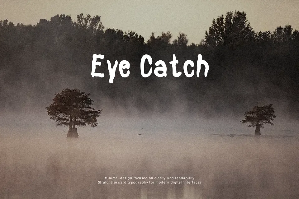
Basement Horror Font
Free for personal useAbout
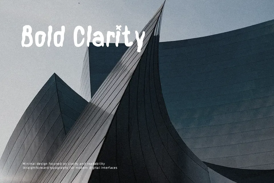
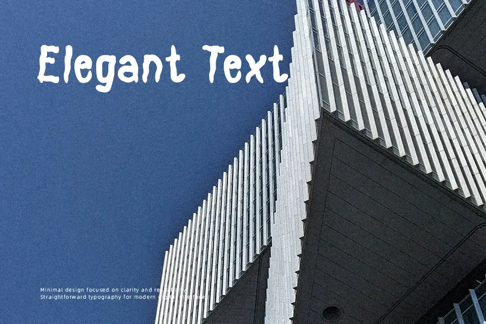
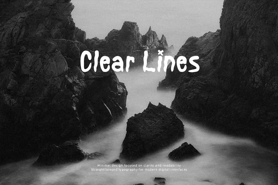
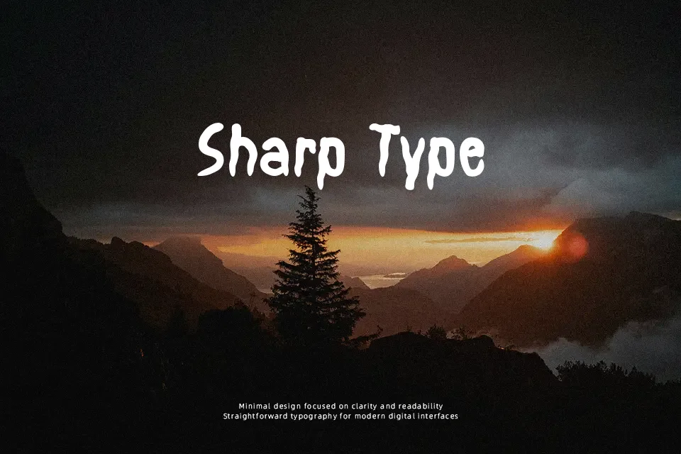
Each letter in Basement Horror looks like it’s melting off the page — strokes smear downward with an intentional wet-ink drip effect that reads instantly as sinister. The overall weight is bold but irregular, with uneven baselines that reinforce the chaotic, unsettling mood rather than feeling polished. It suits Halloween party invitations, horror film title mockups, and haunted event signage well. Where it falls short is legibility at small sizes — below 24pt, the drip detail becomes muddy and hard to read, making it unsuitable for body copy or any label with dense text. It also carries a strong seasonal identity, which limits its usefulness outside horror and Halloween contexts. Think of it as a one-mood font: when that mood fits, it delivers; when it doesn’t, it overwhelms.
Best For:- Halloween event posters and flyer headers
– Haunted house or escape room branding
– Horror-themed game or film title mockups
– Seasonal merchandise and greeting card headlines
Not Ideal For:- Body text or any copy smaller than 20pt
– Corporate, professional, or editorial layouts
– Year-round branding that requires visual versatility
– Multi-language or accented character needs
Perfect for film, halloween, and holiday, with a dark and decorative style.
License
Gallery