Basebul Font
Free for personal useAbout
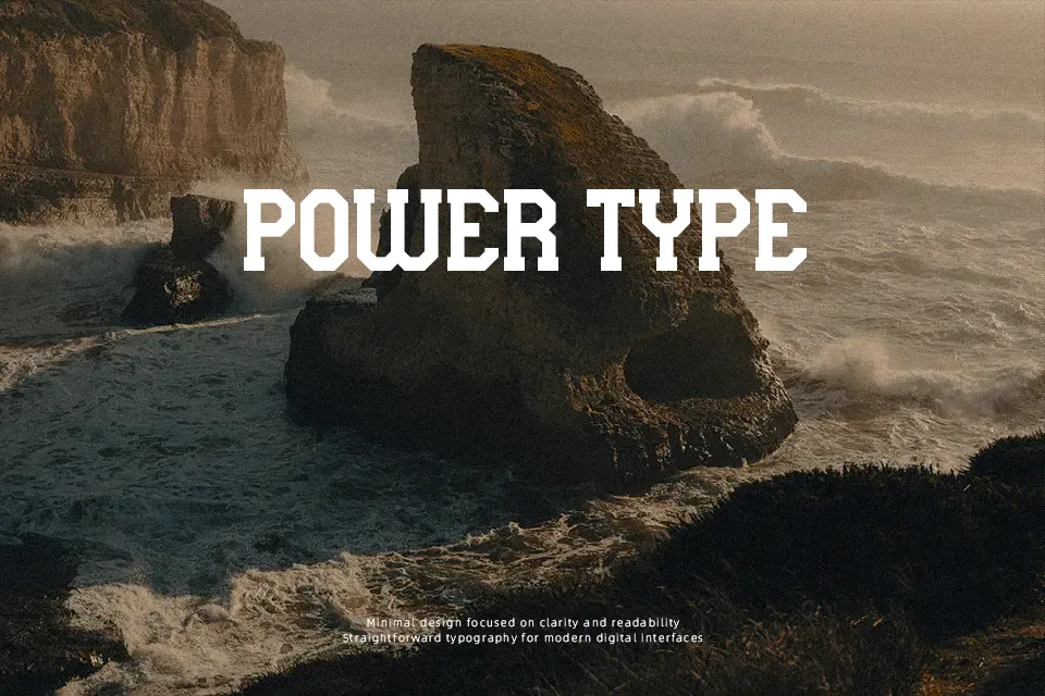
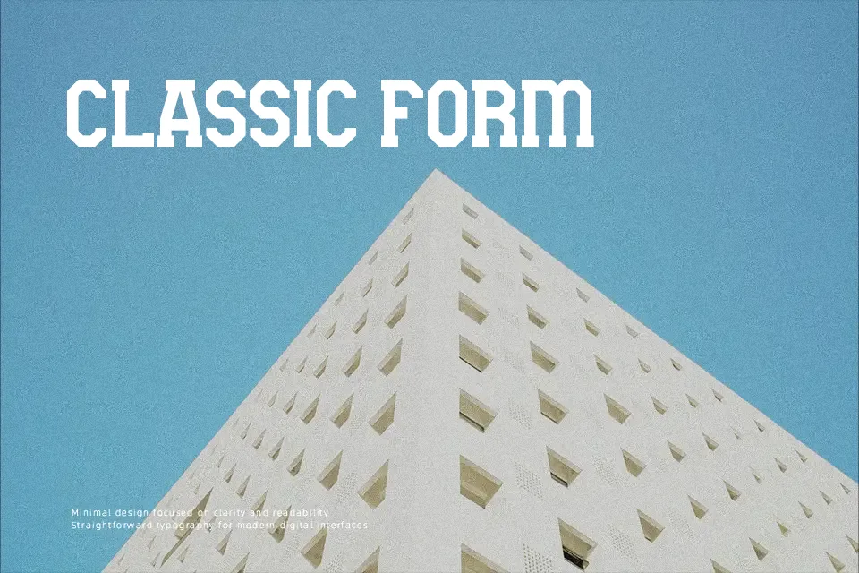
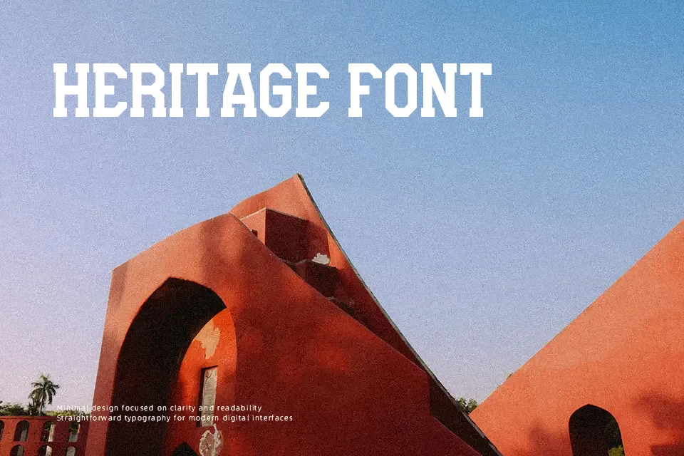
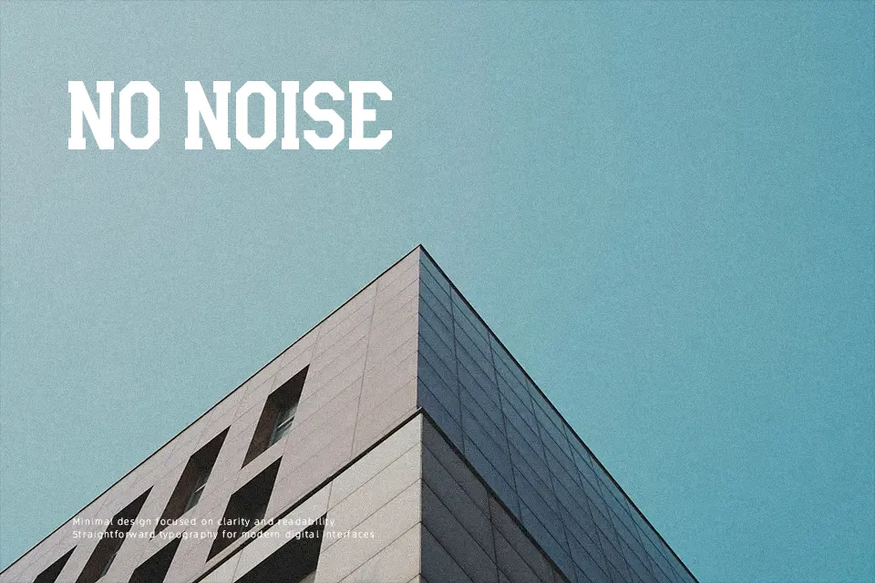
Thick strokes, tight spacing, and a forceful upright structure define Basebul’s character. The letterforms lean into an athletic visual language — chunky, assertive, and built for scale. It reads best at display sizes, where the weight and boldness land with the intended punch. At smaller sizes, character distinction starts to collapse, making it unreliable for body copy or fine print. Designed to reflect dynamic spirit, energy, and toughness, this font suits jersey-style headers, team name treatments, and event-driven social graphics. It won’t serve editorial layouts or anything requiring legibility under 18pt. For anyone working on a personal sports design project, it delivers the tone immediately.
Best For:- Sports team name headers and jersey-style text treatments
– Amateur league poster headlines
– Personal fan merchandise and apparel graphics
– Social media graphics tied to sports events
Not Ideal For:- Body text or any copy below 18pt
– Corporate branding requiring refinement or versatility
– Multilingual typesetting beyond standard Latin characters
– Commercial print without licensing clearance
Perfect for branding, logo, and poster, with a bold and display style.
License
Gallery