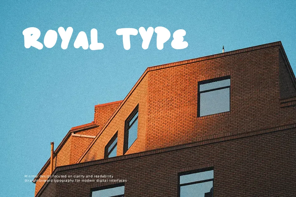
Ballsye Font
Free for personal useAbout
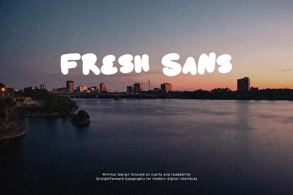
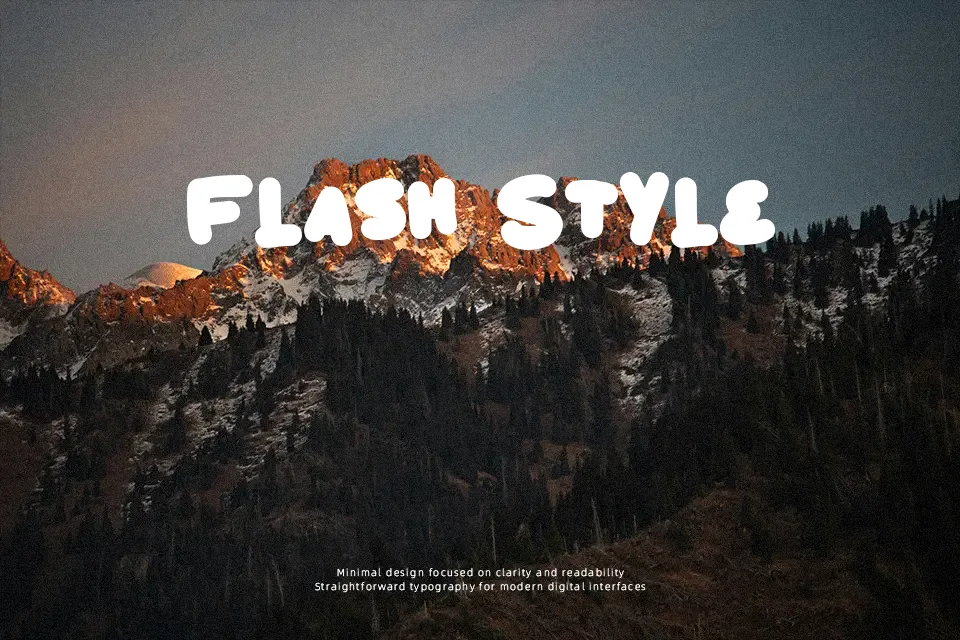
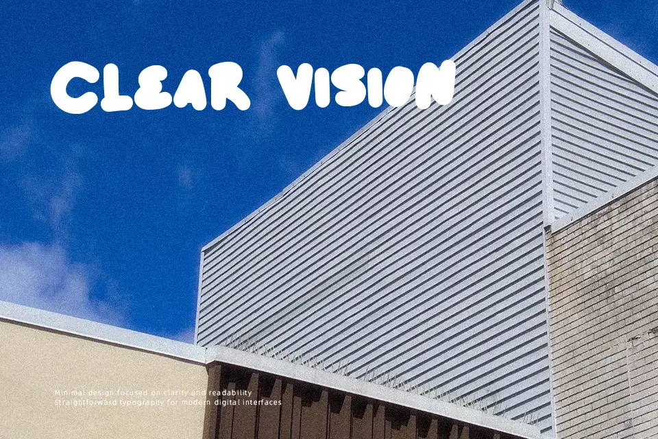
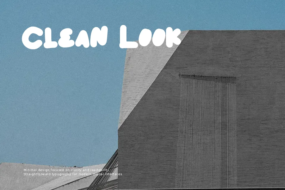
The letterforms are thick and rounded with slightly irregular edges that suggest hand-drawn energy rather than precision. This extra-bold weight creates immediate visual impact, but the comic style limits versatility—it reads as playful and somewhat mischievous rather than refined. The font performs well in contexts where boldness and personality are priorities, such as cartoon branding or youth-oriented packaging. However, legibility drops quickly at small sizes due to the heavy weight, and the informal character makes it unsuitable for corporate materials or elegant designs. It shares visual DNA with other comic display fonts but leans more aggressive in weight. The spacing tolerates short phrases better than extended text, where the density becomes overwhelming.
Best For:
cartoon channel logos
children’s product packaging
gaming team branding
comic book titles
Not Ideal For:
body text or paragraphs
corporate presentations
elegant wedding materials
small print applications
Perfect for branding, gaming, and kids, with a bold and comic style.
License
Gallery