Balans Font
Free for Commercial UseAbout
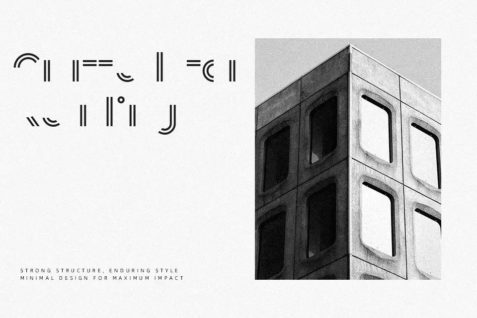
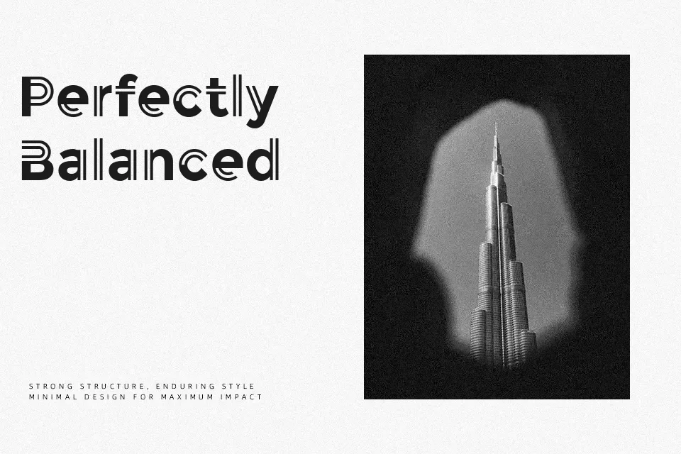
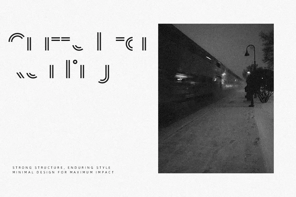
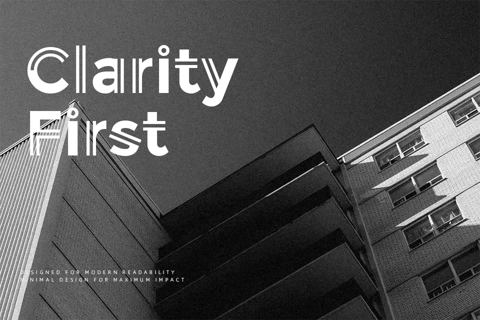
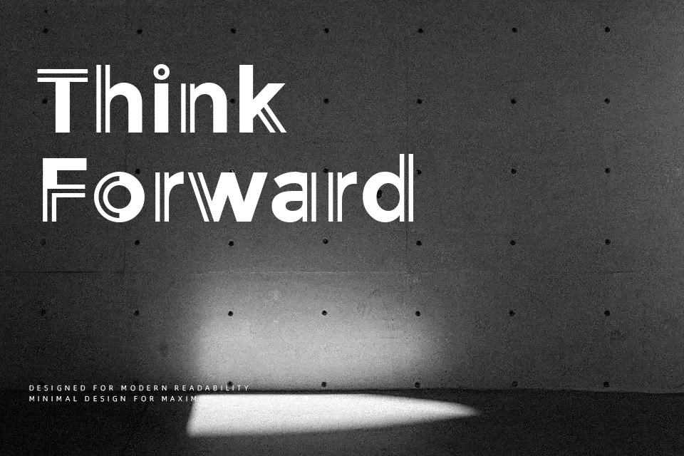
Its letterforms follow a geometric construction with even stroke weight and open counters that create breathing room in tight compositions. The Dutch name translates to “balance,” reflecting the designer’s philosophical approach to form versus function in typeface creation. Balans offers two variations—Normal and Line—giving flexibility for layered or outlined treatments in posters, product packaging, and visual identity systems where modern sensibility matters. It handles well at display sizes for tech startup branding or contemporary art gallery signage, though the geometric precision can feel cold in contexts requiring warmth or approachability. The uniform construction lacks the personality needed for hospitality or children’s content. While the font delivers clean professionalism for minimalist projects, its straightforward nature means it won’t stand out in crowded design environments where distinctive character is essential. Works best when paired with softer elements to offset its technical demeanor.
Best For:
– tech startup logos and branding
– minimalist poster headlines
– contemporary product packaging
– modern editorial mastheads
Not Ideal For:
– children’s book covers
– handmade craft branding
– warm hospitality materials
– long-form body text
Perfect for branding, headline, and logo, with a clean and display style.
License
Gallery