Baconlicious Crispy Font
Free for Commercial UseAbout
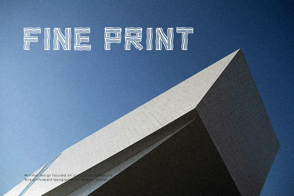
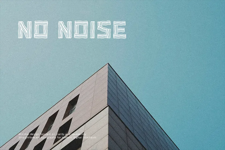
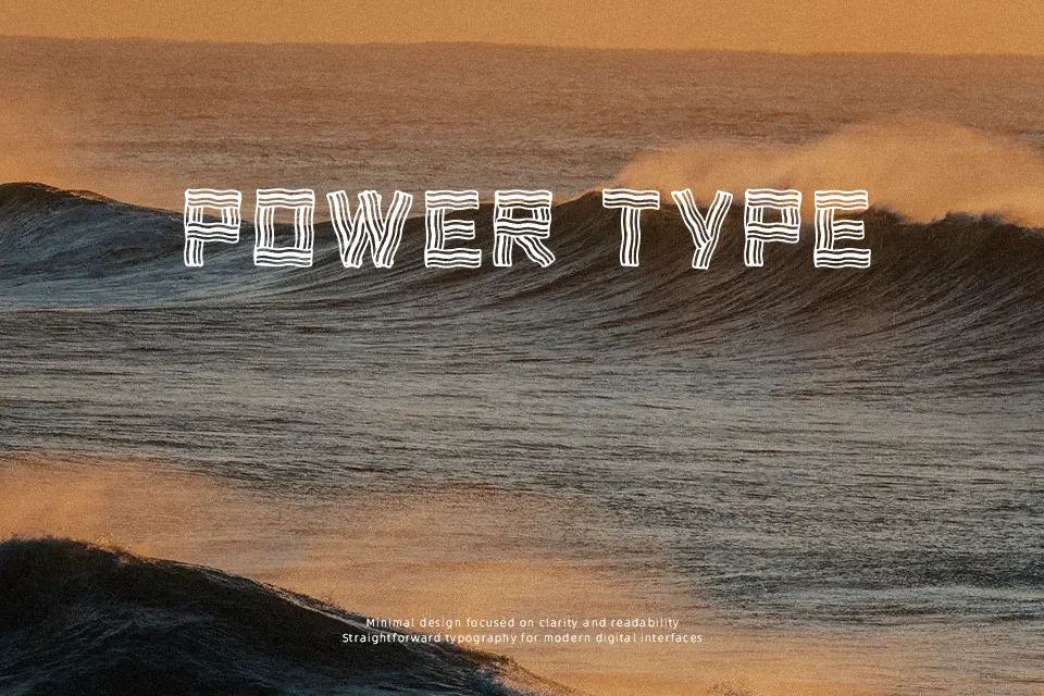
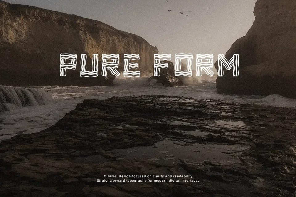
The letterforms in Baconlicious Crispy are constructed entirely from thin, stacked parallel lines shaped to imitate strips of bacon — making the typeface more illustrative than typographic in the traditional sense. That structural quirk gives it a distinct novelty personality: amusing, food-centric, and immediately recognizable at large display sizes. It works well on breakfast restaurant menu headers, food blog thumbnails, snack product labels, or any project where humor and visual concept carry more weight than legibility. The construction also sets a hard ceiling: at small sizes the parallel stripes collapse visually, making this font a poor fit for body copy, captions, or anything that needs to be read quickly. It’s the kind of font you use once for maximum effect — not a typeface that holds up across an entire brand system.
Best For:- food truck or diner menu headers
– novelty snack packaging labels
– food-themed social media posts and thumbnails
– breakfast restaurant promotional signage
Not Ideal For:- body text or any extended reading
– corporate or professional branding
– small-scale print (business cards, footnotes)
– digital interfaces where legibility is critical
Perfect for branding, packaging, and poster, with a friendly and decorative style.
License
Gallery