Arrobatherapy Font
Free for personal useAbout
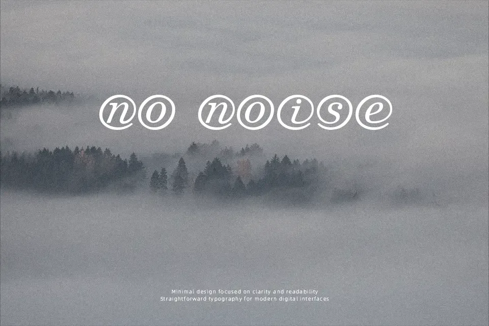
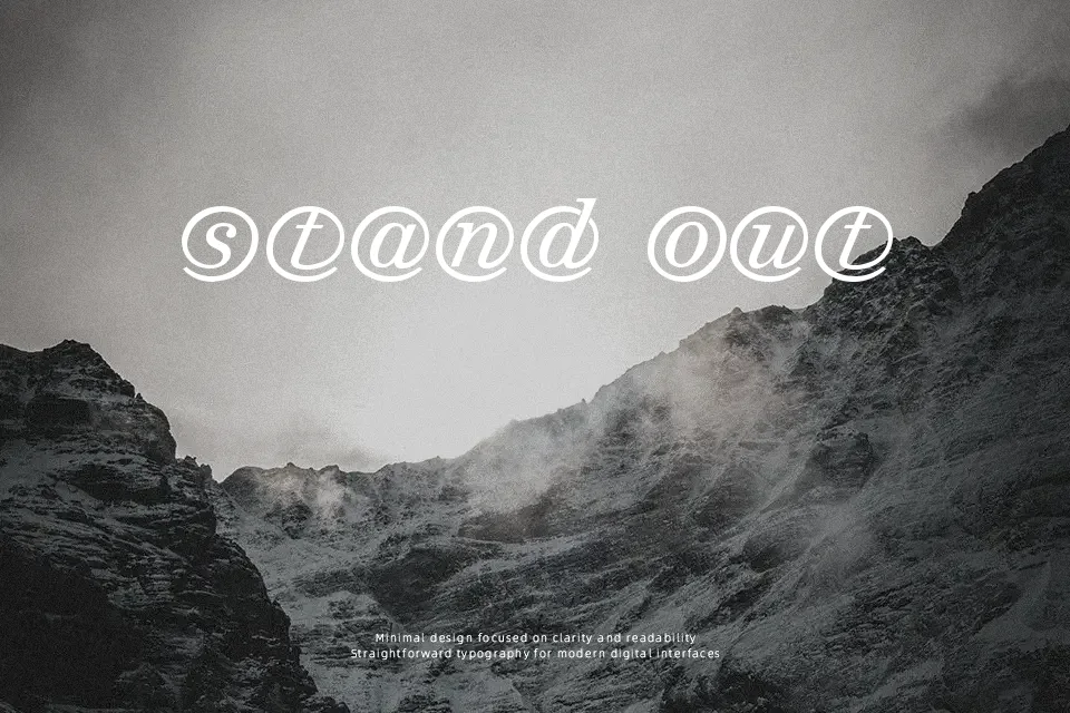
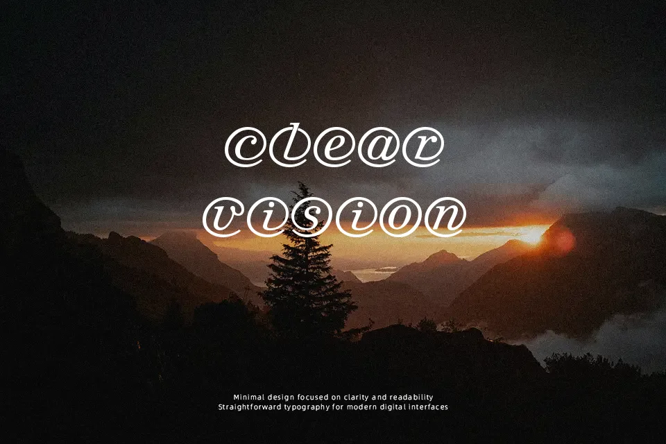
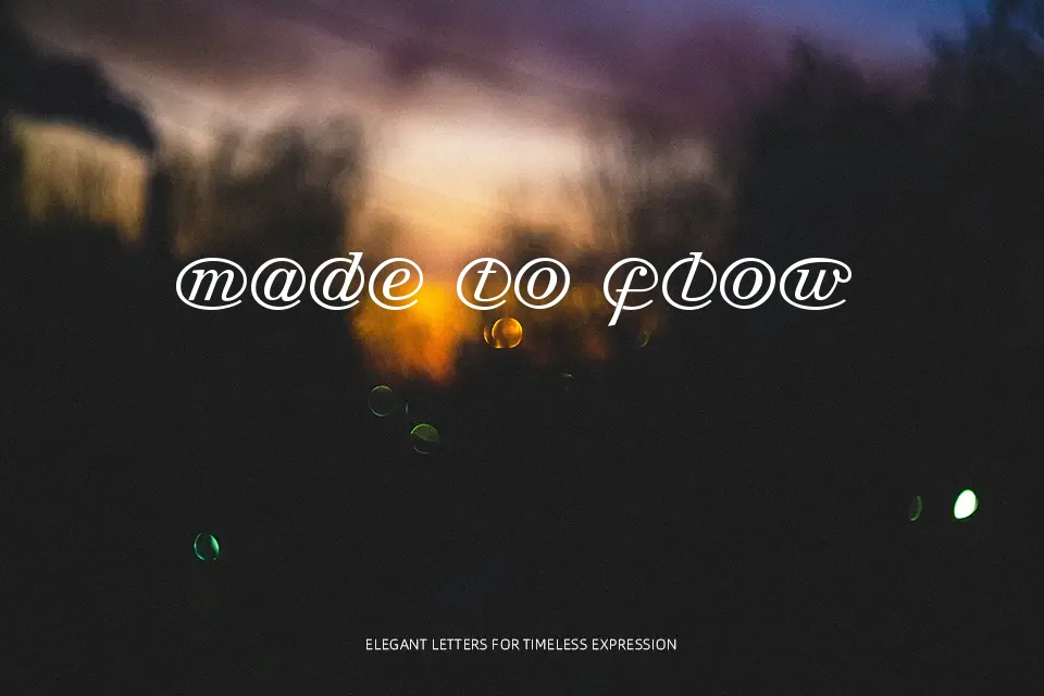
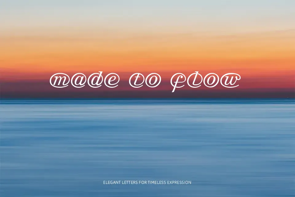
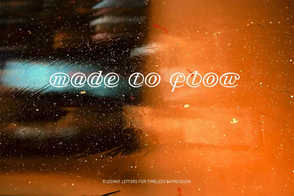
Each character in Arrobatherapy is wrapped inside a looping “@” motif, making the letterforms feel more like illustrations than traditional type. The strokes are monoline and slightly slanted, carrying the visual rhythm of an italic script without committing fully to calligraphic contrast. That playful structure works surprisingly well on novelty packaging, event flyer headers, or band merchandise where the concept itself becomes part of the visual identity. Because the “@” rings reduce the interior negative space of each letter, legibility drops fast at smaller sizes — it genuinely struggles below 36pt. At display sizes on a single word or short phrase, the visual payoff is high. Don’t reach for it when your layout needs clarity or when the copy runs longer than a few words.
Best For:- Novelty merchandise and zine cover titles
– Music event poster headlines
– Social media profile graphics with bold single-word statements
– Themed branding for digital-native or internet-culture concepts
Not Ideal For:- Body text or any running copy
– Corporate or professional documents
– Small-size applications (business cards, footnotes)
– Multilingual layouts requiring extended character support
Perfect for branding, headline, and logo, with a artistic and decorative style.
License
Gallery